This is a followup to my previous blog post that tried to determine the "Group of Death" in the 2015 Women's World Cup. Given the format of the tournament this year, perhaps it would have been best to define two groups of death -- the other four groups saw three of their four teams move onto the knockout stage (final 16 teams).
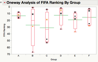
It turned out that the two groups that did not see a third place team advance were groups B and E. Here is a new version of the FIFA Ranking by Group plot I showed in my previous post, but this version has asterisk symbols for the teams that advanced. Also, I have colored the third place finishing teams for each group in orange.

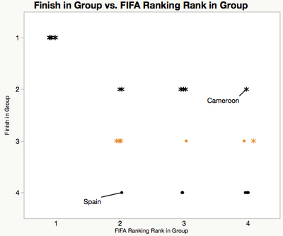
Seeing that all the highest ranked teams going into the tournament advanced made me wonder about how FIFA rankings within a group compared to how the teams finished in group play. It turns out that there's not a lot of correlation between the relative FIFA rankings within a group and how a team finished in the group, with one exception. All six of the highest ranked teams won their respective groups. Two teams that stand out in the plot below are labeled. Cameroon managed to finish second in Group C, despite being the second lowest FIFA ranked team in the entire 24 team field; Cameroon's FIFA ranking was 53 at the start of the World Cup. On the other side of things, Spain finished with a draw and two losses, leaving the 14th ranked team in the world left out of the knockout stage.

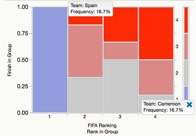
Here's another view of the same data using a mosaic plot. Notice that the Finish in Group axis is reversed from what the above image. Again, Spain and Cameroon stand out.

This is a good example of using multiple views of your results. Some views will resonate more than others. Is there a view of these data that you'd like to see? What are the pros and cons of the two views shown here?
You must be a registered user to add a comment. If you've already registered, sign in. Otherwise, register and sign in.