- New to JMP? Let the Data Analysis Director guide you through selecting an analysis task, an analysis goal, and a data type. Available now in the JMP Marketplace!
- See how to install JMP Marketplace extensions to customize and enhance JMP.
- Subscribe
- Mark as read
- Mark as new
Learn JMP Events
Events designed to further your knowledge and exploration of JMP.- JMP User Community
- :
- Learn JMP
- :
- Learn JMP Events
- :
- Analyzing, Improving and Controlling Process Stability and Quality
Analyzing, Improving and Controlling Process Stability and Quality
Video updated July 15, 2024 using JMP 18.
JMP lets you deploy interactive quality and SPC capabilities to identify process variation over time, determine if a process is stable and predictable, and track the impact of adjusting abnormal variation.
See how to:
- Learn how to deploy JMP's interactive quality and SPC capabilities
- Identify routine (common-cause) and abnormal (special cause) process variation over time
- Measure how well a process is performing compared to its given specification limits
- Easily explore stability and capability metrics for a large number of processes across time
- Easily compare stability data Pre and Post a process change
- Learn the basics for using
- Control Chart Builder
- Process Capability
- Manage Spec Limits
- Process Screening
- Attribute and Variable Control Charts with Phases
- Pareto Plots
Questions answered by Christian Stopp @jmpstopper and Mike Anderson @MikeD_Anderson during the live demo:
Q: Sometimes there's interest in viewing process capability parameters like Cpk over the past x weeks, months, etc. What suggestions do you have to accomplish this?
A: In a local table, the Local Data Filter under the red triangle allows one to subset the data and recalculate the metrics based on other column data (e.g. data period). if you're thinking along the lines of a data pipeline, JMP's query builder can ping ODBC compliant databases and filter accordingly, too.
Q: Why is Cpk not included in the PC Interactive Tool?
A: See below. If interested in suggesting this feature, submit it to the JMP Wish List.
Q: Is the presence of the process capability analysis specific to JMP 18? I haven't seen this feature in JMP 17 within control chart builder, even when setting spec limits in the data table.
A: Remember to add spec limits as "spec limits”, not as reference lines.
Q: Can Process Screening be used on Live Data using Alarm Setting?
A: If you have JMP Live and put the Control Chart there, JMP Live has an alarm system built into it that will will send you emails when new alarms come in, and then it's up to you to set the refresh rate. The rate of refresh depends on how many data, how many data channels you're pushing into the control charts and how much processing is required.
Q: Can I calculate using different spec limits for different variables?
A: If you have different spec limits, that implies there are 2 different levels of variance in your process. Generally speaking, handling one spec limit per column of data is the preferred, historical approach. If they have the same underlying process but are different products, you might use a Short Run Control Chart. You can turn on the Short Control Chart option then select Part to assign to different products that have different control limits, that may exist withing the same processing capability. But, specifying this analysis pretty tricky and creates issues for creating Cpk and determining where control limits come from. See below.
Q: Can I look at distributions?
A: If, for instance, you're trying to put a control chart on yield, it is questionable whether you should do that. But if you must do something like that. You can go directlyt to Process Capability and select the option for distributions. See below:
Questions answered at previous live sessions:
Q: Can Control Charts show average in the chart itself, the similar way that variability chart usually does?
A: Yes. Those are shown when you use sub-groups.
Q: What's difference between Within and Overall in the Process Capability histogram?
A: When you’ve defined a sub-group within will show the within-sub-group value. Overall will be the value for the entire data set. Within is used to calculate Cpk and Overall is used to calculate Ppk. Within is for looking at short-term variation and is based on sub-group size and Overall is looking at variation over time.
Another way to think about this is to consider the sigma value used to calculate the Cpk vs the Ppk, as this is the essential difference between these two statistics (their mathematical formulas are otherwise identical).
The "within" estimate of sigma used to calculate the Cpk is in-effect a root-mean-squared-error (RMSE) of the sigmas of each of the subgroups defined as part of the control charting exercise. For the case of Individual and Moving Range (I-MR) charts, the "within" sigma estimate is calculated by considering the relative difference between each observation and its prior observation (this is what we mean by "MR").
The "overall" estimate of sigma used to calculate the Ppk does not consider subgrouping. Rather, it considers the root-mean-squared error made up of each individual datum relative to the grand mean. Another way to think about this is that the overall estimate assumes a subgroup size of 1; the standard deviation is computed on the entire dataset, treating it as one overall group (not subdivided).
See statistical details.
Q: I always have to look up the guidelines for Cp, Pp, Cpk, Ppk because I don't use them regularly. Can I color-code the values in the table as a prompt, like the red/yellow/green in the control charts?
A: There are some options to do contextual coloring in JMP’s preferences (JMP > Preferences on Mac or File > Preferences on PC) you can explore.
Q: What would you say is the difference between the IMR chart and Xbar-R or Xbar-S (since JMP differentiates between them depending on type of data)?
A: IMR uses individual measurements. R uses subgroup means with a range for variability. S just uses standard deviation.
Q: What is the recommended subgroup size to switch to the S-chart from the R-chart?
A: There isn’t one that I’m aware of. It’s more about how you want to quantify the variation in the data set.
Q: What's the difference between an S and R chart?
A: S = Std Dev, R = Range. Also see documentation here: https://www.jmp.com/support/help/en/17.1/#page/jmp/shewhart-control-charts-for-variables.shtml
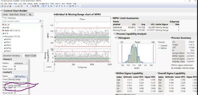
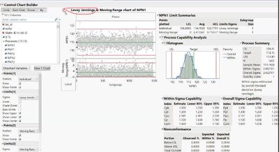
Q: Can I plot Levey Jennings control chart using control chart builder?
A: Yes. It’s just a change to the variability method in the IMR chart in the chart properties.
Q: Is there a way to bulk load control limits in addition to spec limits?
A: The Get Limits method of specifying control limits is the most flexible. You should use this method in the following cases: 1) If you have control limits for many different processes 2) If you have different control limits for each phase (see Specify Multiple Sets of Control Limits). Of course, to use the Get Limits method, you need a data table that defines your historical limits. See details. https://www.jmp.com/support/help/en/17.1/#page/jmp/example-of-control-limits.shtml#ww1831927
Q: Can I make x-axis show the actual date?
A: It’s possible to change the displayed format or use dates as the X values, depending on how your data comes in.
Q: Can I set up data screen limits that throw out faulty test data?
A: Yes. You can put a local data filter on the control chart to do that.
Q: Can you show us a way of import the control limits for many process ?
A: Generally, control limits should be calculated. There’s not really a way to mass override that in the column properties. You could request support for that in manage limits in the JMP Wishlist.
Q: When you have a repeated measures (e.g., an instrument whose performance is being assessed over time) could this platform be used or would you need to use one specifically designed for repeated analysis of the SAME unit (versus different units produced at different times? I’m thinking about situations in which instruments get less accurate (or less precise) over time.
A: You could use a control chart if you’re measuring something like a standard reference for a spectrometer or something like that. CUSUM chart is good for looking at process drift over time.
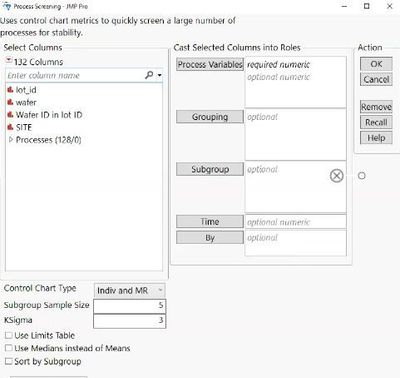
Q: In Process Screening, what is the difference between grouping and "group by”?
A: Grouping is used when you want each process variable analyzed at each combination of levels of the grouping variables. The results are presented in a single report. So, Grouping gives you the ability to break up a channel into multiple sub-channels. For example, when you have one data set coming in with multiple tools attached to that one stream of data, you could clip it out using the grouping. (Group) By is for a column whose levels define separate analyses. For each level of the specified column, the corresponding rows are analyzed using the other variables that you have specified. The results are presented in separate tables and reports. If more than one By variable is assigned, a separate analysis is produced for each possible combination of the levels of the By variables.
Q: How can we calculate the stability index?
A: You can find the formula here.
Q: How you describe the diff between Within and Overall Sigma?
A: Within is used to calculate Cpk and Overall is used to calculate Ppk. Within is for looking at short-term variation and is based on sub-group size and Overall is looking at variation over time. See details.
Q; How could I indicate that spec limits were changed at a certain point in time ? Am I able to assess performance over time relative to the limits in effect at each time?
A: You could add a Phase column and associate different spec limits with the different phases.
Q: I believe Process screening assumes each process quality characteristic has normal distribution. For example some of my processes out of 117 are non-normal, I have to screen all 117 and assign distribution in column property. Right?
A: Yes. And you can use standardize attributes to do that quickly.
Another method that doesn't require manual screening is to use the Process Capability Platform to identify and compute Ppk on the basis of the best fitting distribution for each of the 117 quality characteristics. You can use the Best Fit option under the launch dialog and assign that to each column before clicking OK to run the analysis. In every case except for the Johnson Fit, maximum likelihood is used to fit the available distributions in that platform, and the one with the highest negative log-likelihood is chosen as the best fit. Another option is to compute Ppk for one or more characteristics using a nonparametric method. For more information, please consult the help documentation here.
Q: What do the colors on the Goal Plot mean?
A: They related to Cpk. You can find out values here by using the question mark icon (?), which will bring you to in-context documentation, where you can find the anser to your question. In this case, it found:
When you select Shade Levels, shaded areas appear in the plot. The shaded areas depend on the relationship between p and Ppk, with p representing the value shown in the box beneath Ppk:
–Points in the red area have Ppk < p.
–Points in the yellow area have p < Ppk < 2p.
–Points in the green area have 2p < Ppk.
See this video to see how to use the ? to get answers when you are using JMP.
Q&A from previous sessions on this topic:
Q: What is a range chart?
A: A range chart looks at the running range of the data. You can convert it to an std dev chart in the control chart builder options.
Q: How is the within Sigma determined for the Cpk?
A: Cpk is a measure to show how many standard deviations the specification limits are from the center of the process. The Cpk indices are based on an estimate that attempts to capture only common cause variation. The Cpk indices are constructed using within-subgroup or between-and-within-subgroup estimates of sigma. In this way, they attempt to reflect the true process standard deviation. When a process is not stable, the different estimates of sigma can differ markedly. See the documentation for more details.
Q: Is there a look-up table option for Missing Value Codes?
A: You can define multiple missing value codes in column properties. You can do this for multiple columns using “Standardize Attributes.” You can create a lookup table manually using JSL.
Q: Does the name of the LSL, Target, and USL have to be the same in the spec limit table. For example, if I had a spec limit table with "Lower", "Upper", and "Target" column names, would this not work?
A: The Manointsage Spec Limits tool does expect those names. The Process Screening Platform does not.
Q: Can you modify/scale the subgroup axis to show only last 50 lots so that the Lot IDs in IR/MR charts are readable?
A: Yes. Just double click on the axis to access the axis properties. Or you can drag axes like you would with other charts. One way to do this would be to modify your first graph X-axis, use Edit > Copy Axis Settings, and then hold down control and use Edit > Paste Axis Settings.
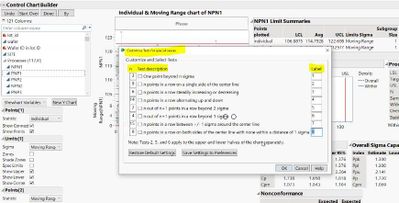
Q: Can we define our own tests?
A: Yes, there is a custom test option. In Control chart Builder, Customize Tests is available in the right-click men for some chart types. It enables you to design custom tests and select or deselect multiple tests at once. After the option is selected, the Customize Tests window appears for designing the tests. Select a test description and enter the desired number (n) and label. You can save the settings to preferences and restore the default settings. Available only for Variables and Attribute chart types. See the documentation for more details.
In Process Screening, Choose Tests enables you to choose the tests that you want to include in the calculation of Alarm Rate and Any Alarm. To select multiple tests, press Alt and click the Process Screening red triangle to open a menu of all platform options. See the documentation for more details.
Q: Do you have any comments on using Ppk vs Cpk? That's been a point of confusion since the labeling changed a few versions ago. What used to be Cpk in JMP is now Ppk.
A: Yes, it is a bit complicated. Have a look at this. Here are more details on the differences.
Q: How would you import specs for a phased chart where the different phases have unique specs?
A: Currently, you are only able to use one set of specs per process. You might also consider this approach using the Process Screening Platform.
Q: How do I generate Control Charts with spec limits and not calculate limits?
A: Control limits are generally always calculated. Spec limits are generally set based on customer requirements. You can set control limits using column properties.
Q: I noticed in your column properties list you have "Detection Limits" option. That is not available for me. Why?
A: It was introduced in JMP Pro 16, so you need JMP Pro Version 16 or later.
Q: Can JMP help me use historical data to create specification limits?
A: Yes, you can fit distributions to historical data and also use the Interactive Capability Plot to explore the impact of changing specification limits.
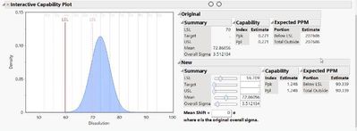
Q: How can I plot control charts for two processes right next to each other? For example, I am using process A from 2020 to date and then in 2022 I made a change to the process and now it's process B. I want to plot these consecutively to show the switch in Xbar.
A: You can do that using a Phases and a Phase column value. Here is an example using Diameter.jmp from our sample data, creating one chart or separate charts to show the processes.
Q: What is the difference between a Control Limit and a Specification Limit?
A: Control Limits are there to monitor the variability of the process to see if the variation is expected. Specification Limits are about the capability of the product and are the tolerance levels defined by the customer or stakeholder.
Resources:
- JMP Quality and Process examples and excercises from Learning Library
- Free Statistical Thinking for Problem Solving (STIPS) self-paced course
-
Overview and examples of Control Chart Builder.
-
Summary of Control Chart Types
- © 2026 JMP Statistical Discovery LLC. All Rights Reserved.
- Terms of Use
- Privacy Statement
- Contact Us


