Often, at the beginning of an introductory statistics course, I find students reluctant to learn a new software product – in my courses, it’s JMP. They ask why they can’t just use Excel, which they already know. Early in the course, I demonstrate the capability to create maps with JMP Graph Builder. They immediately see the ease and power of JMP for visualizing information with maps. I follow the demonstration with a class activity where the students create a US map of health expenditures associated with smoking from data available from the CDC website.
Flu data and visualizations are an ideal topic for the classroom as today’s students are interested in health topics and information is readily available nationally, statewide, and even at local levels. Data on many other health topics is publicly available. The CDC Wonder database is a good source for such data.
It’s out there: flu data
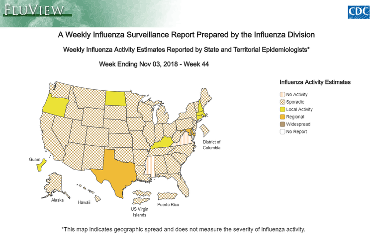
The Centers for Disease Control (CDC) publish FluView, allowing users to interactively explore data on the spread of the flu, rates of hospitalization, and mortality from the flu. The data is presented visually, which makes it easily assimilated by a wide audience. Maps are particularly helpful to assess the geographic spread of the disease. Here is the US map showing flu activity for the week of Nov. 3, 2018.
https://www.cdc.gov/flu/weekly/fluviewinteractive.htm
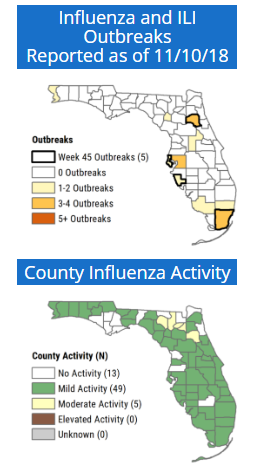
State departments of health also post information and maps on flu activity at the county level. Here’s a map of the flu activity in Florida as of Nov. 10, 2018.
http://www.floridahealth.gov/diseases-and-conditions/influenza/index.html
The weekly reports posted by the CDC and state departments of health offer many data visualizations on a timely topic that can engage students in the statistics classroom. Here is an example of the weekly flu surveillance report for New York state, showing many different data visualizations.
Case studies showing how to create maps
Our casebook, Data Management and Analysis Using JMP: Health Care Case Studies, offers several case studies that show JMP users how to make maps in Graph Builder.
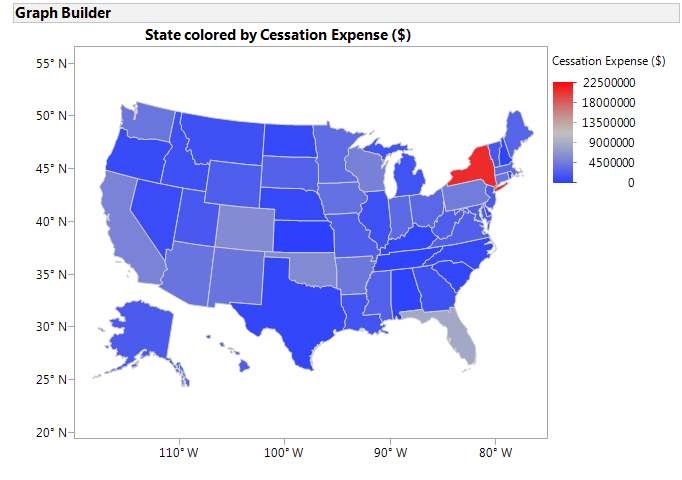
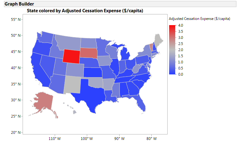
Two cases studies illustrate mapping health related smoking expenditures in the US. A key learning objective in one of these cases is to distinguish when absolute vs. relative measures are appropriate. In the two maps below, we show total state expenditures for smoking cessation compared to cessation expenditures per capita.
In the case “Appointment Wait Times at Veterans Medical Centers,” we use Graph Builder to create a map of the Southeastern US with an embedded bubble chart showing the size of the appointment backlog and the hospital’s bed capacity.
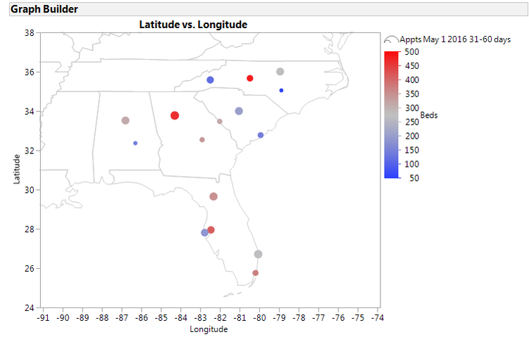
The map gives the reader the ability to assess the medical centers’ performance in a geographic context. Background maps can be added to JMP graphs from a variety of sources, either by connecting to a Web Map Server or from one of the map shape files in JMP.
Maps in the classroom
Maps, such as those shown here, can serve as catalysts for discussion in secondary, college, and graduate courses in both classroom and online settings and can integrate course content from other disciplines. For example, creating a map of measles outbreaks can provide data to support a discussion of the ethics of childhood vaccination. In the statistics classroom, teaching students to create maps is a valuable skill for those pursuing analytic careers, and will be an especially important tool for those entering fields such as public health, economics, and business.
You must be a registered user to add a comment. If you've already registered, sign in. Otherwise, register and sign in.