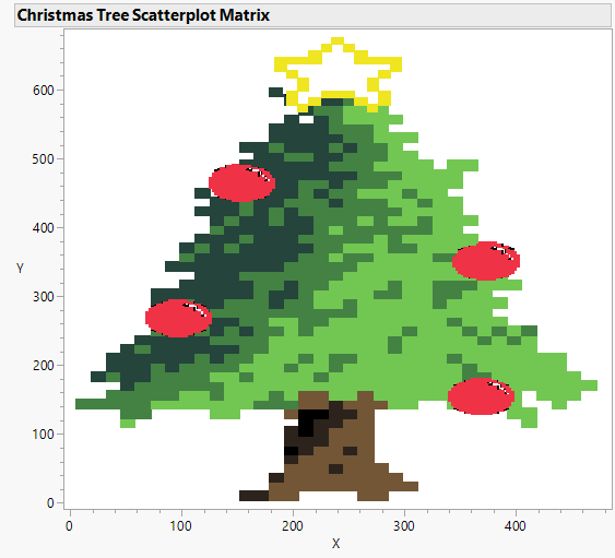
Christmas is only less than two weeks away, as we begin to wrap up 2021 and plan for 2022, I wanted to do something fun to celebrate this festive season.
Is there anything more magical than a beautifully decorated Christmas tree? And where else better to visualize a Christmas tree by using Scatterplot Matrix in JMP!
Take a look at the decorated Christmas tree I made using Scatterplot Matrix Y by X.

I've also attached my data table with x and y coordinates, so you too can easily build this is JMP and color it with your own style.
Follow these few simple steps:
1) Open the file "Christmas Tree XY Coordinates.jmp"
2) Go to Graph > Scatterplot Matrix
3) Drag Y to "Y, Columns" and X to "X".
4) Click OK.
5) To color the Christmas tree, go back to the data table.
6) Right-click on any of the colors and "Select Matching Cells". (JMP will highlight all the matching cell values.)
7) Right-click into the row header of the highlighted cells and select Colors.
8) Pick the color that you like. You can also select "Others..." to create custom colors.
I hope you enjoy this tutorial! Merry Christmas and happy holidays!
Have JMP? Try to visualize something fun today!
Christmas Tree XY Coordinates.jmp
You must be a registered user to add a comment. If you've already registered, sign in. Otherwise, register and sign in.