Turn on suggestions
Auto-suggest helps you quickly narrow down your search results by suggesting possible matches as you type.
] />
- New to JMP? Let the Data Analysis Director guide you through selecting an analysis task, an analysis goal, and a data type. Available now in the JMP Marketplace!
- See how to install JMP Marketplace extensions to customize and enhance JMP.
JMPer Cable
A technical blog for JMP users of all levels, full of how-to's, tips and tricks, and detailed information on JMP features- JMP User Community
- :
- Blogs
- :
- JMPer Cable
- :
- Regression to model the State of the Union trend
Article Options
- Subscribe to RSS Feed
- Mark as New
- Mark as Read
- Bookmark
- Subscribe
- Printer Friendly Page
- Report Inappropriate Content
Regression to model the State of the Union trend
Created:
Jan 22, 2018 10:41 AM
Can we use JMP to make meaningful, data-driven, non-partisan decisions about news? Of course, but what should our focus be? Can we also do something that's slightly fun?
Since at least 2012 (see Tau), the approximate grade level of US presidential State of the Union Addresses has made the news. Here, let's see how we can use JMP and regression to predict what the grade-level of Trump's upcoming Jan. 30 State of the Union address. Both Obama (see Tau) and Trump (see Wilson) have made the news for the grade level, or lack thereof, of their state of the union addresses (or joint addresses).
Here, we'll examine the State of the Union addresses via a simple linear regression model, as discussed in Chapter 9.2 "Simple Linear Regression" of my new book Biostatistics Using JMP: A Practical Guide. However, we can't just stop at creating a regression model, we need to evaluate the quality of the model and its errors; here, we'll examine the basics of such diagnostic tasks, but all of Chapter 10 of my book is dedicated to this topic.
Grade level is considered the approximate reading level based on Flesch-Kincaid, which is a simple approach that attempts to map the total words, total sentences, total syllables to the approximate education grade level it would take to comprehend any given text. For more details, see DuBay (2004) or Bihl and Bauer (2017). Why and if this is even appropriate for evaluating the State of the Union are not of direct concern. However, we tried to answer some of this in a recent paper, Bihl and Bauer (2017), concluding that the grade level was associated with the type of speech (written vs oral, televised vs non-televised).
As a simple example, and for fun in predicting the near future, we'll just look at the connection between year of speech and grade level through regression. In doing so, we must also look at the overall quality of the regression model as well.
Data Collection
All state of the union addresses were gathered from the Presidency Project, a nice repository at UC-Santa Barbara. For data cleaning, every [Applause] and [Laughter] was removed; tables were also removed from the written speeches of the 1800s. To compute readability statistics, Microsoft Word's built in Flesch-Kincaid grade level computation was used for all speeches. In StateOftheUnion2017.jmp (attached to this post), I've also added a row for the as yet unknown 2018 results.
Regression Model Building
For this prediction task, we will consider linear regression and both prediction and confidence intervals. While in Bihl and Bauer (2017) we used many variables, here we will only consider Flesch-Kincaid as the dependent variable and year as the independent variable.
We can use Fit Y by X to create a regression line for this data. Once we have the regression line, we need to do a few things:
1. Evaluate basic fit results
2. Examine the model for violations of assumptions (normality, outliers, etc.)
3. Compute and visualize prediction and confidence intervals
With a simple regression model, we see a generally declining relationship between Flesch-Kincaid grade level and year. If one were to look at the Linear Fit results (which I'm not showing), we would see the Summary of Fit, Analysis of Variance, Lack of Fit, and Parameter Estimates. At first glance, our fit looks decent, it has an R2 of 0.77, the ANOVA table shows a statsitical significant model (95% level). However, the points are scattered all over so examining the quality of the fit is necessary. Additionally, the regression model is Flesch-Kincaid = 101.96665 - 0.0459147*Year, which will obviously only work for certain range since this will go negative eventually. An example of extrapolating out too far: if we extrapolate out to the year 2974, when the movie Idiocracy was set, President Camacho's speech has a grade level of 4.0 years of education, but our model would predict an impossible -34 grade level.
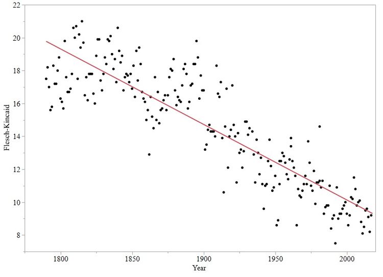 General Trend Between Year and Flesch-Kincaid Grade Level
In the output, we also see a lack of fit table since we have some repeated values (a few years had multiple State of the Union Addresses). But since very few years had this occurance, e.g., 1790 and 1980, we thus can't learn much from this table. So we'll ignore this table.
In order to answer our question – What will the grade level be of Trump's Jan. 30 State of the Union speech? – we will consider both confidence intervals (which are rather tight since it's concerned with the data today) and prediction intervals (which are wider since they are concerned with future values). For a regression analysis, we really want to look at the residuals to see if we have noticeable issues in violating various regression assumptions, e.g., normality.
To examine the prediction and confidence intervals, we will need to visit the red triangle in JMP next to Linear Fit a few times:
1. Select Save Predicted and Save Residuals – we'll need these to evaluate the quality of our model (see Chapter 10 of my book, Biostatistics Using JMP: A Practical Guide).
2. Select Mean Confidence Limit Formula and Indiv Confidence Limit Formula - we'll need these to provide the numerical interval values for the prediction and confidence intervals.
3. Select Confid Shaded Fit and Confid Shaded Indiv
Regression Model Adequacy
Many assumptions of regression models and residuals (the error in a regression model, i.e., the distance between the predicted line and each observation) involve normality. We can examine this by considering a normal quantile plot (a normal probability plot in many books). This can be found by selecting Analyze > Distribution in JMP and selecting the residual column. While the histogram looks normal, we can't trust this completely (see 7.2 Testing for Normality of my book for examples and discussion). So we'll want to select a normal quantile to better examine the normality. We can do this by clicking on the red triangle and selecting Normal Quantile Plot, which results in the following figure. Of interest is that the residuals all follow the line, are not outside the confidence interval and show no apparent shape. So, we're good as far as the normality assumption goes.
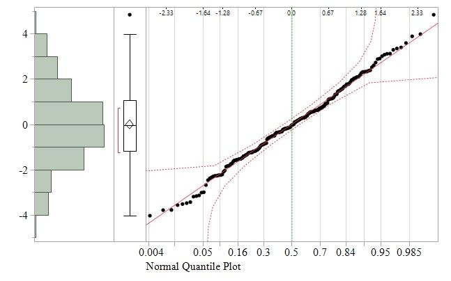 Residual Normal Quantile PlotOther issues can exist with outliers pulling the regression line, non-constant variance problems and etc. There are many ways to examine residuals for such issues; I'm a big fan of standardized residuals because we can both look at the shape of the residuals while getting an impression of what points might be outliers. Standardized residuals are computed by dividing each residual value by the standard deviations, which we can approximate as the square root of the ANOVA model's MSE. For our data, we would create a column with the following formula.
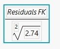 Standardized Residuals EquationThe result is now our residuals are scaled, if we plot the residuals by prediced, the y-axis is unitless and corresponds to standard deviation. We can thus look for large values, e.g., by a basic heuristic that values above 3 indicate possible outliers. Looking at our residuals, we don't see apparent outliers, and we see that the scatter looks largely random. So we'll continue with it since there's no compelling reason to use a transformation, which would involve interpretation difficulties. However, we should note that things start to trend toward negative errors at high Flesch-Kincaid values, so there's a possible non-constant variance issue here at the least.
 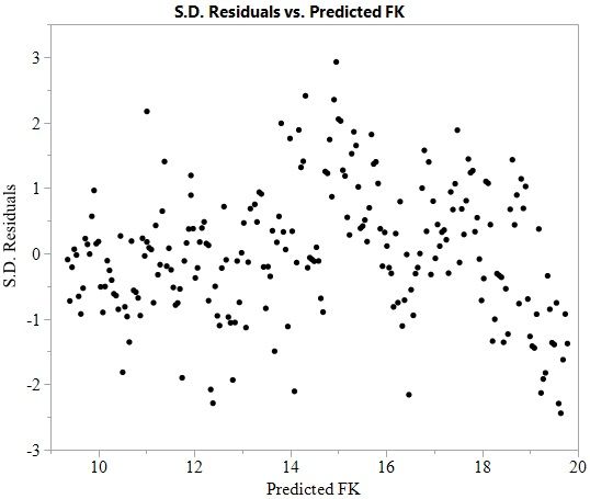 Standardized Residuals versus Predicted Values
January 30 State of the Union Prediction
With some confidence in the quality of our model, we can now proceed to the question we care about: "What is the Trevor prediction for the grade-level of Trump's Jan. 30 State of the Union Address?" We can use prediction and confidence intervals for this purpose. Visually, we see that the confidence interval is rather close to the regression line, with the prediction inverval covering a much larger area outside of this. This is expected since the prediction interval assumes more uncertainty.
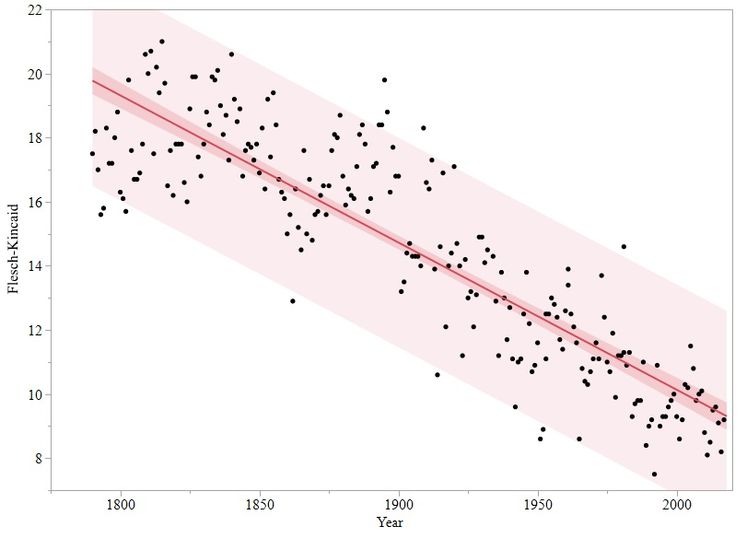 Regression Model with Both 95% Confidence and 95% Prediction Intervals
For the value we care about, we need to look in the data table at the year 2018. We have a predicted value of 9.31 for the 2018 State of the Union Address. This is therefore my prediction for the upcoming Jan. 30 speech.
However, this is not all; we can't stop at a single number, and we should include a bound on this. The prediction interval at 2018 is very wide (6.0 to 12.6), as seen in the figure above. Instead of using this very wide and useless interval, let's look at the confidence interval, which is 8.9 to 9.7.
Thus, my prediction for the Jan. 30 State of the Union is a Flesch-Kincaid grade level of 9.31+-0.4. Now let's see how right (or wrong) I am in a few weeks. Do you have any predictions you want to share?
References
- Bihl, Trevor J. Biostatistics Using JMP: A Practical Guide, SAS Press (2017): Chapter 9 Regression and Curve Fitting
- Bihl, Trevor J. Biostatistics Using JMP: A Practical Guide, SAS Press (2017): Chapter 10 Diagnostic Methods for Regression, Curve Fitting, and ANOVA.
- Bihl, Trevor J., and Kenneth W. Bauer Jr. "Statistical Analysis of High-Level Features from State of the Union Addresses." International Journal of Information Systems and Social Change (IJISSC) 8, no. 2 (2017): 50-73.
-
DuBay, W. H. (2004). The Principles of readability. Costa Mesa, CA: Impact Information.
- Presidency Project, UCSB: http://www.presidency.ucsb.edu/sou.php.
- Tau, Byron, 01/25/2012 "State of the Union registers at 8th grade reading level," Politico: https://www.politico.com/blogs/politico44/2012/01/state-of-the-union-registers-at-8th-grade-reading-....
- Wilson, Chris, 03/01/2017 "President Trump's Speech Was Given at a Seventh-Grade Reading Level," Time: http://time.com/4686828/donald-trump-congress-address-reading-level/.
Comments
You must be a registered user to add a comment. If you've already registered, sign in. Otherwise, register and sign in.
- © 2026 JMP Statistical Discovery LLC. All Rights Reserved.
- Terms of Use
- Privacy Statement
- Contact Us
