- JMP User Community
- :
- Blogs
- :
- JMPer Cable
- :
- Prediction Profiler enhancements in JMP® 18
- Subscribe to RSS Feed
- Mark as New
- Mark as Read
- Bookmark
- Subscribe
- Printer Friendly Page
- Report Inappropriate Content
The Prediction Profiler has long been a showcase feature in JMP for exploring models and fitted surfaces. With the Profiler, you can take vertical cross sections of the surface and interactively change where you take those cross sections, making it possible to explore and characterize even the most complex models.
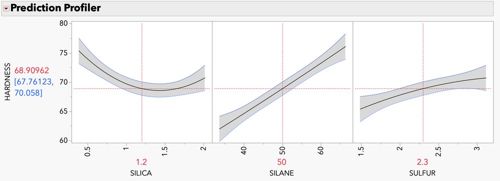
One of our favorite sample data tables is Tiretread.jmp, which is great for showing the features of the Profiler. Here, you see the Profiler for the response HARDNESS, fit with a response surface model.
Figure: The Prediction Profiler for the response HARDNESS
The Profiler has undergone many generations of improvements over the years, and even more features and functionality have been added in JMP 18.
I asked two of the developers, Xan Gregg and John Sall, about these new features in the Prediction Profiler.
Can you describe some of the changes you’re most excited about?
Xan: The ability to plot overlaid interaction curves and data points on the profilers.
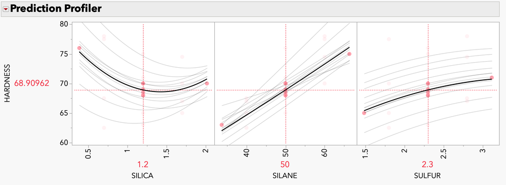
The Overlaid Interactions option adds additional faded curves to each Profiler frame showing how that factor’s profile would look while varying one of the other factors. In that mode, it creates a view that lets you assess two-factor interactions in the regular model context (rather than in a special-purpose tool like the Interaction Profiler).
The Data Points option shows the data values as markers within each profile in such a way that only those data values in or near the current factor’s plane are prominent and others are faded. The points allow you to see where the model is better supported by the data or has more variation.
Why did JMP add interaction traces and data points on the profilers? What additional information do they provide?
Xan: The overlaid interactions provide the same information you would get by manually adjusting each factor’s setting to explore a model surface, but it’s available all at once instead of along the way. They provide hints for exploring further with manual adjustments.
In the Profiler, the model is the main attraction, but the data points can provide useful context for interpreting the model, especially if the data is sparse or irregular and some factor combinations have little data support.
How and when should I use them?
Xan: The default setting for Overlaid Interactions is targeted for seeing two-way interactions, which is the most common case and easiest to understand. However, there are more settings available once the feature is turned on to see multi-way interactions or other amounts of detail.
For data points, the markers are linked to the data table as in any JMP graph, but there is one twist: since regular mouse actions are used to explore the model, you need to use the Brush tool to click on and select data points.
Returning to the Tiretread.jmp example, here you see the overlaid two-way interaction traces and data points for the response HARDNESS. You can easily see how the effect of SILANE on the response changes as you change the settings of other factors, a clear indication of a significant interaction. You can also see how the data points are distributed across the different factors at the current settings.
Figure: Overlaid interactions with data points
What was your reaction to the addition of interaction traces and data points?
John: I loved the interaction traces but was skeptical about showing the data points.
The one regret I had earlier with the Profiler was that you needed to move the factor settings in order to see interactions – you would otherwise miss them. But now they are visible if you use the new option, so you get a much more complete portrayal of the response surface.
Showing the data points, however, can be misleading. You can have a near perfect fit with your data, but seeing the points in the Profiler can mislead you into thinking the points do not fit very well. This is because the points show only one factor’s value, and they only represent the fit to the Profiler curve if the factor values for the other factors coincide with their current settings in the Profiler. But fortunately, Xan was two steps ahead of me – if the off-axis factor data values are much different than the current Profiler factor settings, then the markers are dimmed, so you only look at the undimmed points to get a good picture of the fit. I asked Xan to dim them even more than they were initially. Now they add value, rather than mislead.
If you want to see each point’s contribution to the fit, leverage plots in Fit Model were invented for that.
In JMP 18, an option for prediction interval in the Profiler has been added. Can you say a little more about prediction intervals and why JMP added this option?
John: The traditional “confidence interval” in the Profiler is a confidence interval for the expected value, not for an individual value. This means that over many iterations of taking a sample and fitting it, the confidence interval will contain the true expected value for those factor settings 95% of the time (assuming the model is true, etc.). However, this does not mean that it contains 95% of the actual values – far from it.
A prediction interval adds the uncertainty due to individual variation to the uncertainty in fitting the model. These intervals are wider, sometimes much wider.
If you have a lot of rows of data, the parameter estimates in the model are fit with high precision and the confidence limits can be small, even if you have a lot of residual error in the model. In this case, the prediction limits are far wider.
If you have only a small amount of data so that the parameters in the model do not have high precision, then the confidence limits become wide. The prediction limits are still wider, but not by much if the residual error is small.
When the Profiler was originally developed, we decided to emphasize confidence limits, rather than prediction limits, because we wanted to show the evidence of whether each factor was statistically significant, given the settings of the other factors. When you are doing a designed experiment to screen for which factors are important, the confidence intervals help you make that judgment, along with how much the profiles separate from a “flatline.”
But Profilers are also used for prediction, and the confidence limits we included are not useful for showing how the range of individual values may vary around the predicted value for given factors settings.
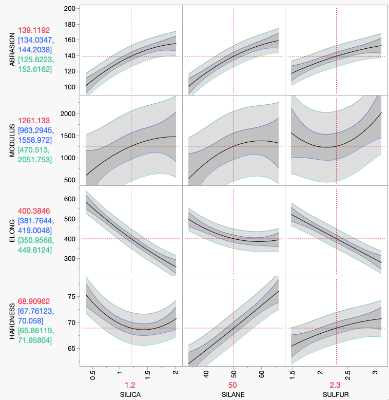
The data table Tiretread.jmp has only 20 rows and the fit is not great, especially for the response MODULUS. Here you see the confidence limits with darker shading and the prediction limits with lighter shading, a much wider interval. I would hope that most of your experiments have a better fit with narrower limit bands than this example. If you do another experimental run with certain factor settings, then it is the prediction interval that is likely to contain your new response, not the confidence interval.
Figure: Tiretread, four responses on three factors, with both confidence limits (expected value) and prediction limits.
What about profiling that uses saved formula columns from the Graph menu? Has this also changed?
John: If you want either confidence intervals or prediction intervals for the Profiler for saved formula columns, then you will need to save more formula columns so that it can find them in your data table.
In previous releases, it was awkward to arrange confidence limits on formula columns. You would need to use a command in the fitting object, like “StdErr Prediction Formula,” then include this in the Profiler selected columns, and even answer a prompt on whether to use this for confidence intervals.
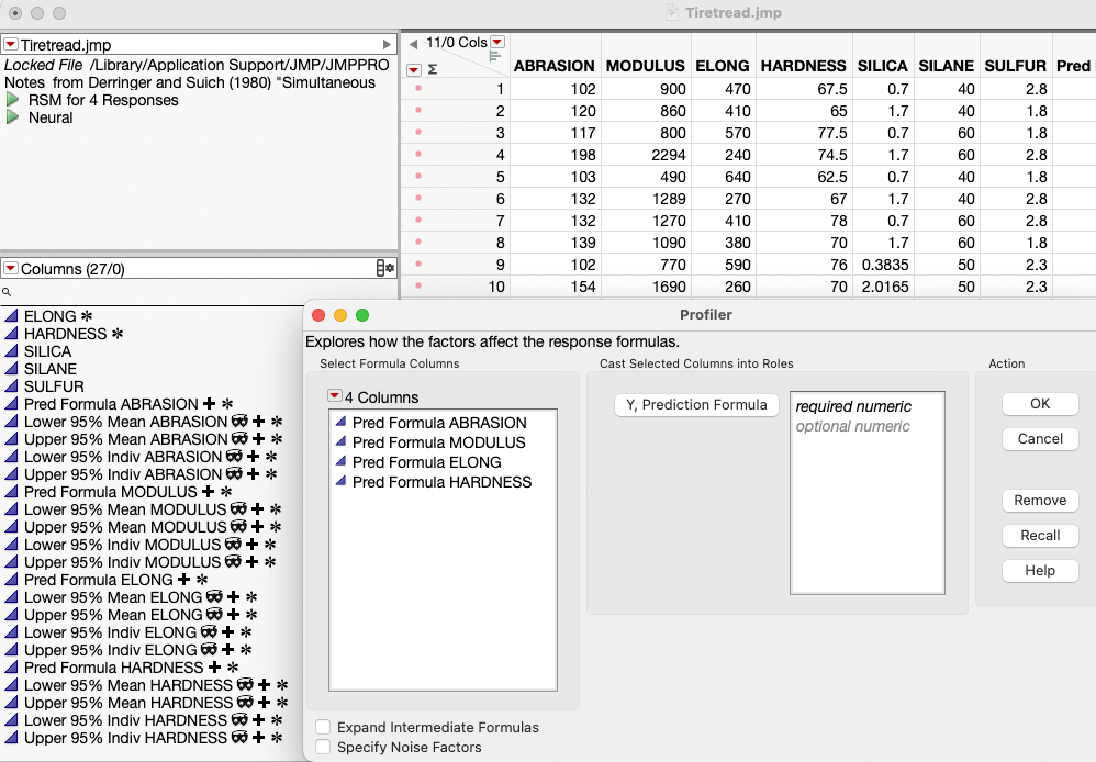
We made it much easier with JMP 18. The new command “Prediction and Interval Formulas” saves five formula columns, one for the predicted value, two for the lower and upper confidence limits, and two for the lower and upper prediction limits. Moreover, you don’t even need to specify them to the Profiler – it will look through the data table to find them automatically. The saved columns are stored with column properties with ID numbers so that even if you rename them, it will find them and associate them with the right response column. The Tiretread example has four responses, so with a control-click to that command to broadcast to all four fits, you get 20 new columns.
When you launch the Profiler in JMP 18 from the Graph menu, instead of showing all columns in the data table list, it will only show the columns that qualify: the formula columns. Also, it will not show the confidence limit columns because those will be automatically found, as associated with the prediction columns. This added functionality should make using confidence and prediction limits easy in JMP 18.
Figure: Note the 20 new columns generated by one command, the hidden interval columns, and the Profiler that shows just the formula columns, not the interval columns.
The term “prediction intervals” is used interchangeably with “indiv confidence interval,” in contrast to “mean confidence interval,” which is on the expected value rather than an individual prediction.
We made other changes to the launch dialog concerning Noise factors. Rather than have them as a Role list, you can now check “Specify Noise Factors,” which prompts you and then shows just the factors found in the prediction formulas. This makes it simpler and more error-proof.
Are there any other changes to the Prediction Profiler in JMP 18?
John: Yes, there have been many other Profiler improvements, including drawing smoother curves if the x-axis is not linear, improved constraint specification, and adding k-nearest neighbor extrapolation control.
At last count, the Prediction Profiler is used in 129 different contexts in JMP, and this doesn't even count other kinds of profilers and derivative profilers, like the Design Space Profiler. The additional features in JMP 18 make the Profiler even more powerful for exploring and understand fitted surfaces.
You must be a registered user to add a comment. If you've already registered, sign in. Otherwise, register and sign in.
- © 2024 JMP Statistical Discovery LLC. All Rights Reserved.
- Terms of Use
- Privacy Statement
- Contact Us


