- New to JMP? Let the Data Analysis Director guide you through selecting an analysis task, an analysis goal, and a data type. Available now in the JMP Marketplace!
- See how to install JMP Marketplace extensions to customize and enhance JMP.
JMPer Cable
A technical blog for JMP users of all levels, full of how-to's, tips and tricks, and detailed information on JMP features- JMP User Community
- :
- Blogs
- :
- JMPer Cable
- :
- Moving from SPSS to JMP: A Transition Guide
- Subscribe to RSS Feed
- Mark as New
- Mark as Read
- Bookmark
- Subscribe
- Printer Friendly Page
- Report Inappropriate Content
Because each analytical software package handles, processes, and outputs analysis differently, transitioning from one software program to another can be intimidating. Once users become comfortable with a program it can be difficult to make transitions, either to another program or to a more recent version of the same program. This can especially be true for new JMP® users who learned SPSS either at another company or as a student.
This guide, written by Dr. Joshua Lambert of the University of Cincinnati, is meant to ease the user’s transition from SPSS Version 27 to JMP 16 and JMP Pro 16. In this white paper, we'll illustrate the differences between SPSS and JMP and show you how easy this transition can be.
To demonstrate these differences, we'll use data from one of the most infamous shipwrecks in history: the sinking of the RMS Titanic.
Topics covered in this paper include:
- Introduction
- Importing and Cleaning Data
- Visualization
- Descriptives
- Descriptives: Custom Tables
- Descriptives: Correlation
- Inference: Two-Sample t-Test
- Inference: Crosstabs/Contingency Tables and Chi-Square Test
- Inference: Linear Regression
- Inference: Logistic Regression
- Data Manipulation
- Data Manipulation: Creating New Variables
- Data Manipulation: File Splitting
- Saving and Reproducing Output
- Other Features
- Conclusion
- Acknowledgements
The full text of the white paper appears below.
(Note: You can jump directly to a particular section by clicking on the hyperlinks above.)
Introduction
The year was 1989, and Poison’s new song “Every Rose Has Its Thorn” topped the charts. The personal computer landscape was changing rapidly and was seeking to shed some of its thorny past through the newly introduced graphical user interface (GUI). The Apple Macintosh popularized the desktop GUI, and many software companies were aiming to create transformative products to leverage the GUI’s user friendliness and accessibility. At SAS Institute, John Sall and his team of developers released John’s Macintosh Project (JMP) Version 1 in October 1989. JMP Version 1 gave users a graphical front-end that allowed them to specify which analyses and options they would like the software to perform without the need to write code. In 1994, JMP 3.1 was released for Windows desktop environment. In 2020, the JMP team continues to introduce newly developed statistical methods while maintaining its long list of high-quality analytic tools in JMP 16 and JMP 16 Pro for both Mac and Windows. JMP’s point-and-click user-friendly environment makes it a popular tool for a variety of data science activities.
Statistical Package for the Social Sciences (SPSS) is a well-known and highly utilized program for the statistical analysis of data. It has a rich history in both academia and industry, and is the standard in certain disciplines. Originally developed in the pre-GUI era, SPSS found a niche early on by being among the first to switch to the GUI format. Like JMP and many other companies, SPSS developed a graphical front-end that allowed users to easily process and analyze data, thus delivering analytics to the masses.
JMP and SPSS data analysis workflows are fundamentally different. JMP is designed so that users have a dynamic and fluid link between their data and analysis. This link leads to a different perspective for data analysis, one which we will explore in this guide. SPSS requires a static workflow that makes users specify which analysis they would like to perform prior to seeing output. JMP walks users through an information cascade, from defining response and explanatory variables they would like to process to the more specific comparisons they would like to investigate. JMP’s user experience is designed to take users through interactive and dynamic data analysis.
In 2020, there are a multitude of software options for processing and analyzing data. Each software handles, processes, and outputs analysis quite differently, which can make transitioning from one software program to another quite difficult. This guide is meant to ease the user’s transition from SPSS Version 27 to JMP 16 and JMP Pro 16. The following example best illustrates the differences between SPSS and JMP and how to ease the transition from one to the other. This example is independent of the software under consideration, so the background and data set come from alternate sources.
Example
The sinking of the RMS Titanic is one of the most infamous shipwrecks in history. On April 15, 1912, during her maiden voyage, the Titanic sank after colliding with an iceberg, killing 1502 of 2224 passengers and crew. This sensational tragedy shocked the international community and led to better safety regulations for ships.
The titanic.csv file contains data for 887 of Titanic’s passengers. Each row represents one person with the columns describing different attributes about the person: Survived (0=No, 1=Yes), Pclass (1=1st class, 2=2nd class, 3=3rd class), Name, Sex (Male, Female), Age, Siblings/Spouses Aboard, Parents/Children Aboard, and Fare.
Importing and Cleaning Data
SPSS
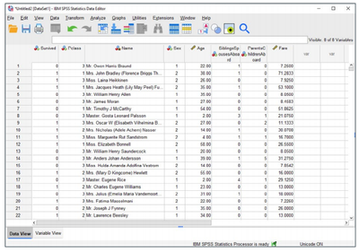
Upon opening SPSS, we can open many file types (CSV, Stata, SAS, Excel, etc.) using the options under the File menu. After a series of steps in which the software checks for things like delimiters and menus, we import the following file (be sure to uncheck Space under “Which delimiters appear between variables?” for the titanic.csv data):
A quick glance at the spreadsheet reveals eight variables and 887 observations. We see data on Survival, Passenger Class, Name, Sex, Age, whether a sibling or spouse was aboard, whether there were parents or children aboard, and the Fare (measured in £s).
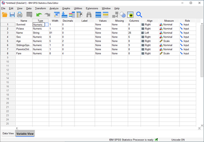
SPSS has two methods of looking at each data set, the Data View and Variable View options, which can be seen via tabs on the bottom of each data set. When we open the data in Variable View, we see the data type of each variable and can modify that information by adding labels and changing formats.
There are already some things we need to take care of to clean this data and get it ready for analysis. Fortunately, most of the variables were read in their correct measure type. Age and Fare are measured as Scale or continuous variables, while the other variables are measured as Nominal. PClass, SiblingsSpouse and Parents Children variables should be changed to Ordinal types, which can be done in the Variable View by clicking under the Measure column. There is also no missing data, so there is no need to assure that the software is treating missing observations correctly.
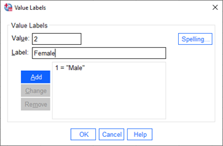
In SPSS, we need to label categorical variables which are String (text) type, which is also done in Variable View using the Values option. There are two variables (Name and Sex) that are of the String type. For this example, we will not be using the Name variable. We do plan to use the Sex variable, so we need to add Values to the categories of Sex. This can be done by clicking the … button on the Sex row and Values column in Variable View.
The basic idea of presenting data in SPSS is to provide two viewing options that show the data in terms of the individual observations, as well as an overview of the type of each variable.
JMP
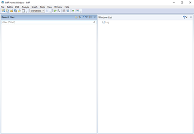
Switching over to JMP, we will open the same data and do the same manipulations. Let’s begin with what happens when starting the program. When JMP starts, the first thing we receive is a Tip of the Day and Home Window screen. The Home Window manages different windows for data, log and output. Recently used files are available on the left side so that we can conveniently reopen files that were used in a previous session.
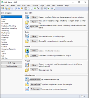
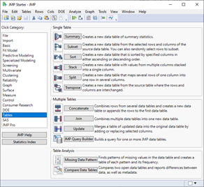
Another feature of JMP is the JMP Starter window, which is found under the View menu. The JMP Starter is convenient for new users since it organizes commands for analysis into categories and provides summaries for each data and analytic option. We can open the Titanic data for this project by clicking on the Open Data Table command in the File category and navigating to the folder that contains the file, selecting it, and clicking Open. You can also open data directly from the File menu.
Like SPSS, JMP can open a variety of files including CSV files, Excel spreadsheets, SAS data sets, SPSS documents and text files.
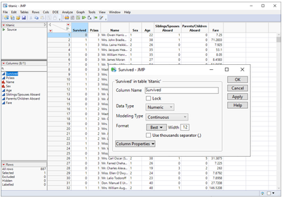
Unlike SPSS’ Data and Variable View, JMP does not switch between multiple views in the data. Instead, there are table panels along the left side that do similar things.
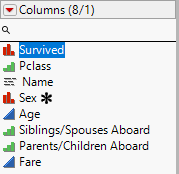
The middle-left panel displays the column information and shows each of the eight variables and the data type. There are modeling-type icons for each data type: blue for continuous variables, red for nominal data and green for ordinal data. Note that the variables Survived needs to be changed to Nominal type and Pclass needs to be changed to Ordinal. Sibling/Spouses Aboard and Parents/Children Aboard can also be changed to Ordinal. To change the type, simply left- or right-click on the variable column header and select Column Info. The type can also be changed by right- or left-clicking on the icon (blue triangle or red histogram) on the left panel. The bottom-left panel summarizes the rows and shows additional information.
Let us change the Survived and Pclass variables. By right- or left-clicking on the blue icon next to the Survived variable on the left-middle panel, we can select Nominal, which turns the icon red. By right- or left-clicking on the blue icon next to the Pclass variable on the left-middle panel, we can select Ordinal, which turns the icon green. We could have also made these changes by right-clicking on the column headers and selecting Column Info.
There are other data types in JMP 16. (For a full description of the data types please refer to this link.) For instance, Name is technically Unstructured Text and not Nominal. This change can only be made by right-clicking on the column header and selecting Column Info and then selecting Unstructured Text under Modeling Type. Unlike JMP, SPSS does not have an option to treat variables as text type variables nor a platform to analyze text responses.
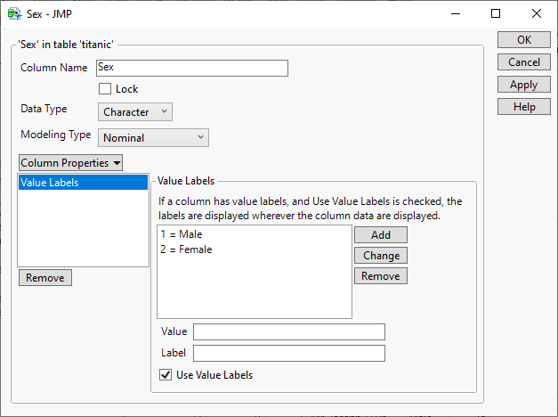
Like SPSS, we can also add value labels in JMP. To do this, right-click on the column header we would like to apply labels to and select Column Info. Then under Column Properties, select Value Labels. Unlike SPSS, JMP gives the us the option to use the Value Labels or the original values. When columns are given properties, JMP signals these changes with different symbols in front of the column names of interest. Here we see that asterisks have been created for the variable Sex. It should be noted that JMP has many other Column Properties that can help us better understand variability within our data such as Value Labels, Value Order and Units.
Visualization
Visualization is a powerful tool for analyzing and understanding data. The ability to easily make graphs via statistical software is one of the principal reasons why analytic software is so popular. Visualization is most easily handled in SPSS via its Chart Builder platform and in JMP via its Graph Builder platform. In this guide, we will discuss three simple yet powerful visualization tools: bar charts, histograms and scatter plots.
SPSS
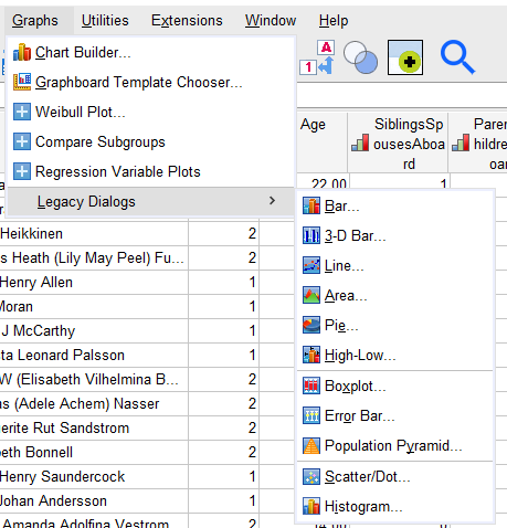
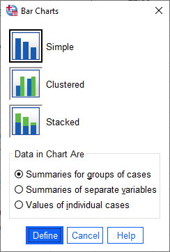
Suppose we want to limit the discussion to the variables Age, Fare and Sex to visualize the distribution of each and see all three on one graph. We start with forming a bar chart of Sex. One quick and easy way to do this is with the Legacy Dialogues under the Graph menu.
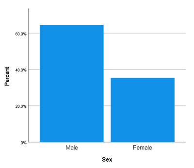
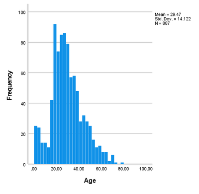
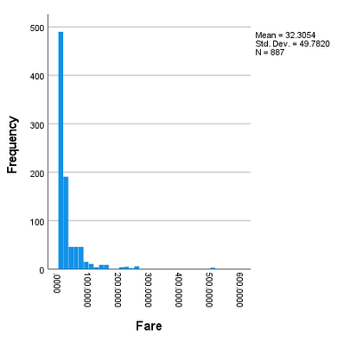
For this data, we see that slightly more than half of the data points are male. Turning to Age and Fare, we can visualize this data in a histogram, which can also be found in the Legacy Dialogues.
In addition to the histograms, we also get some simple statistics for each variable (Mean, Standard Deviation and the sample size N). We can double-click on each graph in the output and customize as we see fit. Examining the distribution of Age and Fare, we see observations that had a much higher Fare than the rest.
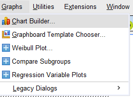
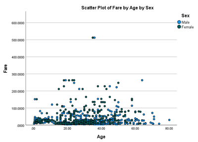
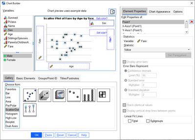
For more complicated graphs, we use the Chart Builder option under the Graph menu. Using Chart Builder, we can build a scatter plot of Age versus Fare that is color-coded by Sex.
The Chart Builder dialog box is useful because it’s easy to use and can be customized. We simply click on the type of graph desired and drag it into the preview box. From there, click and drag the variables we want to use on the x and y axes, and drag the color variable onto the Set color? box. Once the graph is set, we can view our results by clicking OK.
In viewing this scatter plot, several points about the data can be made. First, there appears to be two unusual observations (one Male and one Female) for Fare which happen to be similar Ages. Perhaps they were traveling together? Those data points certainly look out of place with respect to the rest of the data. From the scatter plot, it is difficult to see whether there is a linear relationship between Age and Fare. Also under Fare, there appear to be many points of 50£ or so.
JMP
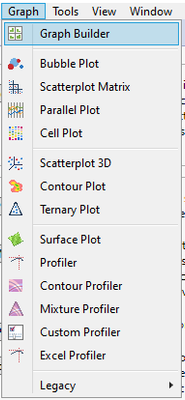
Before we look at data visualizations in JMP, recall from the introduction that JMP is designed to be interactive software. Most of this interactivity comes in the form of little red triangle icons in various places on the data and output that enables the user to explore additional analysis. SPSS output is mostly static, and further exploration requires reopening the graph of analysis platforms and reselecting options. We start again with a basic bar chart. Users can easily access graphing features via the Graph menu item from the top menu bar. For most graphs and charts, JMP’s dynamic and user-friendly Graph Builder is the logical choice. To make a bar chart, we select the Graph Builder, which also allows a variety of other graphs, such as pie charts, bubble plots and line graphs.
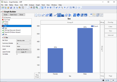
Graph Builder is an easy-to-use, drag-and-drop platform that allows us to explore and visualize data in engaging and interesting ways. Creating a bar chart for a categorical variable is first done by selecting the bar graph button on the ribbon at the top of the graph. Next, drag Sex into the x box at the bottom of the graph. As we drag the Sex variable around the graph, we see that JMP’s Graph Builder dynamically changes and gives us an actual view of what the graph will look like if we decide to drop the variable there. This is different from SPSS, which requires us to select OK before displaying the actual graph. Undoing that change is as simple as dragging the variable off the graph entirely or onto another section of the graph platform. Once Sex is dropped onto the x box at the bottom of the graph, a Bar options panel appears where we can select options for the new bar plot. For instance, including the % of Total over the bar is as simple as selecting that option under the Label drop-down. This option shows the proportion of the total sample that is Female and Male on top of the bar rather than nothing at all (default option).
Changing the axis to the percentage of the total is as easy as selecting % of Total under the Bar options in the Summary Statistic drop-down. All plot titles, axis labels and legend settings can be changed by either double-clicking or right-clicking and going to the setting to be changed. Graph Builder is very interactive, so changing a bar plot to a pie chart is as simple as clicking the pie button in the ribbon at the top. Clicking on Done removes the Graph Builder Control Panel and leaves only the graph that was created. This is useful when we would like to export the graph as an image file, which can be done by clicking File>Export and selecting one of JMP’s many file type options (e.g., Image, PDF, Microsoft Word). We can reopen the Control Panel by clicking the red down-pointing triangle and selecting Show Control Panel.
Another useful option under the red down-pointing triangle is Include Missing Categories if the variable has missing data. It shows the missing data on the graph alongside the Female and Male categories and includes it in all percentages shown. Also useful is the Recall button. Let’s say we spent a long time making the perfect graph only to realize that one data point was mislabeled. With JMP, that is no problem. Exit out of Graph Builder and go back to the data set and change the data as needed. Go back to Graph>Graph Builder and a magical Recall button appears. Click it and it will recreate the graph we just closed out – with the corrections we made to our data.
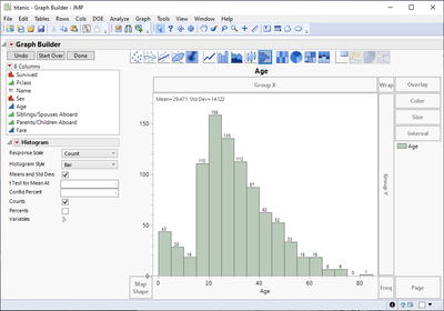
Moving on to histograms, we find a histogram icon in the Graph Builder ribbon. Starting with Age, we can obtain simple and straightforward output by dragging it from the variable list to the x box. We could have also dragged it to the y box to get a vertical histogram instead. As with the bar plot, useful histogram options can be selected on the left panel, including histogram style, the mean and standard deviation, or the counts displayed at the top of the histogram boxes.
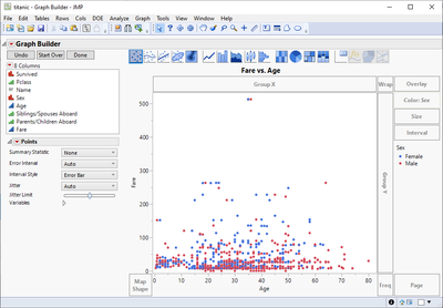
Let us recreate the scatter plot that we created in SPSS that showed the male and female passengers who had an expensive fare and similar ages. Because JMP is dynamic and interactive, we can start with the Age histogram we already created. To transform this into a scatter plot all we need to do is drag the variable Fare onto the y axis and click the scatter plot button in the ribbon above the graph. Next drag the variable Sex onto the Color box, which is located to the right of the graph between Overlay and Size. And voilà! In just a few clicks, we have transformed our histogram into a scatter plot with points colored by Sex.
Again, we see what appears to be two unique individuals whose Fare is much higher than the other individuals. We list them as possible outliers, but this is where the differences between SPSS and JMP truly begin. JMP allows us to dynamically interact between the data and reports. When all the points are selected (not grayed out), we can hover over the points and get information quickly about the variable values used in the graph, as well as the specific rows in the data table those points correspond to. We can also select individual points to highlight a certain data subset of interest.
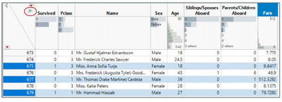
Returning to the data table, the selected rows show up as highlights in the data table, which gives us the option to quickly inspect the rows to determine exactly which observations are causing the controversy. If the data needs to be checked for consistency, then having the data and the output dynamically linked makes it easy to go back and inspect individual observations. There are many ways to clear data selections, but one of the easiest is to double-click on Selected in the Rows panel of the data table (likewise double-clicking on All Rows selects all the data).
From Graph Builder, we begin to see exactly how dynamic linkage separates working with JMP from working with SPSS. We can click on individual points in these graphs and select them for dynamic analysis. Doing this for our observations with high Fare shows that what we thought were just two observations was actually three! Miss Anna Ward, Mr. Thomas Drake Martinez Cardeza, and Mr. Gustave J Lesurer all had Fare of 512£. Miss Ward and Mr. Lesurer were both 35 years old, while Mr. Cardeza was 36. Interestingly all three passengers survived.
In SPSS we observed the possible outliers in the graph, but JMP takes it a step further and allows us to highlight those individual points and see them in the data and/or other report. In addition, we can exclude certain data points from analysis without having to delete them. Excluded data stays within the data table, but is not considered in analysis, thus making it easy to do analysis with and without potential outliers. There is also the Hide option if we wanted to remove individual points from visualizations but not analysis. This exclusion or hiding can be done by going back to the data table, right-clicking on the row that to be excluded or hidden and clicking the corresponding button (Exclude or Hide).
Another distinguishing visualization feature of JMP 16 is the header graph. Within the data table, there is a small histogram button on the left-most column (see figure below with blue circle). Clicking this icon will show graphs in the column headers for each variable, which is extremely useful and dynamic. By clicking on the various parts of the header graph, observations in the table that correspond to our selection are highlighted. Below, I selected those that survived (1), which gives me a quick view of the variable distribution across the other variables in my data set! Neat!
Descriptives
Descriptive Statistics
Descriptive statistics are at the heart of any good statistical analysis and, when performed properly, provide real insight beyond what is seen in visualizations. This section will focus on univariate descriptions and creating custom tables. Assuming we want to continue to study the variables Age and Fare, we will leave in the potential outliers and consider that data because it is still unclear whether the potential outliers should be removed from analysis.
SPSS
Many SPSS users know that the Frequencies dialog box can be a one-stop option for analysis of many different variables simultaneously. While there is a Descriptives dialog box, the Frequencies dialog box is nice because we can request descriptive statistics and graphs in one place. Also, we can put several different types of data into this option and SPSS will produce the appropriate graphs and statistics for each type of variable.
The options selected here give the standard univariate report, where we see the typical measures of center and spread that are discussed in basic statistics courses. Frequency tables, histograms, bar charts and many other useful descriptive outputs are also available under the Charts option.


JMP
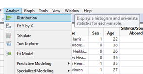
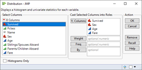
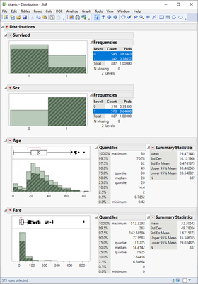
Like the Frequencies dialog box in SPSS, JMP has the Distribution platform to obtain simple descriptive output. The Distribution platform is found under the Analyze menu. We start by selecting Survived, Sex, Age and Fare.
After clicking OK, a distribution report is displayed. By default, quantiles, mean, standard deviation and other summary statistics are produced for continuous variables, as well as a 95 percent confidence interval for the mean. Also, by default the variable outputs are unstacked and will be arranged horizontally. By clicking the red triangle and selecting Stack, the output is switched to a vertical view. Frequency tables are produced for categorical variables, and the Male subgroup (Sex=1) has been selected to highlight the interactivity between different portions of the same report.
By clicking on the red triangle, we can customize report display, obtain more descriptive measures or fit different distributions to the data. Add-ons include box plots, normal quantile plots, CDF plots and distribution fits. Being able to work with the output interactively allows us to fit many different theoretical distributions to the data (e.g., normal, exponential, Poisson, binomial, normal mixtures, etc.) and assess their relative fit to the data.
Another nice feature in JMP is the ability to save distribution reports as interactive html files that can be viewed and worked with interactively without the use of JMP software. This can be done through the File>Save As…>Save as type:>Interactive HTML with Data. These files make for good demos to students or can be worked into reports so that the results can be easily discussed between those who have JMP and those who don’t.
Descriptives: Custom Tables
SPSS
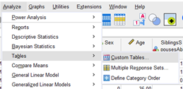
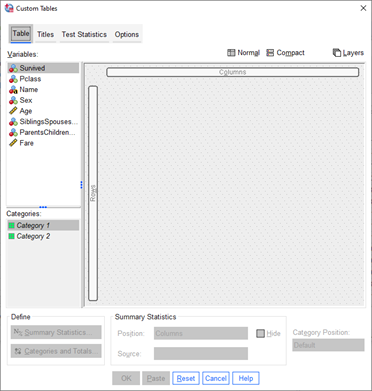
In many cases, specific output is necessary, like in our example where the visuals showed differences in Age and Fare by Sex. SPSS also has options to create custom tables for specific output. We can click and drag the variables into the proper locations and specify which descriptive output we want to see. To see the table, with numbers filled in, we must click OK first and then navigate to the results section to view the table. An example of this output is seen below
JMP
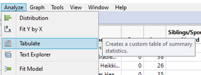
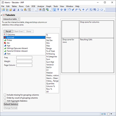
JMP makes custom tables via the Tabulate platform under the Tables menu. The Tabulate platform can build a table interactively, similar in spirit to Graph Builder. Again, SPSS requires us to drag the variables we wish to have in the table and then click OK before viewing the results. JMP gives us these results immediately after dragging and dropping the variable. We can see computations and output as we begin customizing our table. In addition, the interactive table can be turned off in favor of a traditional dialog box if we want to make a very specific output.
Descriptives: Correlation
SPSS
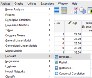
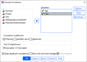
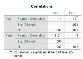
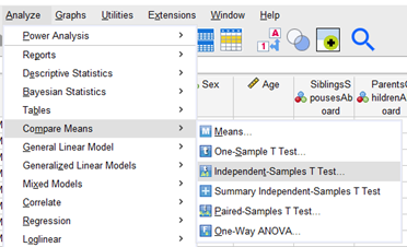
Using the Bivariate dialog box inside Correlate under the Analyze menu, we can obtain sample correlation estimates between Age and Fare. Note that there is significant positive correlation between the two variables.
JMP
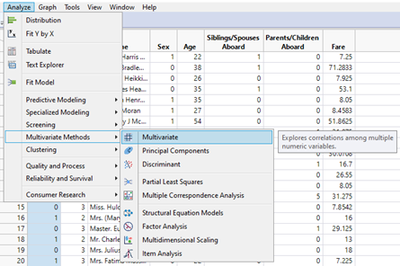
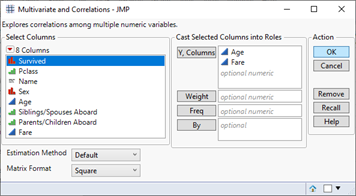
JMP groups sets of analyses into one platform that allows us to do many different things (all somewhat related). For example, the easiest option for finding Pearson correlation coefficients is to use the Multivariate platform under the Multivariate Methods of the Analyze menu.
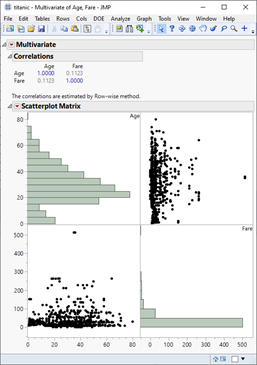
The Multivariate platform is much more than a simple vehicle for finding correlations; however, the basic report shown here delivers both a Pearson correlation estimate and a scatter plot matrix. By clicking on the red triangle, the histograms can be added along the diagonal so that distributions can be quickly visualized. The Multivariate platform also allows us to test correlations, find alternative measures of correlation (e.g., Spearman and Kendall), confidence intervals, partial correlations, and visuals such as Color Maps. In addition, correlation-based measurements such as principal components analysis, outlier analysis and item reliability are all available in the Multivariate platform.
Inference: Two-Sample t-Test
SPSS
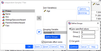
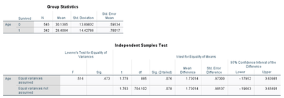
Suppose we want to test whether Age differs significantly between those who survived and those who did not. The standard independent samples t-test is a popular option in SPSS, which is found under the Compare Means menu. Here we can specify one or more continuous measurements and determine if the mean value of that measurement significantly differs between two groups. In SPSS, both the equal variance and unequal variance tests are calculated, and we can rely on a test for variances to determine which test is the most appropriate.
JMP
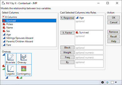
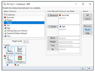
While there is a button in the JMP Starter menu for t-tests, users should be aware that the t-test and one-way ANOVA analyses all go into the same platform. In fact, JMP combines all two-variable inferences into one Fit Y by X platform. Using the Fit Y by X platform, we can make inferences on bivariate comparisons for any type of data.
The grid in the bottom-left corner of the launch window lists different analysis types. We can choose which x and y variables we want to study and JMP chooses the appropriate method based on the type of data being used.
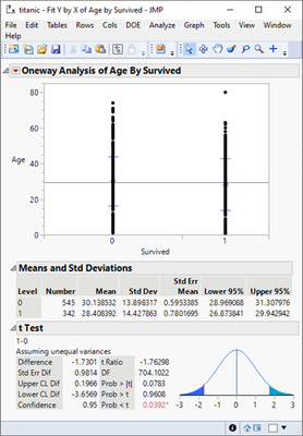
For now, we want to examine the differences between age based on survival status. In the report, we have simple descriptives, along with a t-test that assumes unequal variances (found by selecting Means and Std Dev and t Test from the red triangle icon). We may add graphics (such as box plots) and additional tests looking at the variances, or nonparametric tests more appropriate for skewed data.
Again, we see an important distinction in JMP, as it combines many similar tests into one common platform. We can start with a t-test and look at graphics and summary statistics to determine if the assumptions of a t-test are met. If they are not, then we may add on an alternate test that is more appropriate for the data considered.
Inference: Crosstabs/Contingency Tables and Chi-Square Test
SPSS
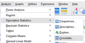
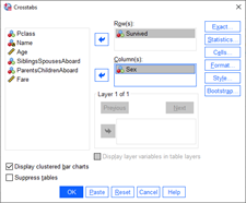
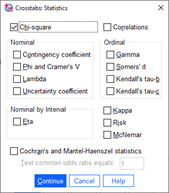
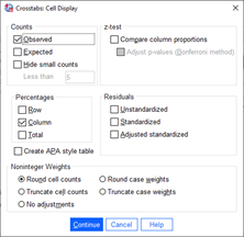
Creating a contingency table and performing a chi-square test of categorical data is an important component to many analyses. Examination of table data is one area where SPSS has always focused, and we can find many options for analysis under the Crosstabs listing in the Descriptive Statistics menu. The Crosstabs menus allow us to ask for several different sets of analysis based on what type of comparisons we want to make.
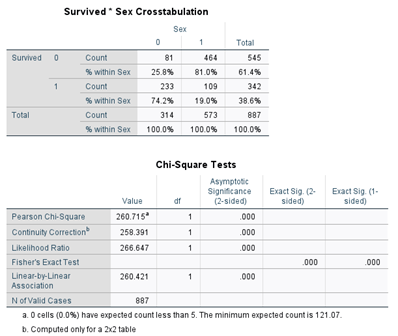
From this example, we can see that the rate of survival among women(sex=0) aboard the Titanic is more than three times that of males(sex=1): 74.2 percent versus 19 percent. From the Chi-Square Tests table we can also see that there is enough statistical evidence to conclude that there is significant association between survival status and sex (chi-square p-value =0.000). It should be noted that SPSS does not display (by default) p-values less than 0.001 but instead just displays 0.000. This may confuse some users if they believe that the p-value is in fact 0. In reality the p-value is just very small (less than 0.001). JMP displays p-values by default to more decimal places (four instead of SPSS’ three) and gives a clearer representation of p-values less than 0.0001 with the notation of <0.0001. When the expected counts are small, SPSS shows a warning message and provides a Fisher’s exact test of the difference among samples with small cell counts. If interested in relative risk and odds ratio estimates, we can check the Risk option in the statistics box to gain those estimates.
JMP
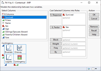
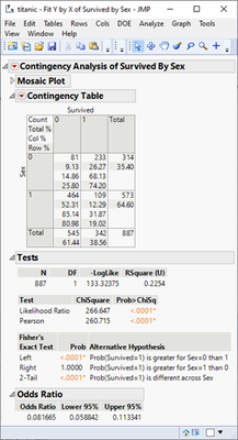
We can access the Contingency Analysis options in JMP via the Fit Y by X platform. Simply specifying categorical variables for both x and y will lead us to contingency analysis. We can specify the same table as we did in SPSS to look at the relationship between sex and survival status. The JMP report gives table information, a chi-square test and Fisher’s exact test (2x2 table only, same as SPSS).
We can then add on additional summaries and tests such as relative risk, odds ratios and measures of association (for items such as Kendall’s tau). The Contingency Analysis is considered a standard report, but we can also see the list of options that are available via the red triangle icon. An interesting aspect to JMP is that the software tries to help users in areas where they may be unfamiliar. By selecting the odds ratio option and simply hovering the mouse over that area, an explanation box appears that indicates which kind of analysis this option produces. For users having trouble interpreting statistics, p-values or other output, this option is available by simply circling or hovering over an area with the mouse.
Inference: Linear Regression
SPSS
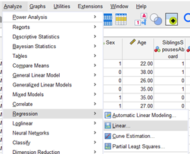
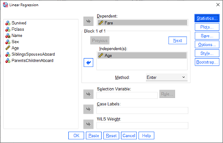
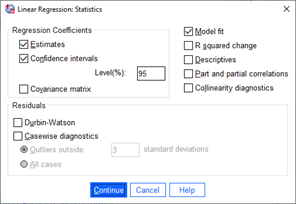
Linear regression can be performed using the Linear Regression option under the Regression menu. Suppose we want to use Age as a predictor of Fare. The Linear Regression option in SPSS is a powerful tool with many different options for model-based estimates, measures of fit, diagnostics, predicted value output and visual plots to assess fit. We can incorporate many potential predictors and look at both simple linear regression and multiple linear regression in the same set of menus.
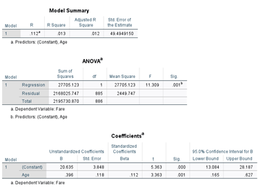
Without using additional options, we obtain standard output with R-square, ANOVA table and a table for regression estimates. We see a significant relationship between Age and Fare, and that as Age increases, the Fare of those individuals also tends to increase (p-value=0.001). It is important to note that the linear option does not allow string variables to be used as potential predictors. In fact there are many different regression options in SPSS, depending on what type of model needs to be fit. The linear option is limited to numeric covariates only; for multiple regression with both continuous and categorical covariates, refer to the General Linear Model platform.
JMP
We have two options for regression models in JMP: the Fit Y by X platform or the Fit Model platform, both under the Analyze menu. Simple bivariate fits go along the Fit Y by X platform, so let’s start there.
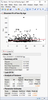
The Fit Y by X platform can again be employed to look at the relationship between two different variables. Here we have listed Age as X and Fare as Y. It is important to note that the Fit Y by X platform ONLY looks at bivariate relationships. It is possible to select more than one candidate for both the x and y roles. In such cases, output consists of multiple bivariate fits with each output displaying the appropriate measures for each set of variables.
The Bivariate Fit report starts with a simple scatter plot and we must assess exactly which type of bivariate fit we would like to make. Here we see a linear fit that models a simple linear regression line to the data. A standard report includes the same basic information as found in SPSS: R-square, ANOVA and parameter estimates with hypothesis tests for the intercept and slope parameters. In JMP, however, we can interact with this output to look at multiple fits simultaneously. For example, we can choose a simple mean, straight line and quadratic fits to the data and compare the fits by either R-square or looking at the parameter estimates. Other fits include density ellipses and smoothing splines, from which comparisons between fits can be made and estimated values can be output to the original data for further study. Under each fit, we can specify diagnostic measurements and plots to assess whether the assumptions for using each particular model are satisfied.
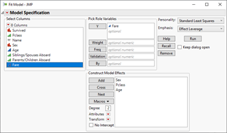
JMP puts many different types of regression models all under the Fit Model platform. In the example shown here, we are fitting a multiple linear regression model that predicts Fare via a combination of Sex, the ordinal variable Pclass, and the categorical variable Sex (no need to separate categorical and continuous covariates). Clicking Run displays the Fit Least Squares output, which includes an actual versus predicted plot, leverage plots, residual by predicted plot and more. More options, such as profile plots, are available under the red triangle.
Inference: Logistic Regression
SPSS
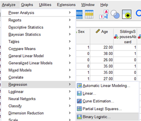
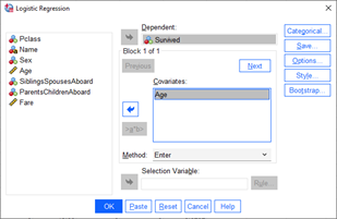
Logistic regression can be performed using the Binary Logistic option under the Regression menu. Suppose we want to use Age as a predictor of the binary variable survival. The Binary Logistic option in SPSS has many different options for model-based estimates, measures of fit, diagnostics, conversion to odds ratios and more. We can incorporate many potential predictors and look at both simple logistic regression and multiple logistic regression in the same set of menus.
JMP
Like linear regression, we have two options for logistic regression models in JMP: the Fit Y by X platform or the Fit Model platform, both under the Analyze menu. Bivariate fits go along the Fit Y by X platform, and multiple logistic fits go in the Fit Model platform. Once OK is clicked, we have many pieces of useful information about our model at our fingertips. More options, such as Odds Ratios, are available under the red triangle.
Data Manipulation
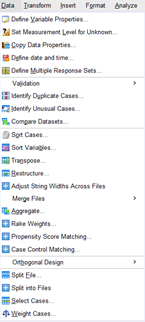
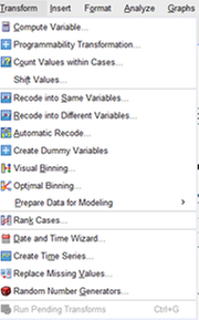
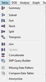
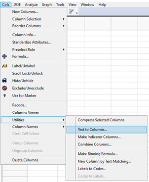
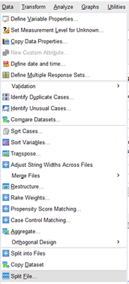
Both SPSS and JMP are excellent for manipulating data since they each provide a number of different ways to organize and manipulate the data. We can sort data, sort variables, merge files, recode and run many other manipulations. Listed below is a side-by-side comparison illustrating a number of the data manipulation features in SPSS and JMP. New JMP users should know that since the data file and the output are dynamically linked, there are occasions where output needs to be closed before the data is manipulated. When sorting or manipulating data, JMP will sometimes default to creating a new data table that has the necessary manipulation; new users should specify that the manipulated file should replace the current data file. Data can be manipulated in JMP through a variety of menu options. The Tables menu item offers many common data table transformations and the Cols>Utilities menu items offer many tools for completing common data column manipulation. The JMP Starter view also shows many of these options in one unified location.
SPSS
JMP
Data Manipulation: Creating New Variables
SPSS
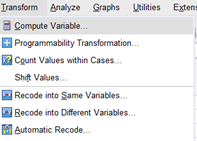
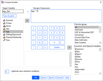
Suppose that we want to create a new variable that is the Age as months (instead of years). We can use the Compute Variable option to define a new variable (call it Age_Std) and attach a formulaic calculation to that variable (Age * 12). SPSS has a number of different functions for aggregating and transforming data, which are all grouped by function type. After filling in the numeric expression, SPSS creates a new variable of the specified name and populates it with the computation from the numeric expression.
JMP
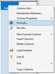
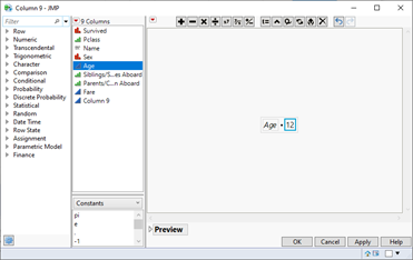
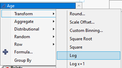
JMP creates new variables directly in the data table. Suppose we want to create the same new variable (Age_Std) in JMP. We start by double-clicking on the unused column at the end of data table to make a new column. Then we double-click on the column name to bring up the Column Info window where we give the column a name, and click on Column Properties and choose Formula to bring up the Edit Formula window. Now, we can edit the formula to create the numeric expression we used in SPSS. Note that JMP also has a wide array of functions that can be applied to manipulate and transform our existing data. Also, we can also create a new column using the menu item Cols>New Columns. Common data transformations can also be done on the fly in many of JMP’s platforms such as Graph Builder, Tabulate, Fit Y by X, and Fit Model. This on-the-fly option is as simple as right-clicking on the variable we would like to transform in the Columns box and going to Transform.
Data Manipulation: File Splitting
SPSS
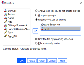
Suppose we want to look at different output for men versus women aboard the Titanic. We can use the Split File option to tell SPSS that further output should always be stratified by a particular variable. We have the option of creating new files for just men and just women, but the splitting option is a unique way to indicate to SPSS that subsequent output should be separated between women and men.
If we want to return to a non-stratified analysis, simply go to the Split File option and choose “Analyze all cases, do not create groups” to turn the stratification off.
JMP
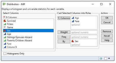
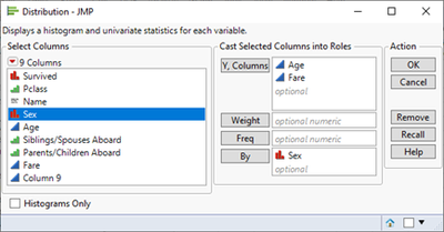
Splitting a file may not be necessary in JMP since all analysis platforms feature a By option to stratify output by a particular variable. So, if we want stratified descriptive statistics, we use the By statement in the Distribution platform as seen below.
Saving and Reproducing Output
Manipulating data and producing great output and visuals are possible only if there is a mechanism to save and reproduce them. It doesn’t seem obvious but JMP is also fueled by a scripting language, which works mostly behind the scenes for casual or new users. Many advanced users find that coding produces quicker results for repetitive tasks. Let’s discuss how to save and reproduce output in SPSS and JMP.
SPSS
When we save an SPSS data file in SPSS format (.sav file), the data file maintains all manipulations, transformations and labels. In order to retain output, we save as a separate file (.spv format). Since the point-and-click interface for SPSS is really a mechanism for code generation, code precedes all output in the output file. For instance, if we want to look at the descriptive statistics for Age and Fare, the following code could be generated in the output from the point-and-click interface:
JMP
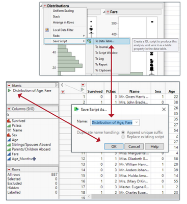
JMP takes a different approach to saving and reproducing output. When we save data as a JMP data file (.jmp file), the data retains manipulations, transformations, labels AND script saved from analysis. Let’s look at an example. Suppose we want to save the distribution analysis of Age and Fare information for later use. In all JMP reports, we can find an option for saving the code (referred to as JMP script) to the data table. There are other options to save JMP script but saving to the JMP data table is one option. When we save the data in JMP format, all scripts saved to the data table are saved as well. We can edit the name of the saved script and reproduce the output with the red triangle located by the saved script’s name in the data table. In addition, we have one file that contains both the data information and analysis related to a specific project. JMP data files can be shared among many JMP users, and one file can be a single platform for all project analysis. If we’d like a written set of instructions similar to the code listed above for SPSS, we simply select Save Script>To Journal and the necessary .jsl (JMP scripting language) code will be displayed in a window of editable text. Like SPSS, JMP’s scripting language is quite complex and can be useful in completing repetitive tasks.
Other Features
Users transitioning from SPSS to JMP may be interested in some of JMP’s unique features.
Machine Learning and Text Mining
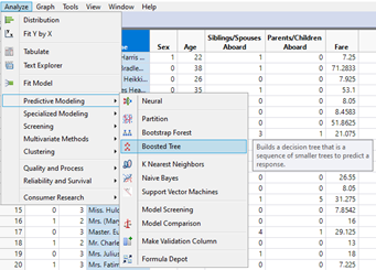
While both JMP 16 and SPSS 27 come standard with decision trees and neural networks, JMP 16 has a number of advanced Predictive Modeling methods that SPSS 27 does not, including Bootstrap Forest, Boosted Tree, Naïve Bayes, and Support Vector Machines. Also, JMP 16 has many built-in tools useful for creating a predictive model. One such tool is the Make Validation Column which allows the user to create a column based on stratification, grouping, and cut point columns.
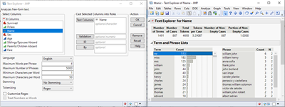
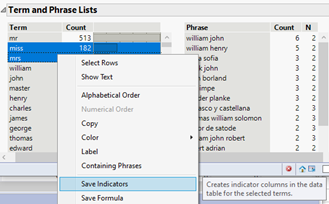
Text mining is another data mining approach is fun and engaging in JMP. SPSS does not have any built-in text mining features. As an example, recall that the Name column is unstructured text. With JMP 16, we can explore this text data for patterns of words or phrases. Under the Analyze menu, the Text Explorer module allows us to select many unstructured text columns and tell JMP how it should tease out the words or phrases within the text selected. Once we click OK, Text Explorer shows common terms and phrases within the columns selected. As we can see from the figure above, the word “mr” appears 513 times; “miss” appears 182 times while “mrs” appears 125 times. This insight is something our Titanic data does not currently account for as a variable. Using JMP, we can easily create indicator columns (0 or 1) for rows that have the words “miss” or “mrs” in their Name column. Just right clicking on the words and selecting Save Indicators creates these new indicator variables in our data set. That is so cool!
Sample Data Sets
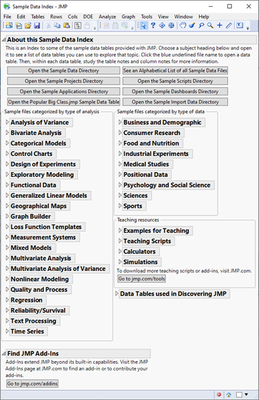
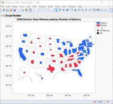
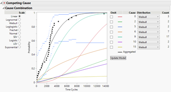
One difficulty in learning and teaching statistics is finding nicely formatted example data sets. JMP knows this and has included hundreds of data sets. Categorized by type of analysis, field, and teaching resources, JMP’s built-in datasets are easily accessible via the Help>Sample Data menu item. Opening these data sets is as easy as selecting the type of data or statistical method we want to explore or learn about and clicking the blue highlighted link. Want to learn how to make a map in JMP? Under the Geographic Maps data type, find the US Election 2008 data. Once the data set opens, we find a number of JMP scripts ready to be run in the top left. Clicking the green play arrow next to Graph Builder Map Sized by Number of Electors launches Graph Builder with a map of the United States color-coded with blue or red depending on whether Obama or McCain won that state. Neat! Want to learn about survival analysis? Find the Reliability/Survival category and select Appliance data set. Running the Life Distribution script in the upper left of the data set fits and compares distributions of time-to-event data. It is so easy to learn and explore with JMP!
Conclusion
Both SPSS and JMP are terrific software tools for manipulating, visualizing and analyzing data. In this guide, we have highlighted how to complete many common data-oriented tasks in SPSS and JMP. Throughout, we made sure to point out many of the differences between the two software packages and how JMP may elevate the insights you get from your data. It is easy to see that JMP and SPSS approach data analysis workflows differently. The point-and-click mechanism in SPSS generates SPSS code, so users decide which analysis and options they want to perform and then submit the generated code to obtain the output. The code and results are listed in the output file, which can be saved, copied or manipulated. By contrast, JMP dynamically links the data and reports to create an interaction between the data and the user. The user starts with a general area of analysis and can then customize output to add different features or analytics. The dynamic link between data and output makes exploring unusual observations very simple and intuitive. The interactivity of features such as Graph Builder allows users to create and update visuals in real time.
Acknowledgements
I would like to thank Ruth Hummel, Larry LaRusso, Anne Miley, and Amy Stuart at JMP for all their assistance, edits and feedback during the making of this guide. I would also like to thank Jason Brinkley, the author of the first version of this guide, for providing a clear and precise starting point for creating the second version.
- © 2026 JMP Statistical Discovery LLC. All Rights Reserved.
- Terms of Use
- Privacy Statement
- Contact Us










You must be a registered user to add a comment. If you've already registered, sign in. Otherwise, register and sign in.