The Distribution platform is one of the most widely used platforms in JMP. This platform is not only used for testing which distribution fits your data, it is used for data exploration, capability analysis, and so much more. This platform has been around since the first version of JMP and it was time for a modernization. JMP 15 has delivered the modernization of this commonly used platform.
My first blog post detailed the new fitters in JMP 15. The second blog post detailed comparing distribution fits. This blog post details the new options available for fitted distributions.
Diagnostic Plots
The diagnostic plot has been replaced with two new plots (QQ and PP plots). The quantile-quantile (QQ) plot shows the relationship between the observations and the quantiles obtained using the estimated parameters. The percentile-percentile (PP) plot shows the relationship between the empirical cumulative distribution function (CDF) and the fitted CDF obtained using the estimated parameters.
To see an example of these plots, open Braces.jmp found in the Quality Control sample data folder.
Open("$SAMPLE_DATA/Quality Control/Braces.jmp");
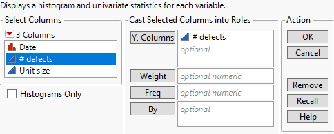
Select Analyze->Distribution. Specify # defects as Y, Columns and click OK.
From the red triangle next to # defects, select Discrete Fit->Fit Negative Binomial. From the red triangle next to Fitted Negative Binomial Distribution, choose QQ Plot and PP Plot.
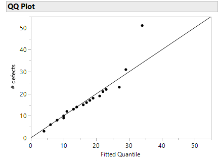
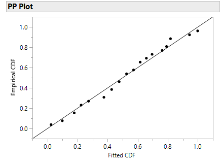
For the QQ Plot, most observations fall close to the diagonal line. The last point is questionable. If the two sets (fitted negative binomial quantiles and the # defects) come from the same distribution, the points should fall approximately along the reference line. The PP plot has a similar interpretation. The points in the PP plot fall approximately along the reference line indicating that the Negative Binomial fitted CDF and the empirical CDF come from a population with the same distribution.
Profilers
Two Profilers have been added. The Distribution Profiler is a Prediction Profiler of the cumulative distribution function (CDF). The Quantile Profiler is a prediction profiler of the quantile function.
Using the previous example, choose Distribution Profiler and Quantile Profiler from the red triangle menu next to Fitted Negative Binomial Distribution.
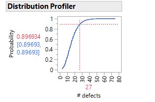
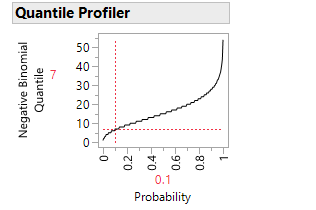
If the data follow the fitted negative binomial distribution, the Distribution Profiler shows that the probability of getting 27 defects or fewer is .896934 (~90%). The Quantile Profiler gives the inverse of the Distribution Profiler. For this example, the probability that we get seven or fewer defects is .1 or 10%. The Profilers are interactive. You can move the slider around to determine what the probability would be for various numbers of defects.
Save Columns
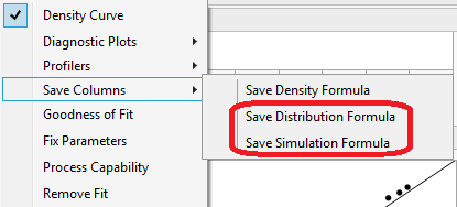
Two new save column features have been added. Save Distribution Formula saves a column to the data table that contains the cumulative distribution function (CDF) formula computed using the estimated parameter values. Save Simulation Formula saves a column to the data table that contains a formula that generates simulated values using the estimated parameters. This column can be used in the Simulate utility.
Goodness of Fit
The goodness of fit test has been standardized to the Anderson-Darling for continuous fits and the Pearson Chi-Squared test for discrete fits. The Pearson Chi-Square test has improved bin creations. JMP now satisfies the rule of thumb that there are at least five expected observations in each bin.

For the previous example, click on the red triangle next to Fitted Negative Binomial Distribution and choose Goodness of Fit.

The p-value is 0.4971. At any meaningful alpha level, we fail to reject the null hypothesis that the data are from the Negative Binomial distribution.
Summary
- QQ Plots
- PP Plots
- Distribution Profiler
- Quantile Profiler
- Save Distribution Formula
- Save Simulation Formula
- Anderson-Darling
- Pearson Chi-Square improved binning
These three blog posts only scratch the surface of the JMP 15 new features in the Distribution platform. Look for my next blog post in which I detail new capability options in the Distribution platform.