- New to JMP? Let the Data Analysis Director guide you through selecting an analysis task, an analysis goal, and a data type. Available now in the JMP Marketplace!
- See how to install JMP Marketplace extensions to customize and enhance JMP.
JMPer Cable
A technical blog for JMP users of all levels, full of how-to's, tips and tricks, and detailed information on JMP features- JMP User Community
- :
- Blogs
- :
- JMPer Cable
- :
- Leptokurtosiphobia: Irrational Fear of Non-Normality
- Subscribe to RSS Feed
- Mark as New
- Mark as Read
- Bookmark
- Subscribe
- Printer Friendly Page
- Report Inappropriate Content
NOTE: This article originally appeared in JMPer Cable, Issue 15, Summer 2004.
John Sall, Executive Vice President, SAS Institute Inc. @John_Sall
Bradley Jones, JMP Development @bradleyjones
Every statistical procedure involves assumptions. We are taught to fear the violation of these assumptions. For example, the standard procedures for comparing means, the two-sample t-test, the paired t-test, and ANOVA all include the assumption that the residual error is normally distributed. If the error is normally distributed, and all the other assumptions hold, then all the test statistics have their claimed distributions, and confidence intervals and hypothesis tests can be trusted. We even have a rich source of analytic tools to probe our assumptions, such as the features in the distribution platform which test and graph against the normal distribution. What if the residuals are not normally distributed? How much should a practitioner worry about whether the residuals are normal? Few articles, and fewer books, go into any detail on how much to worry about the normality assumption.
Having normally distributed residuals is an issue we probably don’t need to worry much about because:
- In large samples, it is easy to detect non-normality, but it doesn’t matter.
- In small samples, non-normality may matter, but you can’t detect it.
With large samples, the central limit theorem states that even if the data is not normal, mean-like statistics approach normal distributions as the sample size increases. With small samples, the test statistic is not necessarily normal, but we don’t have a big enough sample to tell.
JMP developers get frequent requests to implement a test for residual normality as a convenience feature for our fitting platforms. But this would only be useful if there were sample sizes for which non-normality could be detected and mattered. Let’s investigate, using simulation.
For our simulation we compare the means of two groups using two different non-normal error distributions: a double exponential and a shift-contaminated normal. The double exponential is symmetric, but leptokurtotic, i.e., much more peaked and having much heavier tails than the normal distribution. The shift contaminated normal is a normal distribution skewed to the right by adding a shift of three standard deviations in a randomly-selected 5% of the samples.
The double exponential is simulated by this JMP formula:
if(randomUniform()>0.5,1,-1)*log(randomUniform())The shift-contaminated distribution uses this JMP formula:
10+5*(randomNormal() + (randomUniform()<0.05)*3)These are meant to be characteristic of strong, but not extreme, nonnormality you might see in real data.
Figure 1 shows 10,000 points of the simulated double-exponential and Figure 2 shows the shift-contaminated distributions. The solid red diagonal line is a reference for how the data would look if it fit a normal distribution. Note that the data fall below the line for small quantiles and above the line for large quantiles. His is characteristic of leptokurtotic distributions. They have plenty of probability mass in the middle with long but sparsely populated tails.
The data in the normal quantile plot for the shift-contaminated distribution (Figure 2) fall above the solid red diagonal line for large quantiles. This is characteristic of right skewed distributions. Had the data been normally distributed, the top of the histogram would have ended around 30 instead of continuing a bit past 40.
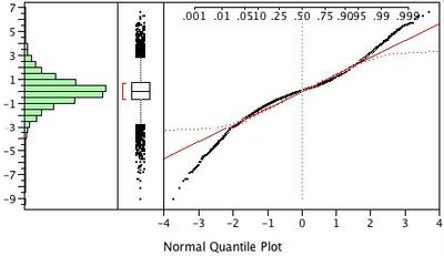
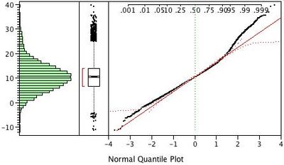
A JSL script was run that generated 10,000 Monte Carlo samples with 10 observations for these two nonnormal distributions. The script (MonteCarlo.jsl) is attached. (NOTE: The script takes a while to run.) Each sample was divided into two groups of equal size. By design, there is no difference between the means of the two groups. We also generated 10,000 samples for the standard normal distribution as a control. For each sample, we ran a one-way analysis to test the difference of the means and a distribution to test the normality of the residuals. We repeated this entire procedure for samples of size 20, 30, 50, 70, and 100.
Test For Equal Means When There is no Difference in the Population Means
First, let us look at the plots of our 10,000 p-values for the non-normal distributions. Remember that our procedure is designed so that there is no true difference in the means for each sample. Because of random variation, the p-values for our 10,000 one-way analyses should be uniformly distributed between zero and one. The uniform distribution function is the diagonal line F(x) = x.
To produce the plots in Figures 3a and 3b, we first sorted the 10,000 p-values. The y-axis is the proportion of the 10,000 p-values less than or equal to a given significance probability. The x-axis shows the significance probabilities (pvalues). Each sample size is shown in a different color.
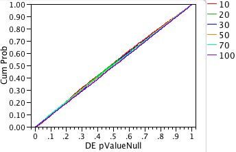
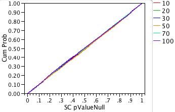
For both plots and all sample sizes, the distributions of the p-values look close to the diagonal line of the uniform cumulative distribution function. As we hoped, neither changing the distribution nor changing the sample size has much effect on the accuracy of significance probability of the ANOVA test for equal means.
Let’s look closer at the low scale near 0.05 where we are judging significance. The plots in Figure 4a and 4b magnify the area.
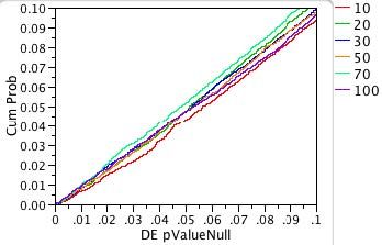
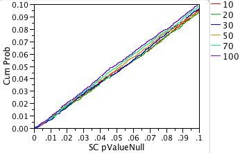
Note that the red diagonal line corresponding to the test for equality of means for two groups with five observations strays slightly below the line y = x. What does this mean?
We know that if we choose a significance probability of 0.05, we will reject the hypothesis that our means are equal in 5% of our experiments due to the vagaries of chance even if the means are truly equal. That is, 5% of the time we will make a Type I error—we will reject the hypothesis that the means are equal when the hypothesis is true.
This 5% Type I error rate is built-in and what we expect if we choose a significance probability of 0.05. If this seems like too many errors, then you need to choose a smaller significance probability.
When the red diagonal line crosses the vertical dotted line x = 0.05, its y-value is 0.043. That means that instead of rejecting the hypothesis that our means are equal 5% of the time, we only rejected 4.3% of the time. We call this a conservative result because we are making fewer Type I errors than we expect. If you are going to miss, it is better to miss conservatively.
On the other hand, suppose a line had crossed the vertical dotted line at 0.05 at a CumProb value of 0.06. Then, instead of seeing the expected 5% Type I errors, we would actually see 6% Type I errors. We call such a test too liberal because the true error rate is larger than expected.
It is reassuring that in the only case where the lines deviate from the 45-degree line, it is on the conservative side. The shift-contaminated case also has the n=10 case shifted to the conservative side, but not so much as the double exponential.
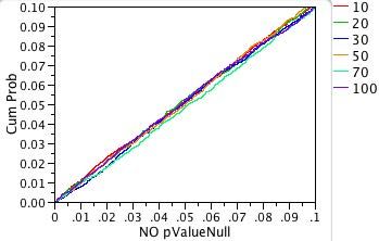
Figure 5 shows the Monte Carlo simulation with a pure normal curve to show the natural random variation in the Monte Carlo study.
Testing Non-Normality
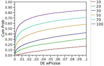
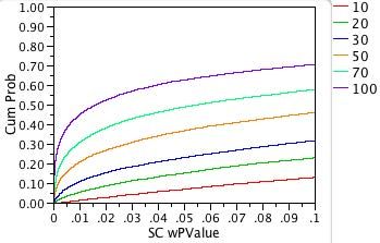
The next question is whether we can detect that errors are non-normal. We start by computing the residuals from each one-way analysis we did before. Using the distribution platform, we test these residuals for normality. Thus, for each distribution and sample size we do 10,000 Shapiro-Wilks tests for normality. The plots in Figure 6 show the cumulative percentage of normality test results as a function of the significance probability in the Shapiro-Wilks test.

What do these plots tell us? First, we know that in both the double exponential case and the shift contaminated normal case, the distribution of the residuals is not normal. We want to know how likely it is that our test will detect this nonnormality. In other words, we want to know how powerful our test is.
A perfectly powerful test would have a graph that looked like the Greek letter gamma, Γ. By contrast, a test with no power would have a graph that looks like a diagonal line.
For double exponentially distributed residuals, we can see that the graph for the sample of 100 observations rises rapidly on the far left, as desired. Unfortunately, the resemblance of the graph to Γ deteriorates as the sample size drops. When the sample size is 10, the function looks much more like the diagonal line (no detection power).
For the shift-contaminated normal distributed residuals, the detection power of the Shapiro-Wilks test is worse for every sample size.
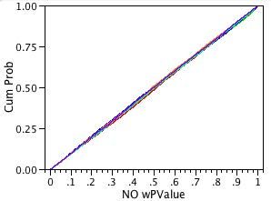
When the residuals really are normal, as plotted in Figure 7, we see a diagonal line for every sample size. This is what we want. We do not wish to detect non-existent non-normality. Here, the “power” of the test is the probability of a Type I error. It is impossible for a test to be less powerful than this.
Now let’s expand the p-value area so we can examine the power at alpha=0.05, as shown in Figures 8a and 8b. The bottom curve (sample size n = 10) in Figure 8 crosses the vertical grid line x=0.05 at the value 0.10. That means that if the Shapiro-Wilks significance probability is 0.05, you have a 10% chance of detecting the fact that the residuals are non-normal. We say that the power of the Shapiro-Wilks test is 10%. This is not impressive.
Another way of saying this is that the probability of a Type II error is 90%. That is, 90% of the time the Shapiro-Wilks test (given this error distribution and significance level) will incorrectly fail to reject the hypothesis of normal residuals.
By contrast, the top curve above (sample size n = 100) crosses the vertical grid line x=0.05 at the value 0.78. So, the power of this test is nearly 80%.
The power curves have a similar shape for the shift-contaminated normal residuals, but the resulting power is even less. For example, the top curve (sample size n = 100) crosses the 0.05 line at about 0.63 (power is 63%).
So, we see that for small numbers of observations you can’t detect nonnormality. For large number of observations you don’t care if the errors are non-normal because our simulated Type I error rate matched the expected rate for large sample sizes.
This study would tend to support not implementing a test for normality in the fitting platforms. Including this feature would only encourage people to worry about something that they either can’t see or that doesn’t matter.
Putting in graphical and diagnostic features for the residual distribution is a different matter. Instead of testing, you are looking for graphical anomalies, like outliers, or a pattern that might be a clue to some hidden structure of the mode. Outliers and patterns are often the main clue to an important discovery.
One of W. Edwards Deming’s commandments was “Drive out fear,” but as statisticians we usually do the opposite, instilling irrational fears in our clients and students. With this study, which you can easily duplicate, I hope you are now brave enough to fight “leptokurtosiphobia.”
Isn’t it nice to have one less thing to worry about?
- © 2026 JMP Statistical Discovery LLC. All Rights Reserved.
- Terms of Use
- Privacy Statement
- Contact Us

You must be a registered user to add a comment. If you've already registered, sign in. Otherwise, register and sign in.