Control Chart Builder is an interactive workspace which allows you to monitor process variation. This blog post details the new features introduced for Control Chart Builder in JMP 16.
Control Limits Labeled in the Graph
We had requests from users for the ability to label the control limits in the graph. This can be useful when the Limits Summary table is not displayed. “Show Limit Labels” has been added to JMP 16. To see an example of this, run the following JSL:
dt=Open("$SAMPLE_DATA/Quality Control/Shirts.jmp");
obj=dt<<Run Script("Control Chart Builder");
This code opens the Shirts sample data table and creates a C Chart. From the red triangle menu next to Control Chart Builder, select Show Limit Labels.
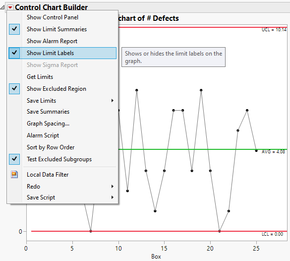
The control limits are now labeled on the right side of the graph.
K Sigma option
Process monitoring is often plagued by too many false alarms. This can lead to the alarms being ignored. The K Sigma option, introduced in JMP 16, gives users the ability to specify K. You can find this option in preferences. Choose File->Preferences. From Preference Group, select Platforms. From Platforms, select Control Chart Builder. In the Options section, near the bottom on the left side you will find K Sigma. Check the box and change 3 to 5.
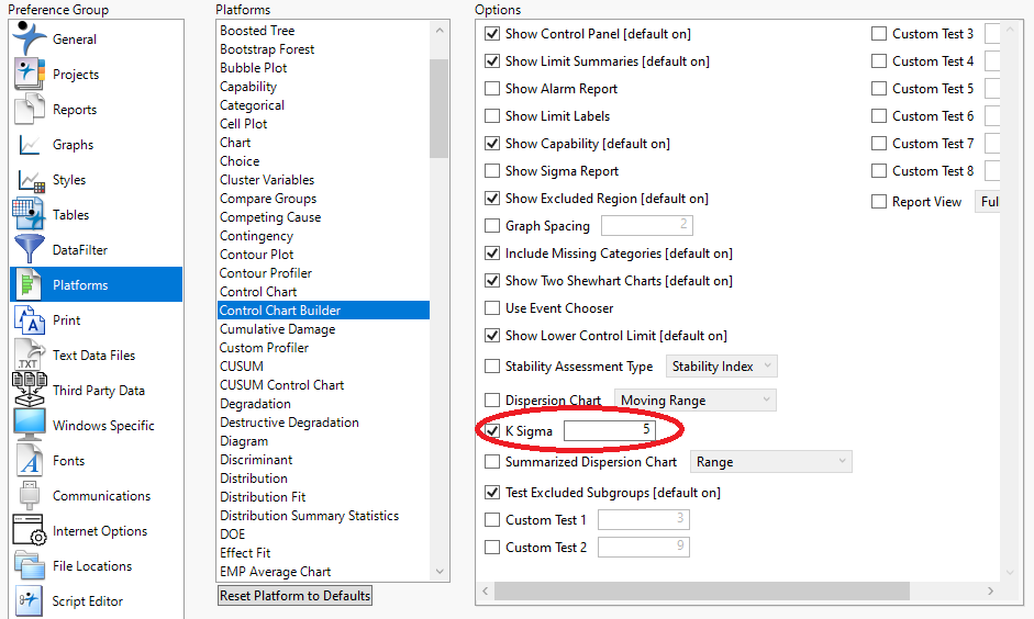
As an example, run the following JSL:
dt=Open("$SAMPLE_DATA/Quality Control/Diameter.jmp");
obj=dt<<Run Script("Control Chart Builder");
This script opens the Diameter sample data table and creates an XBar and R chart.
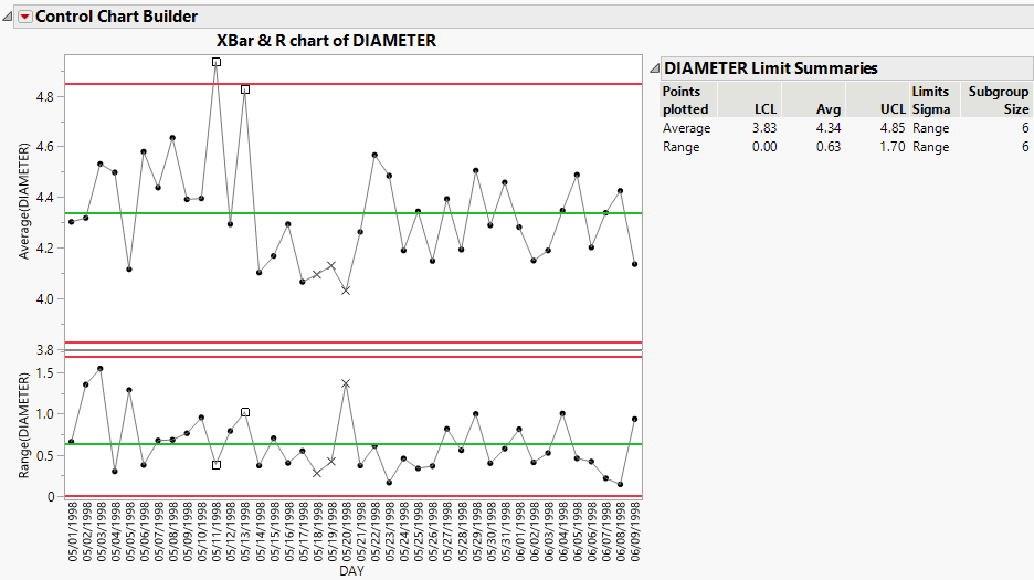
The control limits have been calculated using +/- 5*sigma rather than +/- 3*sigma. This makes the control limits wider and can reduce the number of false alarms.
Remove Location Chart and Remove Dispersion Chart have been added to the right-click menu
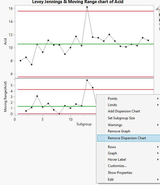
In previous versions of JMP, you could remove location or dispersion charts by right-clicking on the Y axis and choosing the appropriate remove option. Additionally, you could simply grab the Y axis label for the frame of interest and drag it out of the graph. A third method has been added to JMP 16. Now you can right-click in the graph and choose Remove Location Chart or Remove Dispersion Chart. We are committed to providing our customers with options so they can find the method that works best with their workflow.
As an example, run the following:
dt=Open("$SAMPLE_DATA/Quality Control/Pickles.jmp");
obj=dt<<Control Chart Builder(
	Variables( Y( :Acid ) ),
	Chart( Position( 1 ), Limits( Sigma( "Levey Jennings" ) ) )
);
This code opens the Pickles data table and creates a Levey Jennings & Moving Range chart. Typically, a dispersion chart is not shown with a Levey Jennings chart. To remove the dispersion chart, right-click in the Moving Range chart and select Remove Dispersion Chart.
You are left with only the Levey Jennings chart.
Graph Spacing option to control the spacing between charts
Users had differing opinions about how much spacing they wanted to see between charts. A Graph Spacing option has been added to JMP 16.
For an example, run the following JSL:
dt=Open("$SAMPLE_DATA/Quality Control/Diameter.jmp");
obj=dt<<Run Script("Control Chart Builder");
This JSL opens the Diameter sample data table and creates an XBar and R chart. From the red triangle next to Control Chart Builder, select Graph Spacing. In the dialog, change the value from 2 to 5 and click OK.
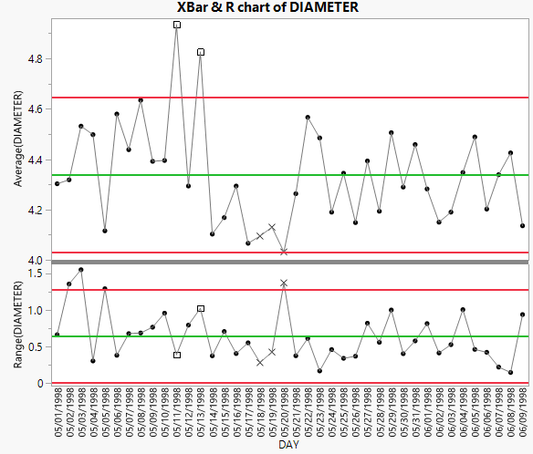
Notice that the line separating the location chart from the dispersion chart is thicker. This option is also available in Control Chart Builder preferences.
Ability to create a Levey Jennings chart with more than 1 observation per subgroup
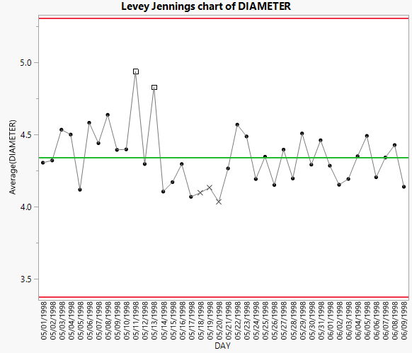
Previous versions of JMP did not allow a Levey Jennings chart if there was more than one observation per subgroup in Control Chart Builder. This functionality has been added in JMP 16.
As an example, run the following JSL to open the Diameter sample data table.
dt=Open("$SAMPLE_DATA/Quality Control/Diameter.jmp");
Select Analyze->Quality and Process->Control Chart->Levey Jennings Control Chart. Notice that a subgroup role has been added to this dialog. Specify DIAMETER as Y. Specify DAY as Subgroup.
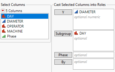
Click OK. A Levey Jennings Chart is created.
This blog post details the following new features for Control Chart Builder in JMP 16:
- Show Limit Labels
- K Sigma
- Remove Location Chart and Remove Dispersion Chart right-click options
- Graph Spacing
- Subgroup role for Levey Jennings charts
Part 2 of this blog series will be coming soon in which I cover JMP 16 new features for tests and alarms in Control Chart Builder.