Collinearity. Collinearity. Collinearity. At Mastering JMP sessions, we often get questions about collinearity, how to understand it, how to detect it, how it’s related to the VIF shown in JMP reports, how to interpret VIF, and how to build models that accurately account for collinearity.
JMP provides all the tools to detect, understand, and account for collinearity during modeling. A recent video by JMP Education Statistician Di Michelson shows how. When you want to understand the relationship between the response and the predictors, she suggests these steps, which she follows in her video, Identifying and Understanding the Impact of Collinearity.
Summarize the Pairwise Behavior Graphically and Statistically
- Visualize the data in the Multivariate platform (Analyze > Multivariate Methods > Multivariate) by putting all the variables into the Y role.
- Examine Correlations (using the correlation matrix), which contains the pairwise correlations between the variables. It's symmetric, because the correlation between X1 and Y is the same as the correlation between Y and X1.
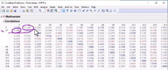 Correlation Matrix
- Look at the Correlations as a Color Map (from Multivariate red triangle, choose Correlations > Color Map), where JMP translates the numbers in the Correlations table to colors. In her example using default JMP colors, red squares show positive correlation and blue squares show negative correlation. You can hover over a square to get the correlation value.
- Look at the pairwise Scatterplot Matrix (from Multivariate red triangle, choose Scatterplot Matrix), which plots Y versus X. Again, this matrix is symmetric.
- Because Scatterplot Matrix is symmetric, you don't need both sides of it. So, you can turn on the Heat Map (From Scatterplot Matrix red triangle, choose Matrix Options > Heat Map).
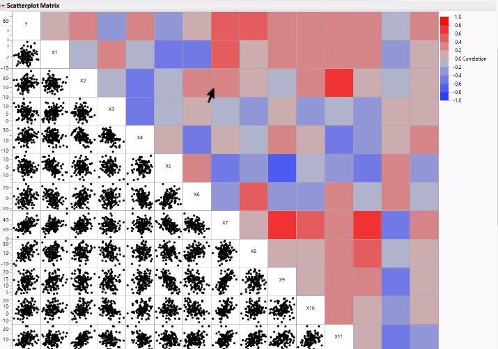 Scatterplot Matrix with Heat Map
- Look for X variables that are correlated with high positive or negative correlations. In her example, the reds are high positive correlation, and the blues are high negative correlation.
- Replace Scatterplot Matrix points with density ellipses (from Scatterplot Matrix red triangle, choose Density Ellipses) and then examine the whole plot to see if there is skewness or any outliers.
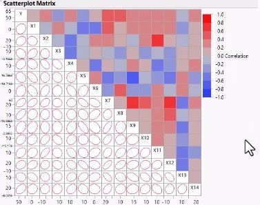
Di’s Summary: You see that Y is correlated with some of the predictors and many predictors are correlated with each other. The reds indicate high positive correlation, the blues indicate high negative correlation. High correlation in your predictor variables can harm your linear regression model. This problem in linear regression is called collinearity or multi-collinearity.
Fit a Model and Explore Variance Inflation Factor
- Fit Model (Analyze > Fit Model). (Di uses the Minimal Report selection in Fit Model Window.)
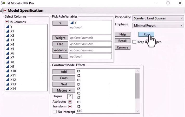 Fit Model Standard Least Squares Minimal Report Selection Window
- Examine Summary of Fit, Analysis of Variance for the Model to determine if the model is doing a good job explaining variability in Y.
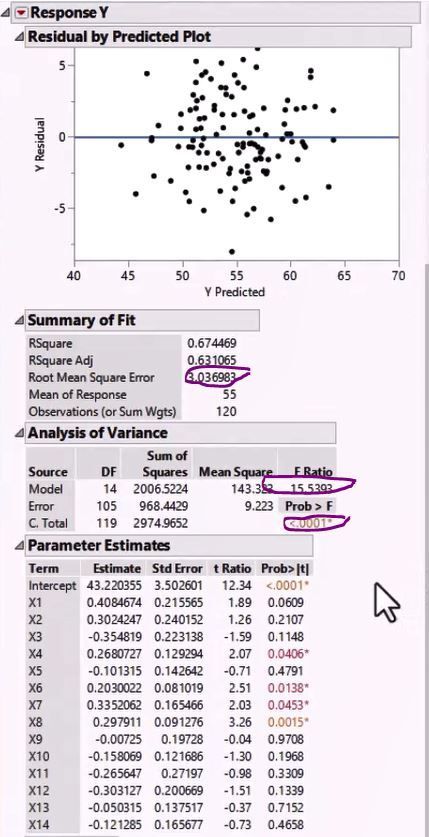 Summary of Fit - Looks Like Useful Model for Explaining Variability in Y
- Right-click Parameter Estimates table to determine if, and how much, variance inflation is happening because of the correlated predictors.
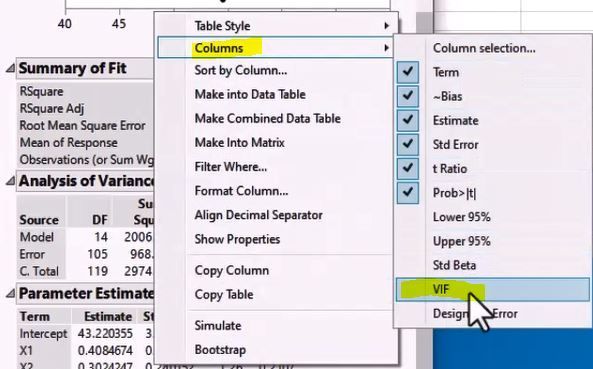 How to Add VIF
- Sort by VIF column to identify the factors with highest VIF, which is the variability in that factor that is explained by the other predictors. In this case, X11 has the highest VIF.
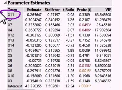 Parameter Estimate Showing VIF for Each Variable
- Model the highest VIF factor as the response and all the other factors as predictors and then look at the R-squared value to see if the variability in that predictor is explained by the other predictors, and thereby uncover possible collinearity. High VIF indicates high collinearity.
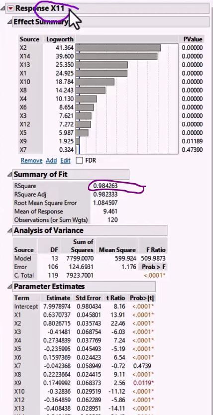 Model and Examine R-Squared for Highest VIF Factor to Uncover Collinearity
- Examine Leverage Plots to get a visual representation of collinearity. They are useful because, unlike Scatterplot or Correlation Matrices, they understand more than two variables at a time. When the points are shrunk in the X direction and don’t fill the whole X axis, then that factor correlates with other factors.
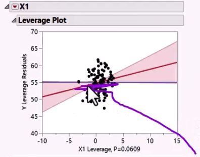 Examine Leverage Plots Visually Represent Collinearity
- Examine Prediction Profiler (from Response Red Triangle > Factor Profiling > Profiler), which has a row for each Response and column for each factor. The combination of settings gives the predicted response shown on the left of the Profiler. When collinearity exists, the confidence intervals are very wide on the edges of the profiler graph for that factor.
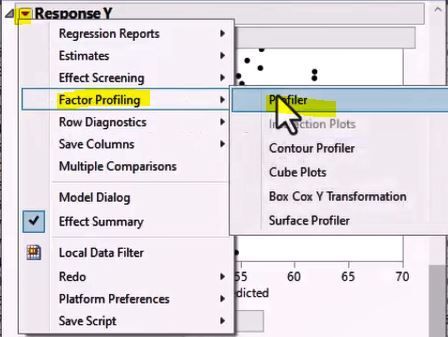 Accessing Prediction Profiler
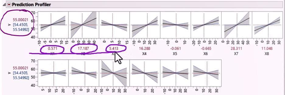 Prediction Profiler Gives Numeric and Cisual Results for Factor Interactions
Di’s summary: When you have collinearity, you can perform Principal Component Analysis (PCA), a type of analysis that derives new independent variables (principal components) that are ordered in descending order of variability explained. You can then use the Principal Components to build your model instead of the original predictors. See her video on how to use PCA in JMP.
You must be a registered user to add a comment. If you've already registered, sign in. Otherwise, register and sign in.