In this blog series, I have introduced a workflow for comparing groups for differentiated expression of genes in JMP Pro 17. Keep reading to see how to apply this step.
Compare groups
The goal of any gene expression experiment is to find biomarkers – markers or genes that are differentially expressed in different traits/treatments. JMP Pro 17 offers several platforms to address this issue, one of which is Response Screening
The Response Screening platform automates the process of conducting tests across a large number of responses, making it a perfect scenario for genomics data. Since the data contains ~19,000 variables, resulting in a huge number of responses, it is impossible to treat responses as a single variable comparison. It is a powerful feature for identifying influential biomarkers when their expression differs significantly within a particular grouping variable, in our case Tissue Type and Tissue Stage.
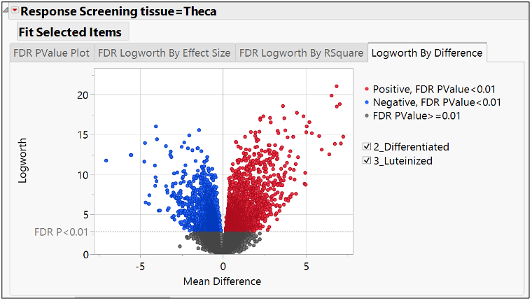
One way to represent this output is a volcano plot, as shown below. It is the most commonly used graphical representation to visualize significantly differentiated biomarkers among pairs of treatments (the treatment in this case is Tissue Stage, and the control is set to “selected”). Each dot is one gene.

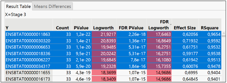
The X axis represents the difference in the biomarkers expression means; the Y axis represents the significance of the difference of means in terms of logworth (-log10 pvalue). Blue means negatively expressed or repressed, and red means positively expressed or over expressed. There are many significant biomarkers, so I filtered FDR logworth pvalues greater than 15, resulting in the six items selected.

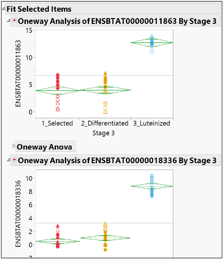
A drill down of the selected items in the Fit Y by X reveals the level of expression in the different subgroups of Tissue Stage.

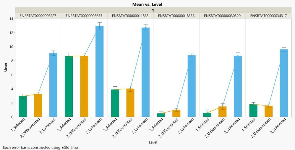
Next, I regrouped all differences into one data table, using Graph Builder to show the end results. A significant difference of expression is represented in all six genes at the Luteinized tissue stage, which was not a surprise considering the earlier results obtained in the Fit Y by X platform and in Multivariate Embedding.

In the next blog, I will talk on how to model gene expression data using different analytical tools.