JMPer Cable
A technical blog for JMP users of all levels, full of how-to's, tips and tricks, and detailed information on JMP features- JMP User Community
- :
- Blogs
- :
- JMPer Cable
- :
- How to make Harvey Balls in JMP in 3 ways
- Subscribe to RSS Feed
- Mark as New
- Mark as Read
- Bookmark
- Subscribe
- Printer Friendly Page
- Report Inappropriate Content
OK, let's get something out of the way right from the start. There are so many jokes... so very many jokes... that I could make about this topic. But, I'm not going to make them. I'm going to take the high road. Not because I want to, if you've read any of my other articles, you'll know I revel in wordplay and corny jokes. No, I'm going to take the high road because I'm reasonably sure my editors won't sign off on me turning this post into a series of one-liners. So, let's all take a deep breath, send our inner child to bed early, and try to keep the rest this article professional (even if the alternate name for these things are "Booz Balls").
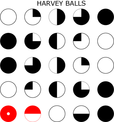
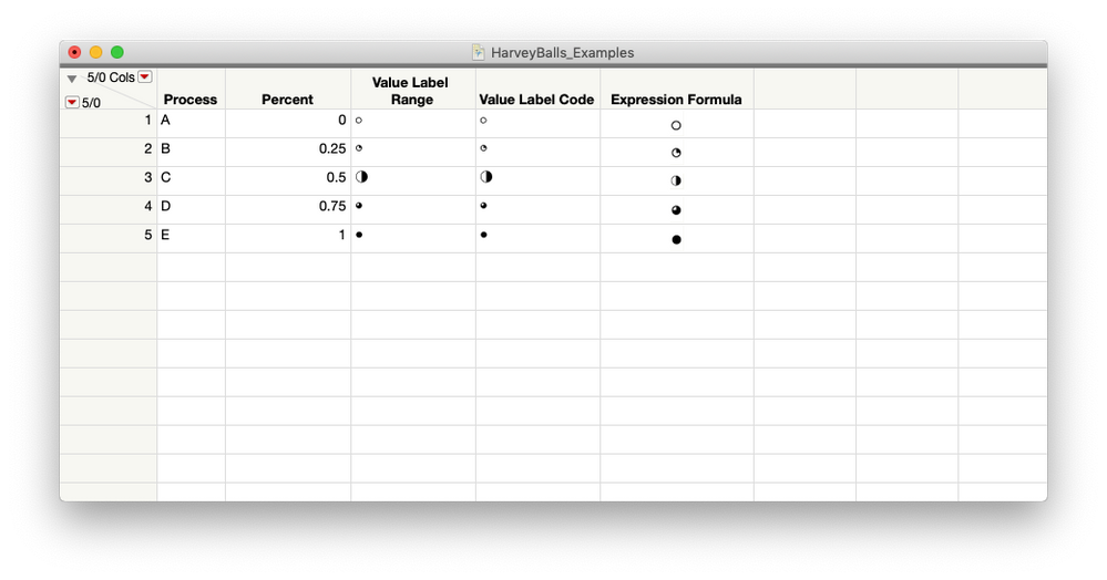
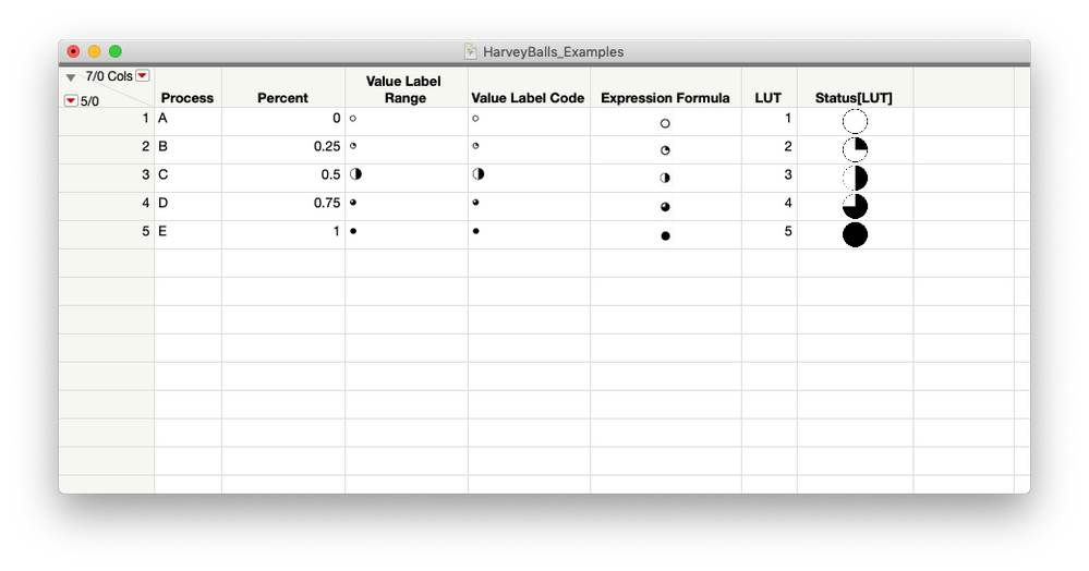
According to Wikipedia, Harvey Balls are "round ideograms used for visual communication of qualitative information." Which is to say they are little circles people use to tell other people general stuff in tables and dashboards. Here's what they can look like:
They show up all over the place in project management and continuous improvement circles. In a way, they are similar to Sparklines in that they are designed to convey high-level information to a viewer. Though, in the case of the Harvey Balls, they show task progress, rankings (good, better, best), etc.
So, how do we make them in JMP? As it turns out, the answer to this question, as is the case with most questions in JMP, is: There are multiple ways of doing it, and they all involve Column Properties to one extent or another. Here they are in rough order of how likely I think you are to be familiar with the techniques needed to implement them.
Using Column Properties: Value Labels
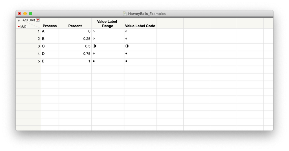
Probably the easiest way to approach this is using Value Labels. You can do this either by assigning ranges to a code value or using value ranges directly. I'll show you both options because they're basically the same process. I've added a table below with the percentage ranges, the code value I'm using, and the symbol. If you're doing this yourself, you can copy and paste the symbols from the table. It'll save you some time diving through your OS utilities for the little symbol widget.
| Range | Coded Value | Harvey Ball |
| 0% <= x < 25% | 0 | ○ |
| 25% <= x < 50% | 1 | ◔ |
| 50% <= x < 75% | 2 | ◑ |
| 75% <= x < 100% | 3 | ◕ |
| 100% <= x | 4 | ● |
In both cases, setting up the Column Property to show Harvey Balls is below.
- Right-click on the column name for the column that contains your progress information
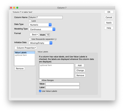
- Select Column Properties > Value Labels. JMP will present you with the Column Info Window for the column with a Value Labels Column Property added and ready for data entry.
- Put your cursor in the Value field and enter in the coded value for the symbol. To label ranges, just click the Allow Ranges check box,and enter the start and end values of the range.
- Copy and paste the appropriate symbol from the table into the Label field.
- Hit Enter (this should add the value-label assignment to the list above the Value field and return the cursor to the Value field).
- Continue with the process until all the symbols are added.
- Hit OK to apply the changes to the Column and close the Column Property window.
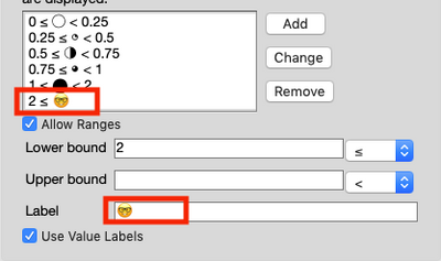
Fun Fact: This procedure works with any Unicode character the table font supports, which means you can put some easter eggs in the data table if you'd like. :nerd_face:
Now you may have noticed that the symbol sizes are a little odd. This has something to do with the fonts. I did a little research, and most fonts have this problem. The good news is that exporting the table to PowerPoint corrects the issue and everything is legible. So, the Value Label option is best reserved for situations when you're going to be taking things into PowerPoint.
Now, what if you want to do everything in JMP? Well, as the title of the article said, there a couple more options. And they make nice looking Harvey Balls in JMP data tables. They both use Column Properties, like the first method, but they are a little more involved.
Using Column Properties: Formulas
Here's a dirty little secret about JMP formulas: They're actually JSL code. The Formula Editor makes the JSL look less intimidating, but under the hood, you're coding in JSL. This means that generally speaking, you can do a lot of the same things you would do in a script in the Formula Editor. This also means that we can address some of the size issues with the glyphs by using a little JSL in a formula.
And before you leave off reading because I proposed scripting, the code is all written for you! You just have to paste it into a formula column. Also, I gotta thank @brady_brady, who came up with this idea.
To generate the Harvey Balls using this method, do the following:
- Create a new column in your data table.
- Right-click on the column name and select Formula.
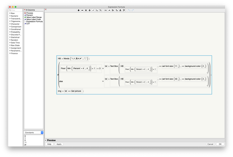
- Paste the JSL below into the Formula Editor by copying the JSL below, clicking the "no formula" box so that it's highlighted blue, and using CTRL-V (or CMD-V for mac users) to paste in the formula. It should look like this:
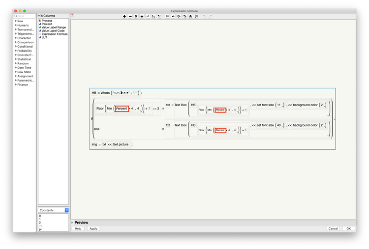
- In the Editor, drag the column that has the percentage information (the formula @brady_brady made is just for percents) to replace the "Percent" column name everywhere in the Formula Editor. There are three of them, and I've highlighted each one in the screenshot below, so you don't miss any.
- Click OK.
HB = Words( "○,◔,◑,◕,●", "," );
If( Floor( Min( :Percent * 4, 4 ) ) + 1 == 3,
	txt = Text Box(
		HB[Floor( Min( :Percent * 4, 4 ) ) + 1],
		<<set font size( 11 ),
		<<background color( 2 )
	),
	txt = Text Box(
		HB[Floor( Min( :Percent * 4, 4 ) ) + 1],
		<<set font size( 40 ),
		<<background color( 2 )
	)
);
img = txt << Get picture;
Let's take a second to review what this JSL is doing because it's pretty slick. It first creates a list called HB that contains the glyphs for the Harvey Balls. Then it runs an if statement to check which glyph is being called and applies a correction to the font size for the glyphs that are too small. Then it creates a picture that's displayed in the data table.
This method is excellent when you're reviewing Harvey Balls in a JMP data table or maybe creating a journal from a data table. It also gives you a lot of control over the sizes, font, etc. for the Harvey Balls. However, since it relies on pictures in expression columns, it doesn't translate very well to PowerPoint files.
Using Virtual Join and a Look-up Table
This method is here because I haven't run into a lot of people who extensively use virtual joins – which is a shame. I'd argue that virtual joins should be at the top of people's list of things to master in JMP after the basics. They can do a lot.
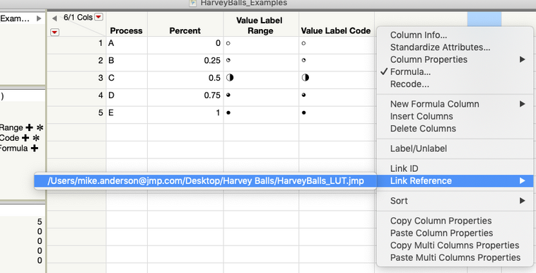
In this case, I'm using a virtual join with a Look-up Table (think V-Lookup, Excel users) to create Harvey Balls for a column. I've created the Look-up Table (LUT for short) already. In this case, you just need to have a column with the coded values, like in the Value Label example. The procedure is below:
- Open the LUT Table.
- Go to the JMP table you're working on.
- Right-click on the column name with the coded value for the Harvey Ball.
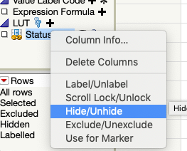
- Select Link Reference > (the file path to the LUT). The data table will now have a hidden data column.
- Right-click on the hidden column in the list of columns on the left side of the data table window
- Select Hide / Unhide
Like the previous method, this one works well when you're using the Harvey Balls in a JMP data table. It also has the advantage of being able to produce Harvey Balls quickly with all the columns referencing the same LUT. This means that a change to the LUT will automatically propagate out to all the columns that are referencing it.
Now What?
OK, now that you've got the Harvey Balls made, you generally are going to need to get them out of JMP to present. This will typically involve PowerPoint. So, how do you do that? The easiest way is to create a journal from the data table. Simply select the rows that you want to export as a table and use CTRL+J (CMD+J on the mac). This will create a journal with the selected rows as a table. From there, it's easy to export to PowerPoint by selecting File > Save As... (File > Export in MacOS).
And, that's it. Harvey Balls in three ways. Now feel free to go off and tell all those one-liners you've been holding in.
Update (2019/6/13)
@Craige_Hales wrote some JSL over in his Uncharted blog that shows how to get around the issue of the fonts and derive fractional Harvey Balls ad-hoc. His method also adds some options for formatting and shows how to build out an HTML wrapper from within JSL. It's a good read.
You must be a registered user to add a comment. If you've already registered, sign in. Otherwise, register and sign in.
- © 2026 JMP Statistical Discovery LLC. All Rights Reserved.
- Terms of Use
- Privacy Statement
- Contact Us

