Graph Builder is the graph creation toolbox in JMP, helping you to discover and share the stories within your data. With JMP 14, Graph Builder has new capabilities that enhance the data exploration process and further the publication-readiness of your findings.
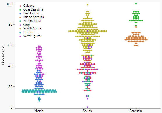
One of the first things you'll notice about Graph Builder in JMP 14 is the new jittering. The default is a symmetrical dot plot, and you have more options to choose from, such as random jitter.
 The default jittering in Graph Builder in JMP 14 produces a symmetrical dot plot, which is one of five jittering options. (Graphs courtesy of Xan Gregg.)Graph Builder also adds more graph customizations, a new chart type called packed bars, statistical enhancements and easier error bar creation.
Xan Gregg, who leads the Data Discovery team at JMP and is the creator of Graph Builder, shared details about the Graph Builder improvements coming in the new version of JMP.
Graph customizations
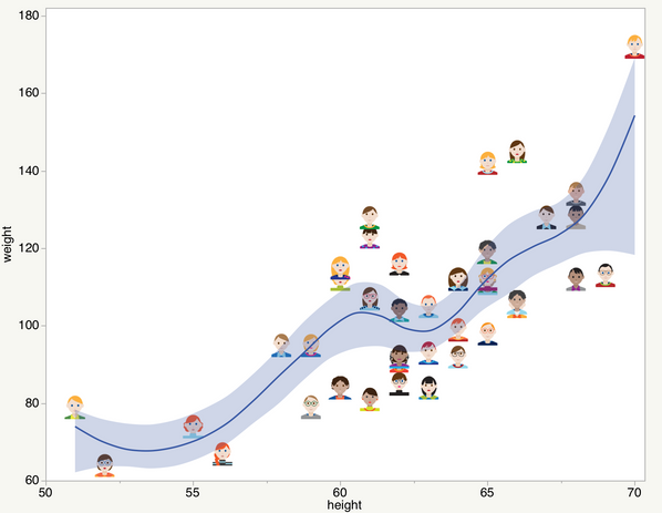
You have more flexibility over the way graphs look in JMP 14. For example, you can change the width of the bars in bar charts and error bars in all charts, and you can add a subtitle to a graph. You have more control over fonts, including in the graph legend. And you can use images as graph markers.
"Customization is important particularly when you are creating graphs for publication. Sometimes, graphs have to look a certain way," Xan explains.
 Graphs can use images as markers in JMP 14. This example also shows the new confidence interval option on the smoother element.
Packed bars
If you read Xan's blog posts in this community or follow him on Twitter, you likely have heard about packed bars. Xan came up with this new data visualization last year and debuted it on Twitter.
He had seen a packed bubbles chart showing the most popular names for dogs in New York City and decided to try a graph makeover.
"I was looking for ways of showing data with lots of categories or levels and skewed distributions. I saw an opportunity to apply the Focus+Context principle. Focus+Context is a powerful technique for seeing the important parts of a data set (the focus) with high fidelity while at the same time seeing the supporting data (the context) with a low-fidelity, details-on-demand view," Xan says.
He blogged and tweeted about packed bars, and asked for feedback on his visualizations. The responses showed that people were interested.
"It's a scaled-up Pareto chart, which is useful when you have hundreds of categories," he says. Scientists and engineers will find it helpful. "Each level could be a defect type or adverse event, whose counts often have a Pareto distribution," Xan points out.
Community member @markschahl, who is in manufacturing, commented: "The packed bars gives me a nice Pareto with details on demand of a treemap."
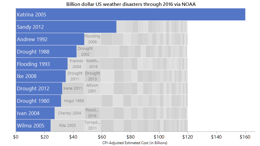
So now packed bars is in the latest version of JMP, as one of the 10 types of bar charts available in Graph Builder.
 This packed bars view of billion-dollar weather disasters highlights the top 10 by cost in the context of all the others. We get a sense of the Pareto distribution of values and that Hurricane Katrina’s cost is more than 10% of the total costs.
Statistical enhancements
The regression element in Graph Builder supports categorical factors, which results in an ANOVA-style visualization.
The smoother element has bootstrap confidence intervals, which you can see in the second image in this post. Confidence intervals provide context, telling you what the uncertainty in a trend line is.
"It helps you realize when you are overfitting," Xan says.
The contour element supports two-dimensional smoothing for more effective visualization of noisy data.
Easier error bars
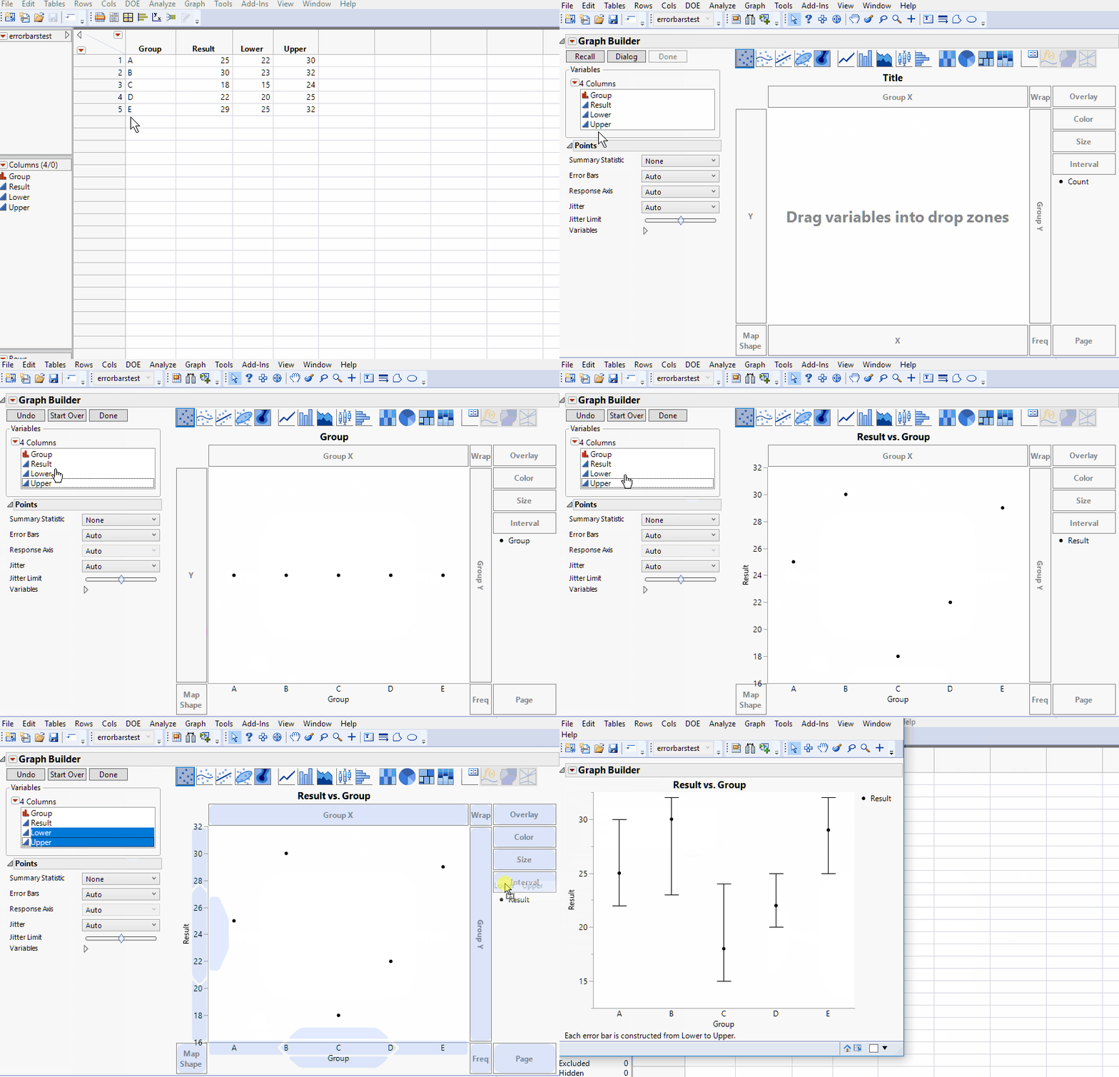
Graph Builder has always had computed error bars. And now, in JMP 14, if you have presummarized data with pre-calculated error bars, you can use the new drop zone for drag-and-drop creation of custom error bars. Watch this animation to see how it works.
 It's easier than ever to create custom error bars in Graph Builder in JMP 14. Just drag and drop. (Animation courtesy of Xan Gregg.)
You must be a registered user to add a comment. If you've already registered, sign in. Otherwise, register and sign in.