- New to JMP? Let the Data Analysis Director guide you through selecting an analysis task, an analysis goal, and a data type. Available now in the JMP Marketplace!
- See how to install JMP Marketplace extensions to customize and enhance JMP.
JMPer Cable
A technical blog for JMP users of all levels, full of how-to's, tips and tricks, and detailed information on JMP features- JMP User Community
- :
- Blogs
- :
- JMPer Cable
- :
- Expression Analysis with JMP Genomics, Part 3: Basic Expression Workflow
- Subscribe to RSS Feed
- Mark as New
- Mark as Read
- Bookmark
- Subscribe
- Printer Friendly Page
- Report Inappropriate Content
JMP Genomics has analytical pipelines or Workflows to perform a series of analyses on a data set. The Basic Expression Workflow automates a series of quality control and normalization methods, followed by ANOVA, to perform a basic expression analysis. For this workflow, we will inspect data from an experiment in which MCF7 cells, cells which cause tumors, are exposed to estrogen at three different timepoints. These cells reproduce rapidly when exposed to estrogen, and expression levels are expected to rise with continued exposure. This series of analyses will give a distribution of data at each timepoint under both control and experimental conditions, compare expression levels for each, and create a standardized data set for use with further analytical tools.
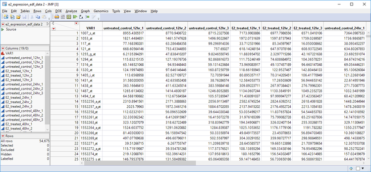
- Open the e2 _expression_edf_data.sas7bdat Inspect the structure of the experiment. Each column represents a group (experimental/control) measurement at a specified time (12 hrs/24 hrs/ 48 hrs). Three measurements are taken for each group at each level for a total of 18 measurements taken at six different experimental conditions.
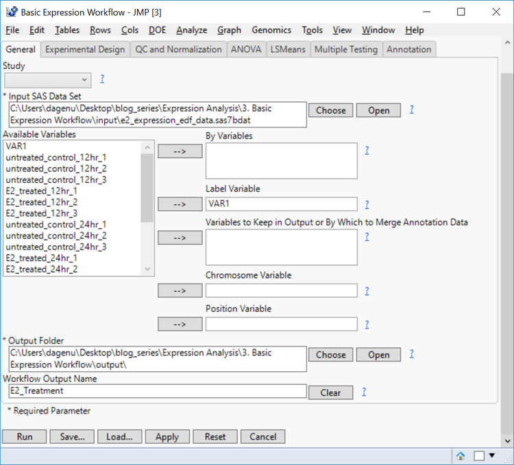
- From the Genomics Starter menu, select Workflows > Basic > Basic Expression Workflow to bring up the dialog box.
- In the General tab, choose e2 _expression_edf_data.sas7bdat as the Input SAS Data Set.
- From the list of Available Variables, select VAR1 as the Label Variable.
- By Variables can be included to separate the output by different levels of a specified variable. This data set, however, does not have any of these variables. Furthermore, a Chromosome Variable and/or a Position Variable can be included if annotation information is included in the data set.
- Choose an Output Folder and set the Workflow Output Name as E2_Treatment for easy file identification.
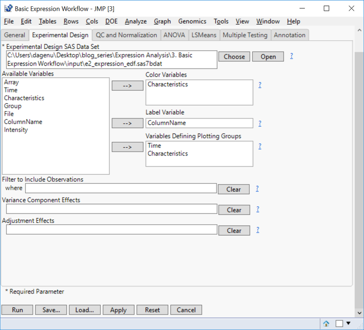
- In the Experimental Design tab, select e2_expression_edf.sas7bdat as the Experimental Design Data Set. This data set contains information about the design of the experiment and is required for analysis. For more information on how this data set was created see: Expression Analysis with JMP Genomics, Part 1: Experimental Design.
- The Color Variable will color output according to levels of the specified columns. For this option, select Characteristics.
- Select ColumnName as the Label Variable. This column corresponds to the column names in the Input Data Set.
- Select both Time and Characteristics for the Variables Defining Plotting Groups to separate plots by the different time points and treatment groups.
- Variance Component Effects can be included to specify columns that define sources of variability and these effects can be adjusted prior to their modeling using the Adjustment Effects. The output from these fields will be a pie chart explaining the source of variability in the data.
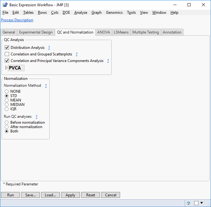
- On the QC and Normalization tab, select the types of QC Analysis to perform. For this example, select both Distribution Analysis and Correlation and Principal Variance Components Analysis.
- In the Normalization box, select STD as the Normalization Method.
- This is a quick and easy way to standardize the expression levels for each experimental group in your data set. The ? icon next to Normalization Method gives a description of the four normalization method options.
- This is a quick and easy way to standardize the expression levels for each experimental group in your data set. The ? icon next to Normalization Method gives a description of the four normalization method options.
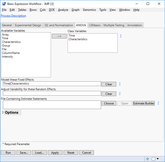
- In the ANOVA tab, select Time & Characteristics as the Class Variables. These variables form distinct categories in the model.
- List the fixed effects in the Model these Fixed Effects box as “Time|Characteristics”.
- Including the bar operator “|” models the interaction effect for Time & Characteristics as well as modeling both variables as main effects. This is identical to entering “Time Characteristics Time*Characteristics”.
- Including the bar operator “|” models the interaction effect for Time & Characteristics as well as modeling both variables as main effects. This is identical to entering “Time Characteristics Time*Characteristics”.
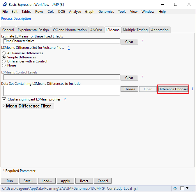
- Under the LSMeans tab, enter “Time|Characteristics” in the field labeled Estimate LSMeans for these Fixed Effects.
- For LSMeans Difference Set for Volcano Plots, select Simple Differences. This will denote differences between the LS Means effects entered in step 16, but only when the levels of those variables have changed.
- To denote the difference between all possible pairs of levels, select All Pairwise Differences, or to take differences vs a single reference level, select Differences with a Control.
- Check the box next to Cluster significant LSMean profiles. This will perform hierarchical clustering for each of the specified variables from step 16 that are calculated to have a significant difference.
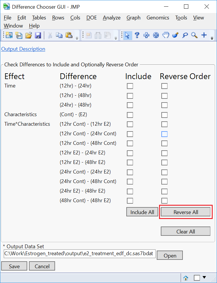
- To ensure the proper differences are calculated in the output, select Difference Chooser (highlighted in red below). This will open a new window showing the default differences that will be calculated for use in the volcano plots.
- In the Difference Chooser window, notice that the default operation is to subtract the timepoint with longer E2 exposure from the earlier timepoint. We want the opposite of this. Click the Reverse All button to swap the order.
- Optionally, select which comparisons to include in your output by checking or unchecking the Include boxes next to each comparison.
- Click Save.
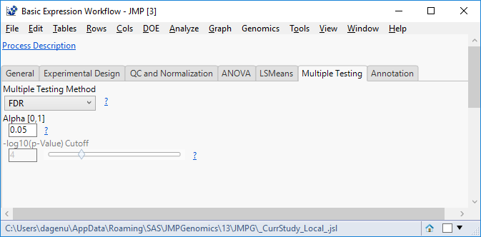
- In the Multiple Testing tab, select a Multiple Testing Method. For this example, we will use FDR to control the false discovery rate.
- Select an Alpha Here, we will use the standard 0.05.
- There is no annotation data set in this example, but in cases where annotation is present, it can be added in the Annotation
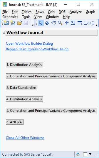
- Click Run to begin the analysis. The result is the following JMP Journal.
Results
**Interactive reports from this analysis can be found on JMP Public.
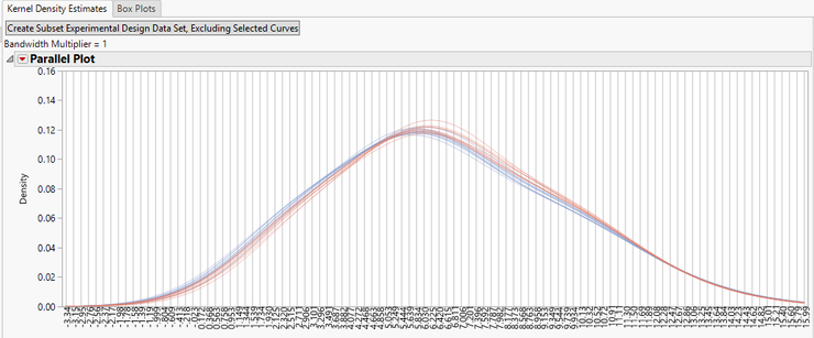
- Click the Distribution Analysis button to bring up the first results window.
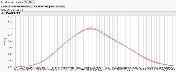
- The initial tab shows the Kernel Density Estimate curves for each of the experimental groups before normalization.
- For further data exploration, highlight any of the curves on the plot and then click the Create Subset Experimental Design Data Set, Excluding Selected Curves option to bring up a new EDF without the highlighted curves.
- For further data exploration, highlight any of the curves on the plot and then click the Create Subset Experimental Design Data Set, Excluding Selected Curves option to bring up a new EDF without the highlighted curves.
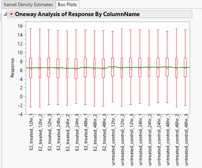
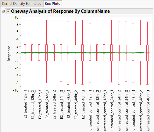
- The Box Plots tab displays a box plot of the response for each column prior to normalization.
- Return to the Journal window and select the second set of output, Correlation and Principal Variance Component Analysis.
- Note that each of the Correlation and Principal Variance Component Analysis result windows are identical in output.
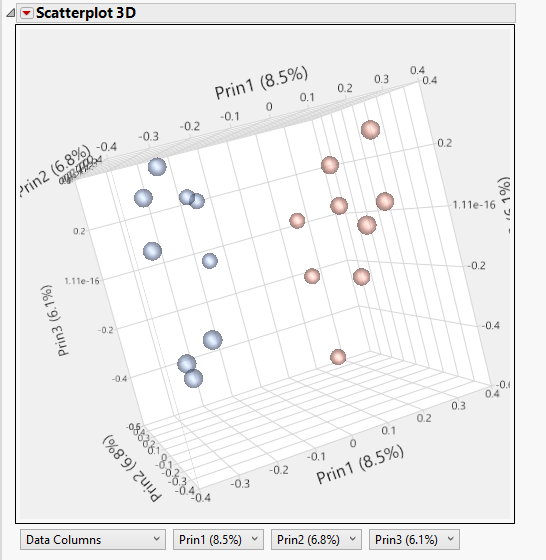
- The 3D PCA Plot tab gives a 3D scatterplot of the principal components. Red points are groups that were treated with estrogen while blue points are control groups.
- There is a clear grouping of the groups, suggesting that much of the variance in the data is explained by the estrogen treatment.
- There is a clear grouping of the groups, suggesting that much of the variance in the data is explained by the estrogen treatment.
- The 2DA PCA Plots tab shows the variance for each principal component group in a matrix. The histograms on the diagonal indicate the percentage of the total variance explained by each principal component. The Scree Plot gives the amount of variance explained by each principal component.
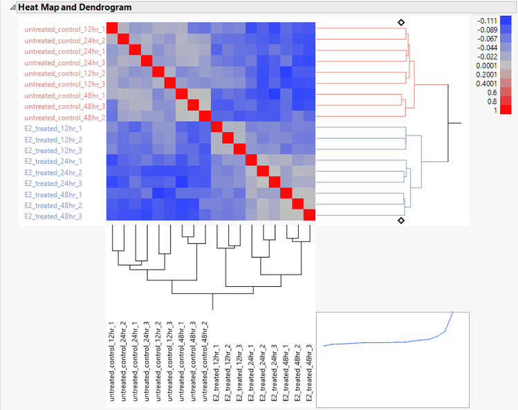
- The Correlation Heat Map tab gives a heat map of the correlation matrix. There is a correlation between the treated and untreated groups seen in the increased blue coloring of the upper-right and lower-left quadrants.
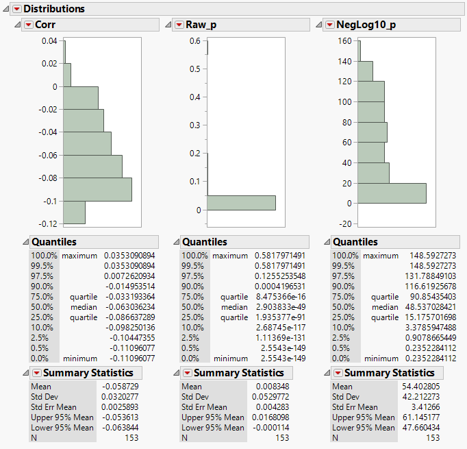
- The Correlation Distributions tab shows the distributions of the correlation matrix and their p-values. The low p-values are indicative of robust results.
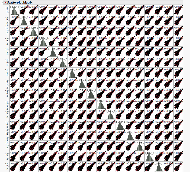
- To bring up the correlation matrix and a matrix of the correlation scatterplots, select Correlation and Grouped Scatterplots from the Launch Follow-Up Process
- This will open a new dialog box; clicking Run will bring up the matrices.
- The resulting output is the correlation matrix that was used to develop the Heat Map, and Distribution A portion of it is shown below.
- Return to the Journal window again and select Distribution Analysis. This is the standardized density curve and box plot resulting from normalization with medians of each response group centered at 0.
- The normalized data sets are now saved to the designated Output Folder and can be inspected by clicking Data Standardize from the journal window.
- The normalized data sets are now saved to the designated Output Folder and can be inspected by clicking Data Standardize from the journal window.
- Return to the Journal window again and select the final output option, ANOVA.
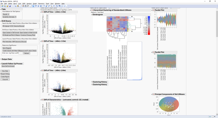
- The initial results window that opens has a volcano plot showing the differences in expression between sets of experimental groups.
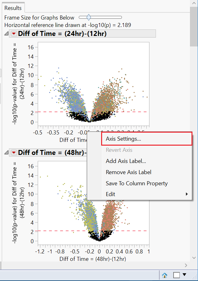
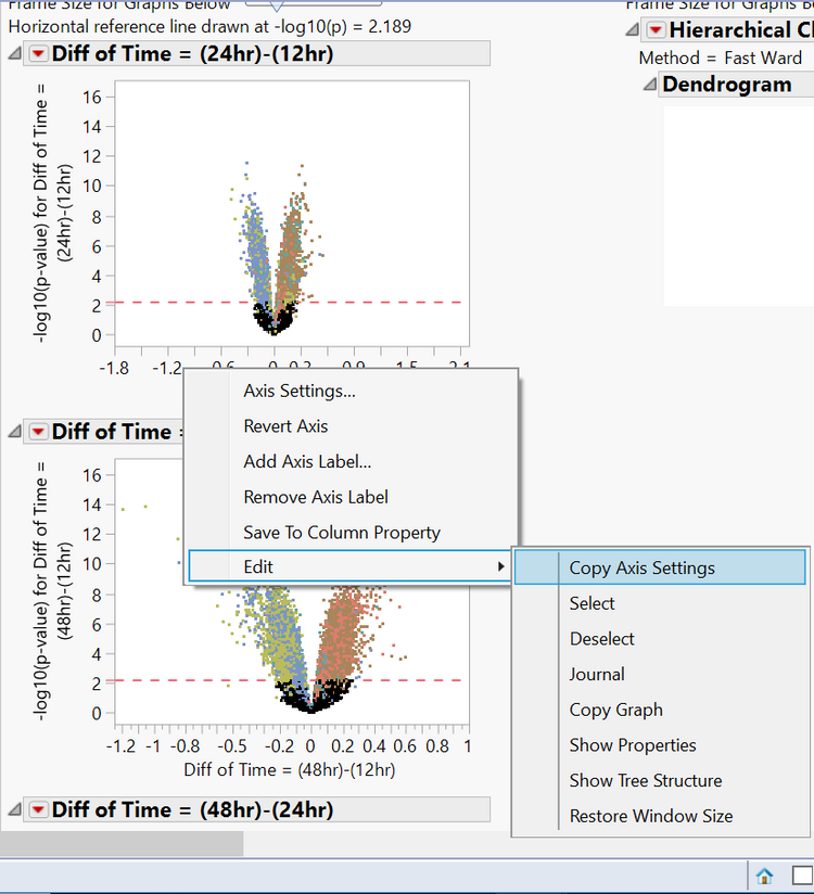
- Notice the x-axis on each of the plots (representing the difference in expression) is not uniform. In order to analyze these plots effectively, the axes will need to be changed. Right-click the x-axis of the first plot and select Axis Settings.
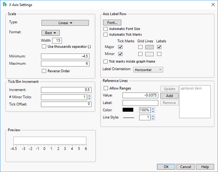
- Enter a range of -4.5 to 6 in the Minimum & Maximum fields for Scale.
- Enter 0.5 as the Increment option and select OK.
- Next, right-click on the same axis and select Edit > Copy Axis Settings. This saves the axis settings so they can be applied to the other plots.
- Scroll down to the second plot now and hold Ctrl + right-click. Select Edit > Paste Axis Settings. This will apply the copied axis setting to every plot.
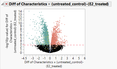
- Once the axes have been adjusted, take a look at the results. The volcano plot below shows the difference in expression for cells that were given estrogen treatment and cells with no estrogen treatment. The x-axis represents the difference in expression and the y-axis represents the statistical significance of the difference. The red reference line represents a p-value of 0.05.
- The plots below show the difference between estrogen treated and control groups at the three different stages of exposure.
- It is clear from the shape of the volcano plots that exposure to estrogen does cause a change in gene expression in MCF7 cells.
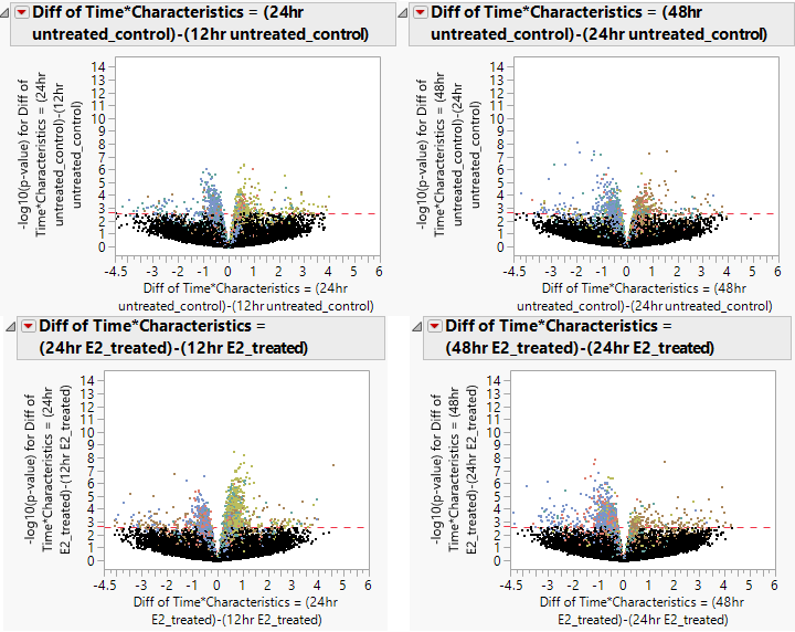
- Below, we compare the volcano plots of the control and experimental groups for the change in expression from 12hrs to 24hrs and from 24hrs to 48hrs. Once again there is a decrease in expression levels from the 24hr to 48hr measurements, and an increase in expression from the 12hr to 24hr timepoints. This is more defined in the groups that were exposed to estrogen.
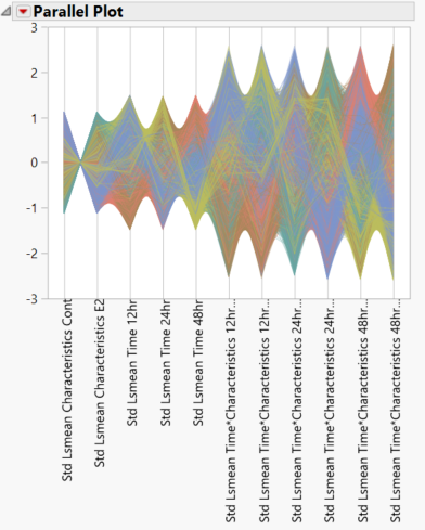
- Scroll to the LSMeans Parallel Plots on the right side of the output window. The top plot shows the interaction between characteristics (control vs. experimental groups) and time. Nonparallel lines, as seen in this plot, indicate an interaction between the two variables. The bottom plot shows simple means with no interactions.
- Note that highlighting any lines on this graph will select their corresponding points in the volcano plots and vice versa.
- Note that highlighting any lines on this graph will select their corresponding points in the volcano plots and vice versa.
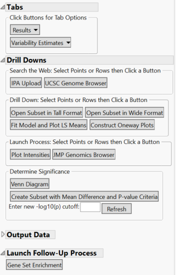
- Further analyses can be conducted from the Drill Downs Menu, including fitting a model using the ANOVA results, creating a subset of selected data, making intensity plots, and more.
Summary
The Basic Expression Workflow is an effective way to string together a series of analyses and compare expression levels across experimental conditions. This workflow is highly recommended for launching into expression analysis. It allows for data standardization and QC, data exploration such as distribution and correlation analyses, and expression and LSMeans analysis. From the output window, it is easy to continue analysis in the Drill Downs menu and fit a model to your data.
You must be a registered user to add a comment. If you've already registered, sign in. Otherwise, register and sign in.
- © 2026 JMP Statistical Discovery LLC. All Rights Reserved.
- Terms of Use
- Privacy Statement
- Contact Us

