I'm very excited to have my first book in print, Biostatistics Using JMP. Part of the work in developing the book was exploring and explaining many methods that I have used for advanced analytics. For data mining and finding meaning in data, clustering has been very beneficial to me in my projects.
In JMP, two clustering approaches are readily available: hierarchical clustering and k-means. Hierarchical clustering compares the distances between each point and groups points together based on their similarity (or dissimilarity). K-means operates differently and aims to find K centroids that are appropriate for the data, but you must specify K as the number of groupings to find.
Simple Example
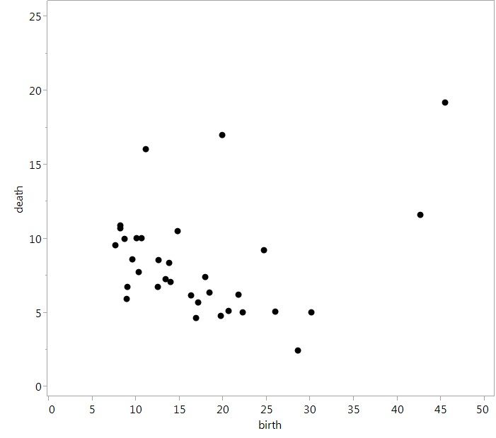
The built-in JMP data set “Birth Death Subset” is one example of a data set that is not too large, but shows the use of clustering. There, we have two variables, the crude birth and death rates, and observations for 33 countries. However, it's hard to find a meaningful interpretation just looking at the data. If we plot the two variables together, we see that most countries are grouped in the lower left of the plot with a general negative relationship between birth and death rates. But the underlying relationship is not that strong, and a regression model for this data is not statistically significant and explains little variance. So what can we do with this?
 Raw scatterplot of data
If we approach this data using clustering, we can begin to see more meaningful interpretations. To perform cluster analysis on this data, we can follow the process found in Chapter 11 of my book Biostatistics Using JMP: A Practical Guide. Briefly, in JMP 13, you would want to select Analyze ► Clustering ► K Means Cluster.
Now you must specify the number of clusters to find. While it is subjective on how many clusters that you want to search for, keep in mind that too few will give coarse groupings, and too many will leave you in the same situation you started in. For this analysis, we will look for three clusters. Click Go and you will be presented with a lot of results (which I'm not showing here).
To quickly analyze these results, we can do a few things:
- Save the colors associated with the clusters to the data table.
- Replot the data with both the clusters and the colors.
Both options are available by clicking on the red triangle next to K Means NCluster = 3. Make sure you save the colors first for the most impactful results.
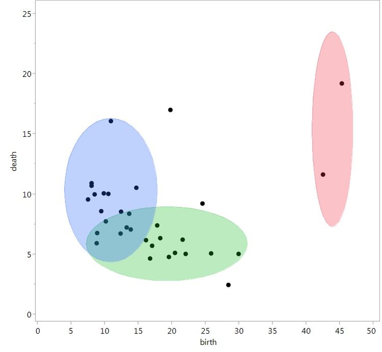
With the clusters as lightly shaded ellipses and the points color coded for each cluster, we can now see some interesting groupings in the data:
- Light green is associated with countries that have low birth rates, but a lot of variability in death rates (incidentally, mostly developed countries).
- Light blue is associated with low death rates, but a lot of variability in birth rates (incidentally, mostly developing countries).
- Red is associated with two countries, which have high birth and death rates (Afghanistan and Zaire).
Although this wasn’t apparent when we first opened the data set, we now have a compelling story. With a combination of the data, interpretation and visualization, one could now easily tell this story to a wider audience.
 Same data, but with coloring for clusters, which now provides a meaningful interpretation of the data
You must be a registered user to add a comment. If you've already registered, sign in. Otherwise, register and sign in.