JMPer Cable
A technical blog for JMP users of all levels, full of how-to's, tips and tricks, and detailed information on JMP features- JMP User Community
- :
- Blogs
- :
- JMPer Cable
- :
- Building a structural equation model for the Tennessee Eastman simulator
- Subscribe to RSS Feed
- Mark as New
- Mark as Read
- Bookmark
- Subscribe
- Printer Friendly Page
- Report Inappropriate Content
Last month, I went over the preliminary analysis required to begin constructing a SEM for the Tennessee Eastman simulator (a chemical process simulator). This analysis yielded factors and factor correlations between manifest variables and the latent factors, which can be used as a baseline model for SEM comparison. However, as I have mentioned in some of my previous posts, other models must be created and considered based on the preliminary analysis to determine that we have found a good model for the system. In this case, a “good” model would be one which can detect faults in the system while not flagging any issues in normal run time. One of the main ways I will assess these models is through the statistical metrics provided through JMP Pro’s model comparison window.
Building the SEM
Before I get into the model construction, I want to provide you with one of my full model comparison tables. Whenever I mention one of the SEMs in this section, I will refer to the table below with the model number corresponding the correct model. I’ve done this to highlight how many models it is necessary to create to even begin to get an insight into the data, but I don’t plan on explaining each of these models, only the most important.
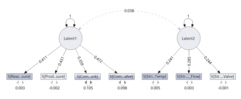
When creating the SEMs, I only used the in-control data. Once the model was completed, I applied the model to various time intervals to try to observe what changes occurred. To keep things simple, I made the first model using only two factors with a covariance between the factors since we know these factors are likely related (this is model 5).
We see this through the solid lines, which denote statistical significance, and the dashed line, which denotes a statistically significant correlation. Since we select the correlations ourselves, a dashed line is likely to indicate that the correlation between those variables is not needed in the model for the model to be a good fit to the data. From our domain knowledge, we know that there must be a covariate relationship between these factors (temperature and pressure), so this should be setting off alarm bells about this model.
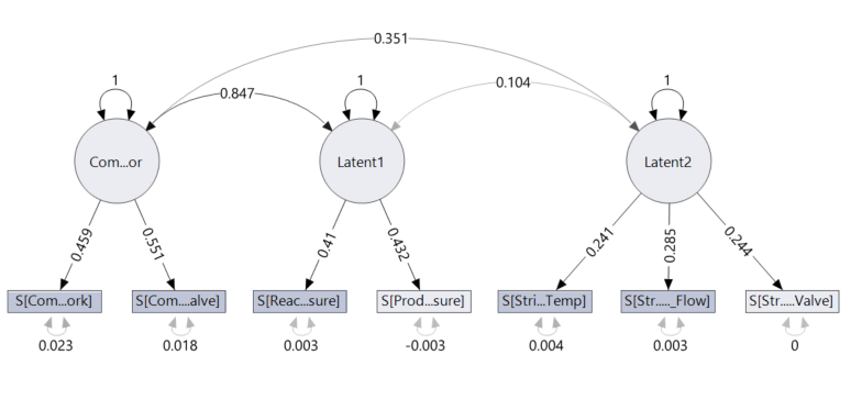
However, you may remember in my previous post I mentioned that a couple of the compressor based manifest variables are not as correlated with pressure as the other variables. So at this point, I decided to add a third latent factor, call it compressor and assign the manifest variables previously associated with pressure to this new compressor factor. As you are probably catching on at this point, all our latent factors are likely to be highly correlated to one another, so in this model a covariance was added between all factors. Practically this makes sense since a compressors job is to increase pressure, but it also produces heat in the process, which means it is likely to affect both our temperature and pressure factors (this is model 9 in the table).
Comparing model 5 with model 9, we see that model 9 performs better in every metric tested for. Not only this, but we also see that all our covariances between latent factors are now statistically significant. This is a promising result. You may also notice in the comparison table that we have a lot of negative values; this isn’t a problem. The same rules apply: Lower values are better. Here you can see, out of the 12 models I created, model 9 is the “best” model statistically.
Fault Detection
So now that we have a model that seems to fit the data reasonably well and gives us statistically significant correlations when in control, it’s time to ask the big question: How does the SEM show us there is a fault? This is the crux of my work, and so I will highlight a couple of ways in which I found that the fault could be detected and the pros and cons of these fault detection methods.
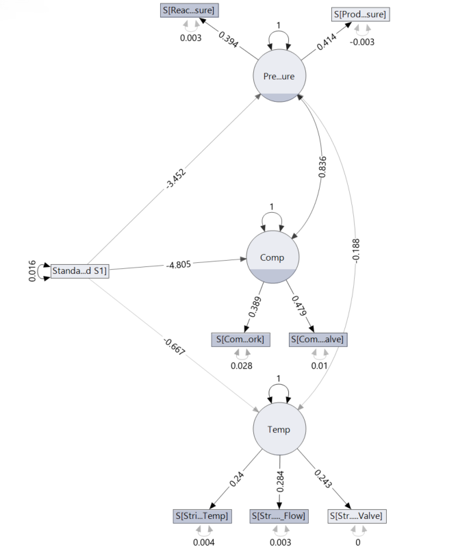
For those sharp readers among us, you may have noticed that although I mentioned in my last post that the fault was an error in the A/C feed ratio, there are no manifest variables relating to the A/C feed ratio in the model! I will cover this point more next month as I address the problems with this model, but for now just know I tested various variables related to the A/C ratio and found that the addition that gave the best statistics was when the variable “A-Feed S1” was added to the model.
Below I have included the comparison statistics for two models with the A-Flow variable included. As usual, the unrestricted and independent models are given, along with model 3, which is a SEM without covariance connections between the latent factors. Model 4 is the same SEM but with the covariance between the latent factors included (this is more likely to be the correct model).
There are a few ways in which changes within the system are observed. Firstly, the significance of the connection between variables can be an indicator of a fault occurring since that connection that should be important is now seen as not important by the model. Unfortunately, sometimes depending on your model and how sensitive it is, the statistical significance of the correlations may change under small changes in the system. This is clearly a sensitivity issue but shows us that we need to be careful when employing this type of analysis.
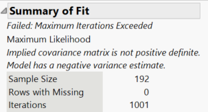
Secondly, convergence failure can be used to detect faults in the system. This is paired with the number of iterations that have taken place in the platform. If over 1,000 iterations are performed, the analysis is cancelled, and the model cannot converge. This is a very clear distinction between the in-control and fault models, and in fact when I first discovered this, I thought it provided a very clear distinction between the in-control and out of control data. But it does just that and only that, which is the drawback. Checking if the model has converged will tell us that there is an error somewhere, but not where or when it occurred. Which, if the system isn’t producing product or is undergoing some catastrophic failure, would be pretty clear and wouldn’t require a SEM.
Therefore, the method of fault detection that I believe to be the best is observing the change in the statistics provided by the model comparison report over a certain, user specified, time period. The easiest way for me to demonstrate this is to use the Local Data Filter in JMP along with the animation controls.
As you can see through the above animation, I have added a Local Data Filter to split the whole data set up into 10 groups of 192 time points. The fault occurs at data point 1120, but is manually observable at about 1130. In either case, this means that the fault occurs at the end of group 5 with the effects being seen mainly in groups 6 and 7 before the system reaches a new steady state. If you observe the comparison statistics over these groups, you can see that after group 5 the statistics rapidly change, which indicates a fault.
However, some statistics are better than others at detecting this particular fault. For example, the AICc changes dramatically over these groups, which tells us that a fault has occurred. But the AICc makes it hard to identify where this fault has occurred specifically since the main changes in this value occur in group 7, long after the fault occurred. In this case, if you didn’t know where the fault was, you would be likely to report that the fault occurred in group 7. Whereas if we observe the CFI and RMSE over the same groups, we see that these values begin to significantly deviate from their baseline values as soon as the fault occurs. The RMSE in particular seems to be the best metric for detecting this change, since in group 5 the RMSE increases slightly and then in group 6 the RMSE is increased to levels that indicate an error in the model. Once the system returns to a steady state after the fault, the RMSE then returns to its pre-fault value. Consequently, for this particular example, RMSE is the best statistical metric to base our analysis off, but this conclusion needs further testing to see if this result is found for other faults in other data sets.
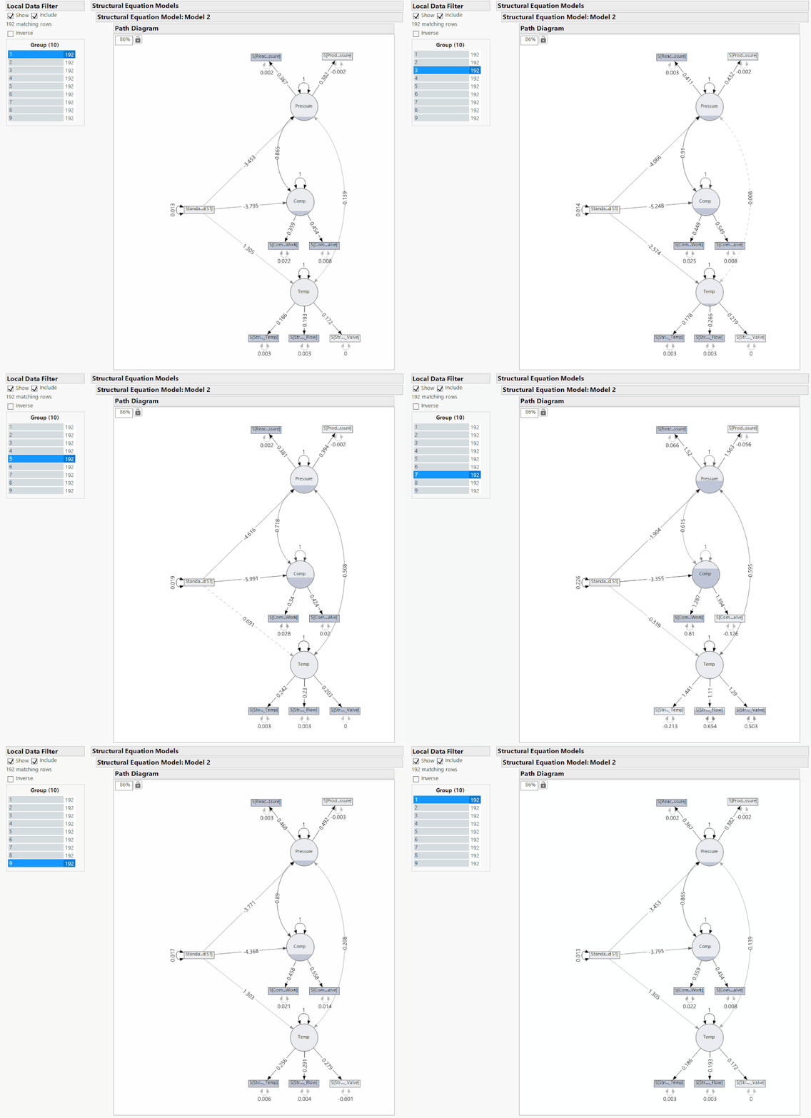
Above I have provided the same analysis as before, but as I cycle through the groups the SEM and its respective correlations are given. In groups 3 and 4, we see that different correlations become statistically insignificant just in the same way that the connections become insignificant in groups 5 and 6, after the fault. The problem here is that it is impossible to tell if the fault occurs in group 3 or group 5 just from the significance of the correlation. This lack of distinction suggests three possibilities: that this SEM is not a good one for the system, there is not enough time points per group, or that this method of detecting a fault is not a good one. Next month, I will explore further the idea of the SEM itself being poor. But considering the comparison statistics of the original SEM, it is unlikely that the model is the issue. Instead, it is likely that the method of fault detection is the issue since being told whether or not a correlation is significant provides far less information than several statistics that give quantitative values for us to compare.
As you can hopefully see, detecting the fault through the statistics calculated in the model comparison section gives a far clearer picture of where the fault occurs as opposed to observing the significance of the correlations alone.
Conclusion/Further Work
From this exploration, you should be able to see how it is possible, although time-consuming, to create SEMs and use them to detect faults in a real industrial system. However, there are obviously drawbacks with this application and the specific way I created the models. Next month, I aim to explore some of these drawbacks and the scope in which SEM can be used in real processes. At this stage, a fair conclusion is that SEM can be used in fault detection but only as a basic model for certain conditions, it is not comprehensive.
If anyone else has had any success with fault detecting using SEM either through another example or by using another method to detect when and where a fault has occurred drop a comment below, I would be very excited to hear about it.
You must be a registered user to add a comment. If you've already registered, sign in. Otherwise, register and sign in.
- © 2026 JMP Statistical Discovery LLC. All Rights Reserved.
- Terms of Use
- Privacy Statement
- Contact Us


