The Great Virtual Cookie Experiment: The results
What makes for a tempting looking plate of cookies? The results are in!
Ryan_Lekivetz
What makes for a tempting looking plate of cookies? The results are in!
Ryan_Lekivetz
A new feature in JMP 16, Sample Size Explorers elevate power calculations to a new level.
My really fun project and collection of exciting tricks are embodied in the structural equation modeling platform in JMP Pro. I’ve written before about the unique advantages of fitting SEMs in JMP Pro 15, but with the release of JMP Pro 16, there’s a lot more to celebrate.
A quick tour of many of the enhancements to Graph Builder in JMP 16.
We have successfully designed a conference that is different from every other virtual conference.
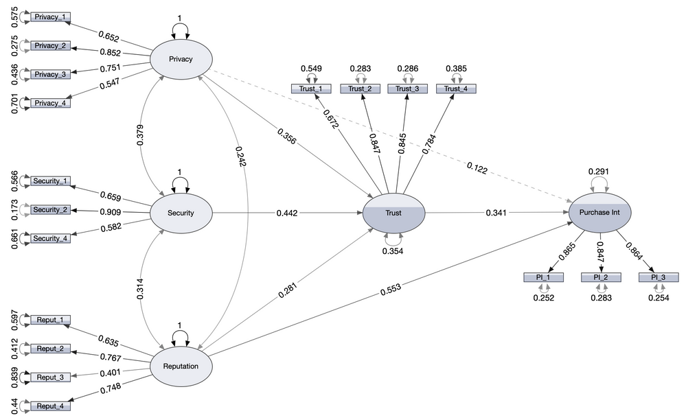
If you’re an SEM user, we both know the countless hours you’ve spent drawing and editing path diagrams so you can convey your results to your audiences. If you’re not a current SEM user, then you can avoid the pain of using secondary software to draw those diagrams just right. Factors that predict the taste of candy expressed as a system of structural equations and as a path diagram.
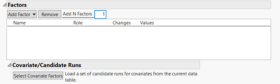
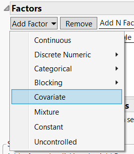
It's easier to use covariates in JMP 16.
Ryan_Lekivetz
Part of the confusion stems from the use of the term covariate.
Ryan_Lekivetz
Some of the most important content of the conference is available right now: the papers.
During a recent livestream event, Ayana Littlejohn of SAS discussed one of the many social innovation projects she’s worked on during her career.
This guide explains how SPSS and JMP differ in the handling of descriptive statistics and visualizations and is meant to help ease the transition from SPSS Version 27 to JMP 16 and JMP Pro 16.
Hover Labels can support drilling and further exploration of visualizations with just a few clicks (no JSL knowledge required!).
Some modeling problems will require you to look at a larger set of outputs to diagnose the health of the model and understand and communicate the results effectively. This post focuses on variance inflation factors, parameter estimates and interaction plots.
Even with the default settings in JMP as a starting place, there are still many outputs that one has to prioritize and figure out how to interpret.
“Which model outputs should I be looking at? There are so many! And how should I interpret them?” The biggest barrier I have seen from analysts who want to use models to solve their problems is that they get confused and/or bogged down with all the outputs they need to look at once they’ve built a model. This is the first of a five-part blog series aimed at helping analysts get started in their qu...
Sometimes you need to look at a few more outputs to improve your model or better understand what it is telling you...just like sometimes you need to add some healthy fats to your meal to satisfy your hunger and body's nutritional needs. This post goes into additional outputs that you can review in addition to those that were described in the previous week's post when necessary.
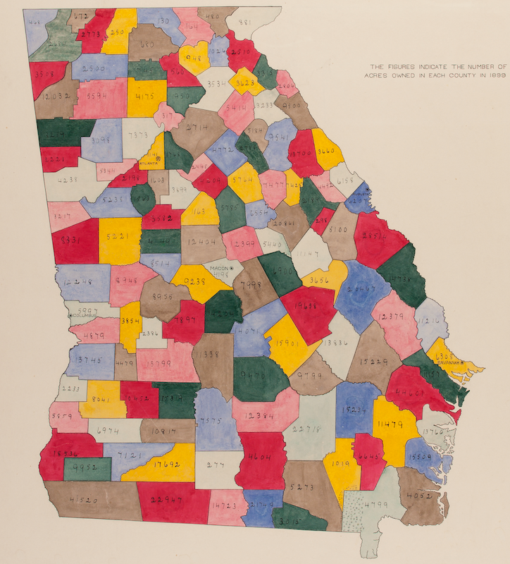
For Black History Month 2019, Montgomery College sponsored the Black Data Project, a contest to draw attention to the data analysis and visualization work of W.E.B. Du Bois. They selected 12 of his works from the 1900 World’s Fair in Paris and invited participants to create derivative works.
Here's what you'll find at the entirely online Discovery Summit Europe 2021.
A how-to on customizing graphs in JMP. The first of two posts on creating high-quality graphics for publications and presentations.
A how-to on getting high-resolution graphics out of JMP. The second of two posts on creating high-quality graphics for publications and presentations.