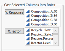
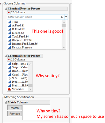
Inspiration: I am tired of resizing list boxes in dialogs so I can see items.
Improvement: Make the default widths wider and list boxes longer. They typically assume column names and data table names are very short and lists are short. Suggest dynamically computing appropriate width and length based on what is being displayed and how much space there is (also using larger dialogs - most people work on large screens and screen size can be detected), or at least add a preference setting for minimum width and length.
Why is this idea important? Half of the clicks I do in dialogs are to make the list boxes wider or longer. Fixing the issue will save time.
Here are some examples of default presentations:

