What inspired this wish list request?
My companies' process control groups are increasingly using the Process Screening platform and the alarm rate is becoming a key metric for us. Also, we are using three-way chart more and more, and it is just as important on three-way charts to track and understand the alarm rate on the within charts as the mean charts. When trying to compare results across platforms as well as expected results, we found discrepancies.
I've been working with @PatrickGiuliano at JMP Technical Support to work through how the platform has been designed to function vs this requests goals.
What is the improvement you would like to see?
The alarm rate section of the Process Screening (PS) platform is a great way to be able to pareto out what process to attack first as well as track performance changes over time while also being able to quickly visualize trends. I would like to see the following:
- The "Alarm Rate Column" and "Any Alarm" columns should respect all selected alarm rates as calculated off both upper and lower control limits. Currently they only calculate off both control limits for the mean chart (as well as any other tests) but only the upper control limit for the "Range Limit Exceeded" when a three-way chart is selected.
- Not respecting the LCL causes different alarm rates when viewing a process in PS vs Control Chart builder. This also creates control charts that are different looking than Control Chart builder when using "show chart as selected" in the PS and adding in the dispersion chart as only the UCL is shown.
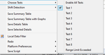
- The names for the dispersion charts should be changed to be clearer. "Range Limit Exceeded" should go to "Disp Limit Exceeded" and be used with MR/-R/-S/three way S/R charts and "3W MR Limit exceeded" should be used for MR charts on three-way charts.
- The alarm rates and alarm count should not be the sum of the alarm rates for each "Test" column and three way "Range Limit Exceeded". They should only sum up across a subgroup (so if any subgroup fails a "test" on the mean chart or the subgroup dispersion chart exceeds a Control limit, that should only +1 the value on the "Any Alarm" column and only add +1 to the numerator in the "Alarm rate" column. For example, if subgroup 2 (of 10) fails for the mean and 3 way within dispersion chart UCL's, and is the only subgroup to fail then the "Alarm Rate" should be 10% and the "Any Alarm" should be 1. Currently this would show as 20% and 2, which is a misleading look at the process.
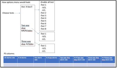
- Since the goal of Process Screening is to be a kind of one-stop shop for an overview of all your processes, it would be value-added to the users to have the platform have the overall alarm rate reflect all the alarm types being selected by the user. (So, I would like to see a Means alarm rate, MR alarm rate, Range Within alarm rate, and an Overall alarm rate which flags for any tests that were selected by the users to flag a subgroup as defective {MR for an I-MR chart can be excluded here as it spans "two subgroups}).
How this might look:


Note: took keep consistent with Control Chart Builder using “Test All Beyond Limits - All” vs "Enable all tests" might work better. I noticed that after I made this picture above.
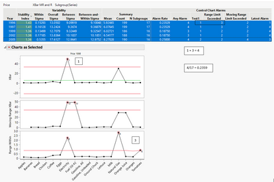
In the picture below you can see both issues for items 1 and 3:
- There are no lower control limits on either of the dispersion charts and the platform does not respect any violations of the LCL (which is an issue for -R or -S or the within charts in three-way charts) and thus, leads to a incorrect alarm rate.
- For the electricity subgroup, it is out of control for both the X-Bar and Range within charts and thus is counted as two alarms, when it should only be counted as one (as the denominator is the number of subgroups). Thus, the alarm rate should be 3/17 not 4/17.

If for some reason item 1 from above cannot be added on, at the very least, then the names should be changed to “Upper moving range limit exceeded” and “Upper range limit exceeded” so that the user won't assume that they include both due to the current naming convention.
Why is this idea important? This is important for the following reasons:
- You should get the same results from both Control Chart Builder and Process Screening, especially since Process Screening will send you to Control Chart builder as an available feature in the platform.
- Tracking and understanding within process variation is just as important as variation between the means and is especially critical when using three-way charts.
- Different companies will have different priorities on what alarm rates matter and thus the user group should be able to control what to display in the Process Screening platform (e.g. whether to turn on or off LCLs in MR and R charts).
Whew, hopefully that came out clear. Please let me know if I need to clear anything up!
Steve