Hello,
I believe the graph builder is the best part of JMP. It is very powerful and allows to make a lot of visualization in an easy way, much quicker than you could ever do in Excel. I'm also pretty sure that a lot of JMP users use only the graph builder and barely any other functionalities, so I believe there is a strong business case to keep improving it.
So, GB is great but it kinda lacks polish. It feels like all the graphs I make look the same. Always the same layout and colours.
Always with this same basic look, with a really oldschool win98 feel to it. Everything is one solid colour, no difference between outline and fill colour, no effects of shadow, transparency, perspective, everything is flat.
Wouldn't it be nice if we add some options to customize that? You know, all the small things you can do in Excel to make graphs pretty.
For examples, giving bars in bar chart a different aspect. Hatch patterns, hollow bars, 3D bars, etc.
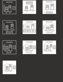
Being able to easily choose where the legends are, having a few pre-selected layouts, like these models from Excel:

Being able to more easily change various aspect of a graph. Example: I want to place a graph on a powerpoint presentation and the axis legends are a bit small. I would be much quicker to have a Font Size button in a toolbar, rather than having to open a separate window for this. Same for changing colours and other elements.
Being able to resize everything in the graph builder. There are some situations where the text is a bit too long for the legends, so sometimes you end up with a legend taking half the space of the graph. Especially if you use overlay/colors etc. Being able to easily change this would be great.
A good way to do this would be for each element in the graph to behave like a Text box. I mean Text box in the sense of how they behave in MS Word/ Powerpoint, that you can just click on and resize. Even better would be if this could be pasted in powerpoint in the same way an excel graph is pasted. (where it can still be edited and resized).
Also there are some visualisations that are missing.
for example scatterplot on top of bar chart :

I don't believe one can make spider charts either:

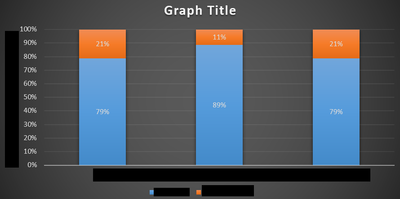
Here is an example of a better looking graph, you can make in Excel, in one click from an existing graph:

Isn't that a hell of a lot nicer to look at than the one below?
