Hello,
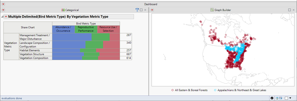
I have a bunch of fields with multiple response data that could be useful for filtering a large dataset. While the histogram platform can be used to summarize multiple responses for a single column, it is often the 2-way interaction between multiple response columns that would be more useful for filtering. The image below shows an example. The share chart on the left was created using the multiple response tab of the categorical platform. Currently, the share chart is static. However, it would be AWESOME if I could click on any combination of x/y values in this graph (using it as a selection filter) to subset the points on the map (e.g., show only the studies that compared vegetation structure with resource use/selection, etc.). These types of interesting and useful 2-way interactions are common in studies that collect multiple response data for many different variables. If I created a dashboard like this that included a dialog box allowing people to choose from a list of multiple response fields to set as x or y variables in the share chart, this would be a very powerful way to filter large datasets.
Also, it is currently possible to sort share charts from high to low response values (e.g., the chart below is sorted this way, where abundance/occurrence is more common than resource use/selection). However, I haven't been able to find a way to sort the x axis for these charts from highest to lowest number of cases (e.g., in this example, the vegetation structure level, with an n of 687, would be on top and habitat elements, with an n of 257, would be on the bottom. It would be great if this kind of sorting were possible. I hope that others think this might be useful. For me, being able to create a selection filter like this would make a world of difference. I've attached a jmp report with this dashboard, in case this might help.

2wayMultipleResponseShareChartAsSelectionFilter.jrp