Similar to predictor screening, the idea is to get a list of columns ordered by their contribution explaining the variability within X containing missings and/or outliers.
In PCA, one can plot the partial contribution of the variables. However, this visualization does not consider the different importance between PCs. The eigenvalues table includes the percentage of data explained.
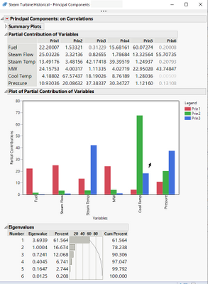
In the PLS platform, this is possible. PCA requires now multiple manual steps.
See the answer here:
https://community.jmp.com/t5/Discussions/PCA-total-variable-contribtion/m-p/338594#M58665