cancel
Showing results for 
Show  only  | Search instead for 
Did you mean: 
Choose Language Hide Translation Bar

Plotting several trends from sensor data that have different units (or scale)

The GraphBuilder can be used to visualize sensor data as Y's and a DateTime as X to make trends.


However, when Y's have different units or scales, the only way is to pre-standardize the columns and plot them all together.


An axis default option that allows this visualization without having to transform the columns will be very essential for new JMP users that are getting data from their manufacturing systems (e.g., Osisoft PI in JMP 17).


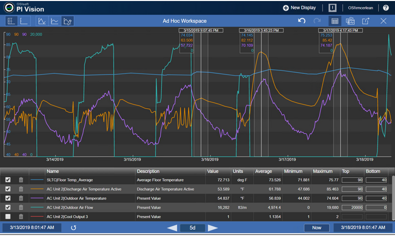
See how it is done in historians below (+video).
ad_hoc_trending.png


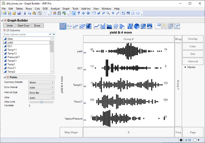
To be clear, this is already standard in JMP, but only if you put variables in one axis:
FN_0-1678228718317.png

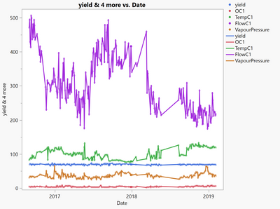
Again, the moment you add an X variable (DateTime), the plot squeezes variables using only one scale.
FN_1-1678228829497.png


12 Comments
markschahl
Level V

So, I typically put each variable in its own lane (separate y against common x) to get around the scaling problem. However, it would be nice if the crosshairs tool gave the y-values for all the y-variables on the plot. What is shown above is a very common thing that those of us that work with time-series sensor data do: we want to know all of the y-values at a given x-value and for other x-values.

ih
Super User (Alumni)
Super User (Alumni)

FYI @markschahl, the hairline idea is submitted here: Multiple plot and variable crosshairs or new hairline tool 

Status changed to: Acknowledged

Hi, thank you for your suggestion! We have captured your request and will take it under consideration.

Status changed to: Needs Info

Hello @FN! Thank you for submitting this request. I have a few questions for you to help us prioritize this wish.  

  1. I think I know the answer to this one, but in order to make these graphs, do you typically leave JMP and use other software or use a workaround in JMP?
  2. Would the solution below offered by @markschahl work for you? If no, would the solution work for you if we fixed the crosshairs tool as proposed?  Why or why not?
  3. Is this a very standard way to graph data in your industry? Would alternative graphs that get the same message across be accepted, or is it a requirement to have a Multiple Y-Axis graph? If so, why? 

We are trying to consider other solutions because the Multiple Y-Axis graph is generally not considered a best practice in the data visualization community.  Let me know what you think!

FN
Level VI

Hello @Sarah-Sylvestre,

With JMP 17 and the option of getting data from Osisoft PI (or this and this add-in), JMP users cannot create the same graphs. Thus:

  1. Not only leaving but even hesitant to start with JMP! There are plenty of alternatives in manufacturing that handle these data visualizations online, better than one sensor per lane (Y-axis).
  2. Unfortunately not, trends are better seen together for a specific asset. For example, perturbations and how the control takes care of these over time.
  3. It is a standard. I agree that adding multiple Y axis is not pretty, as you start to accumulate scales. I think the solution from PI Vision (see example), having this as an auto/manual option (see image below), is the best for handling multiple sensors. The scales and crosshairs can still be interactive when the user highlights the trend of interest.

Again, JMP needs to improve its native capabilities for sensor data as soon as possible (see missing sparklinesmultiple crosshairs).


FN_0-1675802669529.png


FN
Level VI

@Sarah-Sylvestre, I added more information to the wish. This functionality exists in JMP as default but only if you visualize data as multiple Y axis. When you add an X variable, this behavior changes.

Status changed to: We like it! (in the queue)

@FN Thank you for adding more information. We have reviewed your request and think it will be a great addition to JMP. This request is in the queue of items to work on in a future release (note: not necessarily JMP 18).

Steve_Kim
Level III

Hello~! Thank you for sharing the information.

Currently, I cannot draw the multiple Y-axis graph except OSI PI or Unicon program. 


I hope JMP graphic builder also can support multiple Y-axis in a graph as followings: 

Many thanks! : )


Multi axis graph Demo example.jpg

FN
Level VI

On the same note, sometimes we have sensor data that has gaps in time. For example, a sequence batch processes that are different products (A, B, C, C, A, A, and I only want to see As).

This is something Graphana is starting to support.


time-regions-in-time-series-panel-grafana-10.png

https://grafana.com/blog/2023/06/13/grafana-10-release-all-the-new-features-to-know/
There is already a wishlist related to this need, as this is not something easy to do in JMP.

https://community.jmp.com/t5/JMP-Wish-List/Add-easily-configurable-axis-breaks-to-the-Graph-Builder/...
https://community.jmp.com/t5/Discussions/How-to-insert-X-axis-break-in-graph-builder/m-p/525673#M750... 

Hello everyone @FN @Steve_Kim, thank you for the continued discussion on this wish! It is always helpful to have more information. Development work has started on this, but it is a fairly large effort, so it will likely be released JMP 19.