cancel
Showing results for 
Show  only  | Search instead for 
Did you mean: 

JMP Wish List

We want to hear your ideas for improving JMP. Share them here.
Choose Language Hide Translation Bar

New type of cross hair for line and smoother type charts

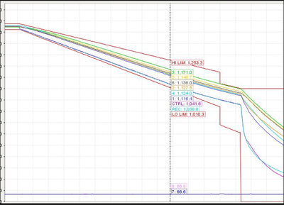
What inspired this wish list request? I use another program where there is an option to have a vertical line on the x axis and all the values for the lines/curves that it goes though the values show along the line.  This is really useful for seeing the values of multiple Y's at a x axis value point.


What is the improvement you would like to see? 

Here is an example of what it looks like, I can see what the values are for all the curve at the same time.  The value boxes are stacked in the order that the lines are vertically.
shampton82_0-1710854872816.png


Why is this idea important? This makes understanding curve data a lot easier that having to move the cross hair tool up and down and try and remember the values or write them down.


2 Comments
hogi
Level XIII

Here is an example of how it feels like :


Plotly graph  from Highlighting Axis labels corresponding to selected data points. 


hogi
Level XIII

Very nice: this functionality in combination with  Traffic Lights and Gauges in Jmp Dashboards :

please have a look at:
https://www.svk.se/en/national-grid/the-control-room


Things like this are already possible in JMP - just design your own gauge, take this appraoch:  Can JMP graphics have this effect?  

and use it to interactively control the gauge.


... but everybody will agree that it will feel 100% better if the gauge gets updated automatically during the mouse movements
- and not just by click and drag  (like in   Can JMP graphics have this effect?  )