What inspired this wish list request?
As a reliability engineer, I frequently use the Life Distribution platform for its distribution plotting and fitting capabilities. These plots are important not only for internal topics but also for critical customer communications. Unfortunately, the method of plotting data points in this platform changed in JMP 17 in a way that is less desirable.
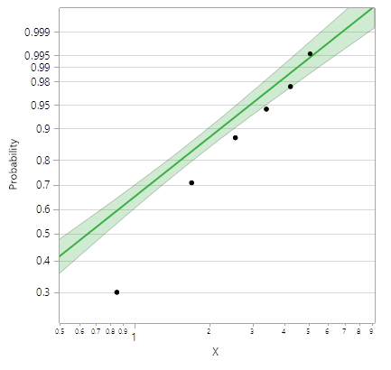
These plots are often used to demonstrate the quality of fit of a distribution model to data. Such demonstrations can be crucial in obtaining acceptance. The Kaplan-Meier / Turnbull estimates used in JMP 16 were appropriate for this, as a good MLE distribution fit often came close to the estimates. For example, see the Weibull MLE fits below (same data table, different versions). Both MLE Weibull fits are identical, however JMP 17 points are significantly below the fit. This change to the default behavior is troubling - now I must question which version of JMP was used when reviewing plots.
JMP 16 – “great fit!”

JMP 17 – “not such a great fit?” (same fit!)

In JMP 17 the user can select Points (black, default) / Step Function (red) / Both / None. Both selected below:

However there are a some issues with this:
- User has no customization options for the red markers (which are what should be default). Need ability to adjust color, marker, size, etc. just like regular markers.
- Buggy behavior: selecting Step Function does not work when going from one of the other options. It works when the platform is first launched if selected as platform default in preferences, however when toggling from Points back to Step Function it once again shows nothing. Even if selected as default in preferences, once the “Nonparametric” distribution is deselected the red markers disappear and can only be recalled if “Both” selected.
What is the improvement you would like to see?
The default point positions should be the “step function” points (Kaplan-Meier / Turnbull estimates) to be consistent with previous versions. It would still be nice to be able to select midpoints, however each option should have full marker customizability.
Why is this idea important?
These plots are often used to demonstrate the quality of fit of a maximum likelihood distribution model to data. Such demonstrations can be crucial in obtaining acceptance. The previous default Kaplan-Meier / Turnbull estimates were appropriate for this, as a good MLE distribution fit often came close to the estimates. Deviating from this now with JMP 17 causes confusion and is inconsistent with previous versions.