I feel the attributes gauge analysis platform needs improvements to increase visualization aspects of the reports and to make the report tables easier to understand. The version I am using is JMP Pro 16. The first point involves comparing agreements between two raters on whether a part is non-conforming or not. JMP's report produces a Gauge Attribute Chart showing on which part there was an agreement or not. The only agreement table provided is
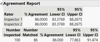
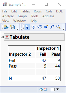
which doesn't show the breakdown by each rater. That requires generating a Tabulate report shown below which I feel should be included in the report.
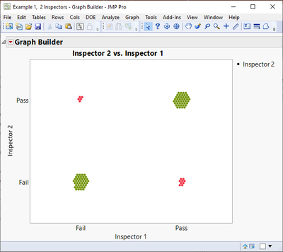
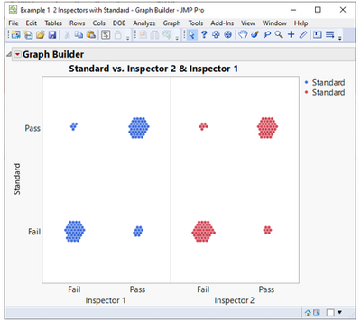
Equally important would be to show the data visually using a graph like the one created in Graph Builder shown below.
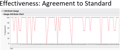
When dealing with a comparison to a standard by raters, there is an additional feature not mentioned in the JMP Documentation. To get an effectiveness chart requires unchecking agreement choices in the Attribute Gauge red hotspot and selecting all the effectiveness choices to get the useful graph below.
I feel the effectiveness report tables on misclassification to a standard are a bit confusing. See below.
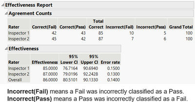
I suggest that the table below is much easier to understand.
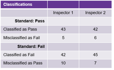
In addition, the table is much easier to comprehend using the graph shown below.
For further examples of the ideas discussed, please see my On-Demand presentation for the 2022 JMP Discovery Summit:
https://community.jmp.com/t5/Discovery-Summit-Americas-2022/Drones-Flying-in-Warehouses-An-Applicati...