What inspired this wish list request?
I was trying to make some errors easily visible in wafermaps and started playing around with Fill Selection Modes. I managed to make my graphs visual enough (but there is no "perfect" option), but I could make it even more visual if I could combine multiple modes (at least two). Also changing and trying out different options requires me to go through multiple menus using mouse.
What is the improvement you would like to see?
I have few suggestions regarding Fill Selection Mode in JMP graphs to make JMP visuals provide more information quicker. There are a lot of different situations where JMPs default option of Selected Patterned isn't really that helpful. I will use Wafer Stacked.jmp as an example dataset for most of these with this starting situation (stacked wafermaps and Defects mean used as color) and I have selected some random areas. There are a lot of other situations where diffee
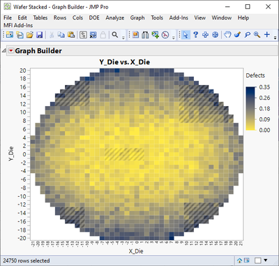
Not very easy to see QUICKLY what has been selected if I'm using default option "Selected Patterned".
1. Let us combine multiple Fill Selection Modes OR provide new options which have these combinations predefined
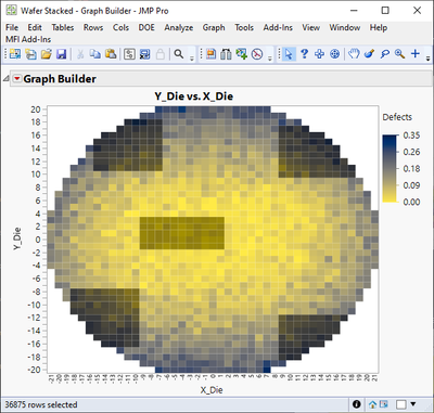
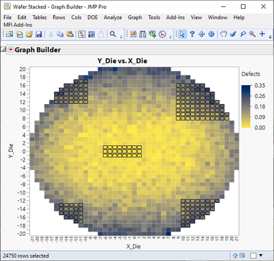
Depending what you are trying to present, you might want to highlight your graphs in different ways. In this case I would like to quickly highlight the specific areas of wafermap. Few selection modes work quite well
Selected Darkened
Selected Outlined
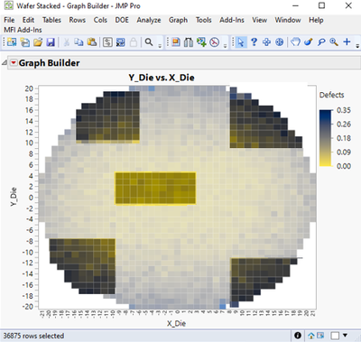
Unselected Faded (best for this case in my opinion with current options)
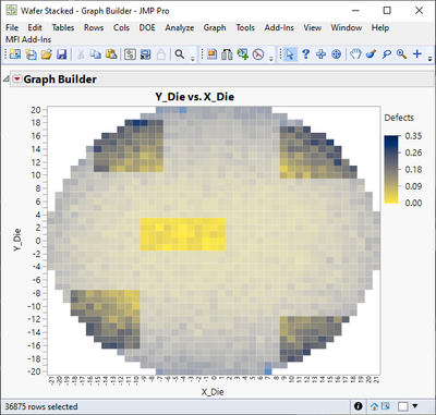
And finally Selected Same Color (otherwise good but it is difficult to change the color AND I will lose information on the graph, so I wouldn't use this in this case)
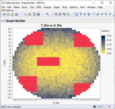
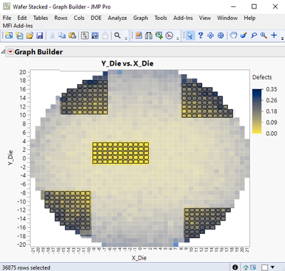
But what I would like to do is to combine these (at minimum two) or at least have few new options. I would like to combine at least Selected Outlined+Unselected Faded or Selected Darkened + Unselected Faded.
Demonstration of Selected Outlined + Unselected Faded
And in this case maybe better option Selected Darkened + Unselected Faded
2. Let us easily change the Fill Selection Mode without always going though the hassle of right-clicking the graph
Drop-down menu toolbar could be one idea, similar to data table list in Script Editor (of course dropdown wouldn't work unless they are checkboxes if we can make our own combinations). I will most likely write my own add-in which will let user to go to next selection by pressing a button (or shortcut key) for now.
3. Let us easily change the "Fill Selection Color" from somewhere else than JMP Preferences or make the color choice somehow smarter.
Currently I don't know if this color can be changed anywhere else than preferences and depending what I'm doing, the preference color might be very bad.
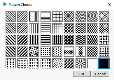
4. Maybe nice to have in some cases let us define which Pattern to use when using Selected Patterned
Sometimes different pattern could solve a lot of visual issues. We do have a lot of different patterns already available, they are just "never" used
Why is this idea important?
Makes JMPs visuals more visual, quicker and more easy to use.
Other
Other a bit similar suggestion for just graph builder and marker selections: Graph Builder: Marker Selection mode -> multiple selections!