When analyzing sensor data, it is common to filter multiple rows (e.g., removing shutdowns, weekends, certain product grades in batch processes, etc.)
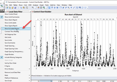
This is not possible to do in JMP, while other software handles this automatically (see Grafana or another user requesting a similar feature here). Yet, the control chart builder has this functionality, limited to run charts only.
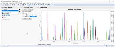
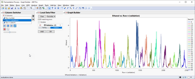
Let's say I want to look at a group of events only.

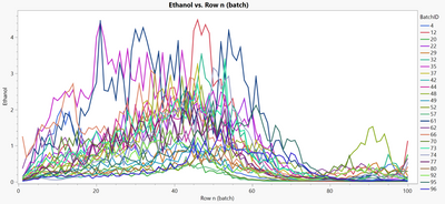
I would expect to have an option to transform this view into this automatically.

In the control chart builder, you can get this plot after some configuration:

Lastly, an index per event will be also good to have as an option.

JMP needs to improve the capabilities for sensor data (not only tabular), especially now that native connectors to historians are possible.
Industrial applications of these visualizations can be found here, including an alignment when events have different durations:
https://arxiv.org/abs/2209.09660
Fermentation Process example.jmp