Don’t miss your chance to experience Discovery Summit Europe at our best available rate! Early bird registration through 31 Oct.
Graph Builder Toolbar streamlines interactive graphing. Creates shortcuts on Report and GraphBuilder Helpers toolbars. Download and install the extension.
JMP will suspend normal business operations for our Rest and Recharge Day on Friday, October 2, 2026.
Regular business hours will resume on Monday, October 5, 2026.
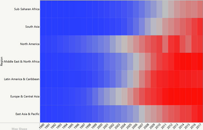
Individual "tiles" can represent several rows of the data table (geographic region: data of many countries). Then the values of the rows are averaged automatically. This is very convenient
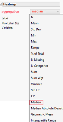
- but "averaging" (mean) is just one option ...
If the user wants to do different aggregations, he has to generate a summary table or use a formula column with exactly the same grouping settings as the desired heat map:
Can't user already do this by using Color property and by changing summary statistic in that? If no color column is defined heatmap will use Count (that is really only thing it can use without "third axis"?).