- New to JMP? Let the Data Analysis Director guide you through selecting an analysis task, an analysis goal, and a data type. Available now in the JMP Marketplace!
- See how to install JMP Marketplace extensions to customize and enhance JMP.
- Subscribe to RSS Feed
- Mark as New
- Mark as Read
- Bookmark
- Subscribe
- Printer Friendly Page
- Report Inappropriate Content
JMP Wish List
We want to hear your ideas for improving JMP. Share them here.- JMP User Community
- :
- JMP Wish List
- :
- Graph Builder Smarter SEM Error Bars Collapsing Replicates Informed By A Selecte...
Graph Builder Smarter SEM Error Bars Collapsing Replicates Informed By A Selected Variable
RE: Case Number 00060333/ 00055270
Brief Take Away: I'm requesting a drag-and-drop feature in Graph Builder to collapse multiple data points across a selected variable of interest [e.g. the "opposite" of overlay], with the goal of informing smarter SEM Error Bars determined by the N of the remaining number of data points displayed. This corrects multiple statistically misleading or incorrect visualizations and drastically increases efficiency that currently requires numerous work arounds that currently make exploring complex datasets challenging. This feature would make JMP incredibly more powerful.
What inspired this wish list request? My name is Brian Sweis, MD, PhD. I am a psychiatrist and a behavioral neuroscientist working at Mount Sinai Hospital in New York City. I primarily work with mouse behavioral data generating very large and complex datasets. The tables I create in JMP to analyze my data have many different types of data including simple items like daily body weight measures or more complex task performance measures like trial reaction times tested on a decision-making task, where I may sometimes have 500 trials as separate rows per mouse x 40 mice x 60 days, easily getting to 1 million rows. I often am analyzing averages across mice, slicing my data in many different ways, including limiting analyses to a particular week of testing, or perhaps to only the first 10 trials of a given day or even multiple days, and so on. When I generate figures, exploring this vast dataset with Graph Builder fluidly is key. I often need to plot the Standard Error of the Mean on bar or line graphs, where in behavioral neuroscience, the desired error term for N samples is at the level of the number of organisms / mice. In datasets where I have numerous replicates or samples, particularly if it's a measure taken multiple times within a day or across days, and I want to plot group averages as described above, the SEM error bars are often incorrectly underestimated because N in graph builder is using the total number of samples in the display (e.g., sometimes N=5,000 samples if binned across days when really I need it to simply be N=40 mice).
What is the improvement you would like to see?
I stared a long thread conversation with JMP support team member via email. We ultimately decided together that the feature I would like would be extremely valuable if implemented correctly natively within Graph Builder and is not currently possibly without numerous work arounds involving having to generate many additional table summaries, columns of data, or scripts that quickly become untenable when the number of variables increases or if the ways the data are binned need to keep changing.
I will illustrate with a series of screenshots sample data, the problem, and a potential solution below.
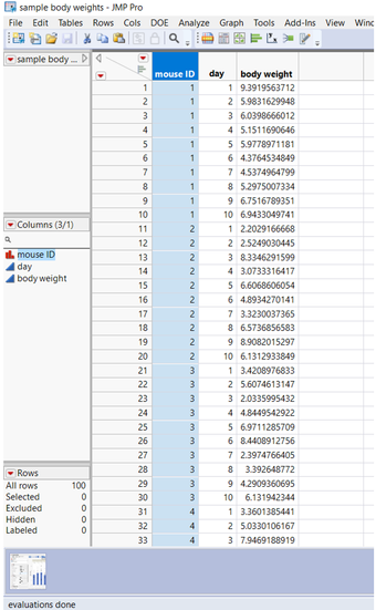
First, here is example data for the bodyweight of 10 mice taken each day for 10 days, so N=100 samples total.
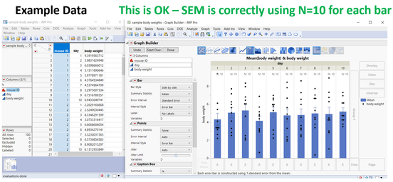
Next I will plot these body weights averaged across 10 mice, split by day when dropped in Group X on Graph Builder.
You can appreciate N=10 dots per day level. Here, average and SEM error bars are correct and as desired. This quickly becomes problematic below.
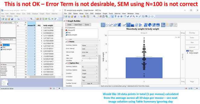
By simply removing day from Group X, all the data are polled together collapsing across days, but now we have all 100 samples displayed here. Each mouse shows here 10 times. Here, average is ok, but the SEM error bar uses N=100 as the error term, and not n=10 mice which almost always should be the case in behavioral neuroscience. It's a simple and common problem that would be incredibly useful if JMP builds in a native solution within graph builder. See below at how this gets more complex that can't be solved easily with current work arounds.
The obvious thing to do is use the Table Summary feature.
I often have to lean on this, but am usually left having to make hundreds of table summaries from my original dataset when I have more complex variables. When exploring my data, this gets out of hand very, very quickly. And it usually is in combination with a complex arrangement of having to apply data filters, making summaries of summaries, and so on and so forth.
One of JMP Support members suggested adding new columns where it calculates the average across the 10 days per mouse, and you can see below, this sort of works, but is quite cumbersome just for a single variable like body weight, and would not lend well to a table that has for example 100 other variables that are much more complex like behavioral task performance measures. That alone would add 8 columns x 100 variables and become unmanagable. Even extracting the formula for such columns and replacing the variable that the formula is using is not ideal and extremely manual / laborious.
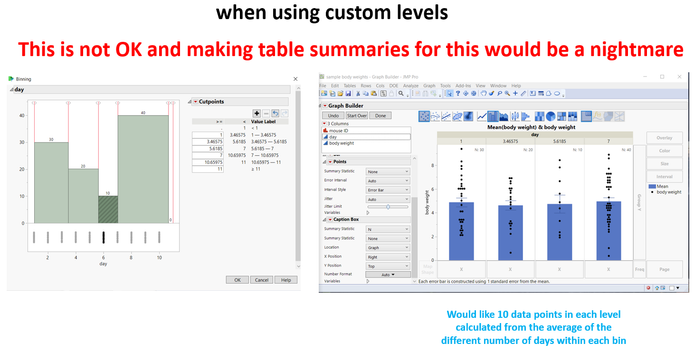
This is especially true if I want to subdivide my data but multiple levels, especially if the levels are made up of asymmetric data points. And especially if I'm exploring my data in graph builder and am often changing these binning parameters on the fly. See below.
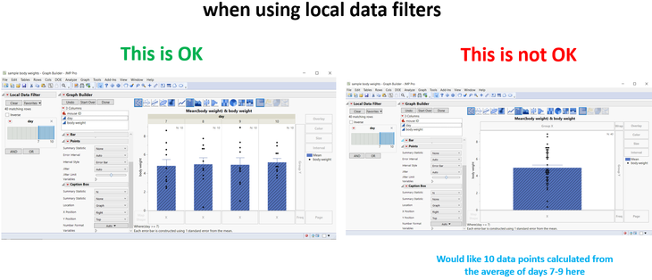
Here's another use case where I am also using local data filters to subset my data. This becomes evermore problematic to implement with scripts or new columns.
You can see that if I subset and include only days 7-10, on the left, when I split by day in Group X levels, of course it displays n=10 per bar just for the selected days as intended, but the pooled data on the right still has n=40.
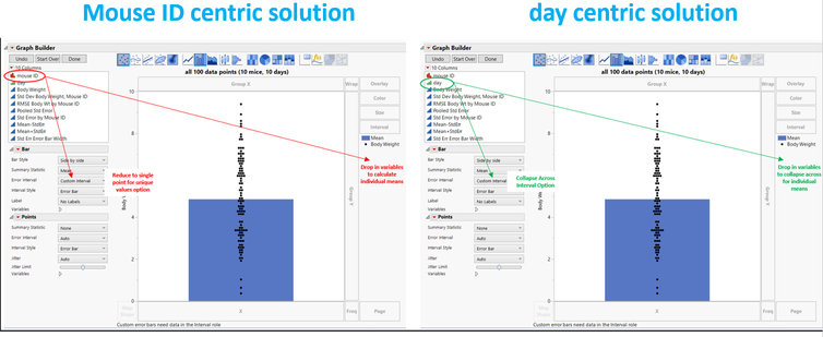
Essentially, the optimal solution would be to implement a way to drag and drop a variable of interest in a new drop zone in graph builder. Below, I describe two possible solutions that I am imagining:
On the left annotated in red is a "mouse ID" centric method, either as a way to drop in mouse ID on graph builder and / or as an option to select in the error interval / error style option where the goal would be to reduce the 10 data points per mouse into a single data point per mouse natively all within graph builder here. Thus, we can tell Graph Builder at the end of the day what variable we want to determine the error term (e.g., via unique values, averaging across the remaining dots). On the right annotated in green is a "day" centric method - the variable I don't care about in this particular example and that I want to collapse across. Think of this as the "opposite of overlay" - instead of splitting by this variable, I want to collapse the data across this specific dimension (essentially the same as me intentionally leaving day out of the Table Summary grouping variable). I have a sense that the red-method makes more sense, but that the user may want to inform somehow which variable I'm explicitly trying to collapse across (e.g., day). Regardless, both would lead you to the idealized bar graph with the correct error term (n=10 total data points, 1 per mouse). When exploring data visually in graph builder, this could solve the more complex examples I describe above (e.g., with custom levels, data filters, etc).
Why is this idea important?
Having a rapid way to make smarter error bars adjust using my suggestion would making exploring complex data sets highly efficient if directly built into Graph Builder, natively. This corrects multiple misleading or statistically incorrect visualizations that often do not represent the underlying analyses many scientists and researchers perform when using individual organisms as the assumed error term. This avoids numerous work arounds that either quickly become cumbersome, untenable, or impossible to manage with larger or more complex datasets. This level of control in Graph Builder would be unprecedented and I think would be a unique and incredibly powerful tool.
You must be a registered user to add a comment. If you've already registered, sign in. Otherwise, register and sign in.
- © 2026 JMP Statistical Discovery LLC. All Rights Reserved.
- Terms of Use
- Privacy Statement
- Contact Us
