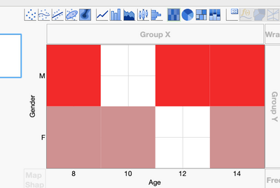
Whenever I create a heat-map in Graph Builder with categorical data, I end up with odd gridlines that don't make sense:

The axes "Show Tick Labels" option is usually set to "Automatic". I'd like to suggest that "Automatic" set the tick labels to "Short Divider" (or "Interval Tray") for heat-maps with categorical data.
Folks on my team have complained about this verbally before so I'm not the only one.
Thanks for considering this!