cancel
Showing results for 
Show  only  | Search instead for 
Did you mean: 
  • DownloadSemiconductor Toolkit: Tools to create wafer maps, add wafer geometry to graphics, explore die defects & compare wafers.
  • Discovery Summit 2026: Early User Edition - September 23-24.Register. It's free.
  • Use JMP Clinical with CDISC-compliant data. Review studies, ID safety and efficacy signals & communicate findings with interactive graphics. Register to see how. Aug. 27, 2 pm US ET.

JMP Wish List

We want to hear your ideas for improving JMP. Share them here.
Choose Language Hide Translation Bar

Graph Builder HeatMap Tick Labels -- change "Automatic" setting

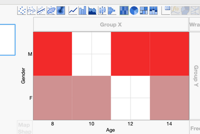
Whenever I create a heat-map in Graph Builder with categorical data, I end up with odd gridlines that don't make sense:
 

BHarris_0-1689693915209.pngBHarris_0-1689693915209.png


The axes "Show Tick Labels" option is usually set to "Automatic".  I'd like to suggest that "Automatic" set the tick labels to "Short Divider" (or "Interval Tray") for heat-maps with categorical data.


Folks on my team have complained about this verbally before so I'm not the only one.


Thanks for considering this!

2 Comments
hogi
Level XIII

Or: change the logic behind "automatic" for categorical data :)
-> i.e. don't use the default short/long mark.


long dividers look also nice ...


cool that there are so many options :)

hogi
Level XIII

hm, strange that we don't get more supporters here.

A setting in the preferences would be awesome.

It would save me at least 10 minutes a day.

And a lot of frustration - because with every tiny change the setting flips back to the bad one : (