Focus - Ease of Use / Efficiency:
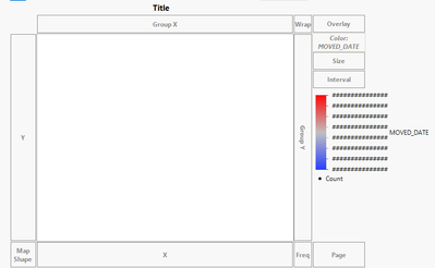
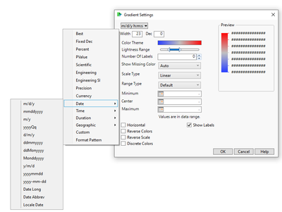
Every time I add a date field in the "long date" format as the "color" option, the gradient that pops up shows ######### for the actual values. It does not matter what size the window for the graph is or how short the name of the field is. The only way to fix it is to go into the Gradient settings and select a short date version (ex: m/d/y). This requires a minimum of 6 mouse clicks - for those who know how to do it. The #### output is not useful in any way and even if I cared about the time portion, if it isn't visible, it isn't useful. If the visual output will show as #### due to lack of space, could JMP default to showing a short date version instead?
This applies when creating graphs on the fly as I investigate data - not for longer-term standard analysis via scripts.
Example of how the Date field shows the not useful gradient ranges in long date mode:

How to get to the gradient setting to change this to a readable output:
