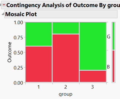
We often use a contingency analysis to show outcomes across groups. However, there is no visual indication on the plot of confidence intervals, giving users no idea about whether the differences are significant or not. What I'd suggest is more like the 2nd image below. Confidence intervals should be calculated using, for example, Agresti-Coull, Clopper-Pearson, etc (https://en.wikipedia.org/wiki/Binomial_proportion_confidence_interval#Agresti%E2%80%93Coull_interval)

