cancel
Showing results for 
Show  only  | Search instead for 
Did you mean: 
  • DownloadSemiconductor Toolkit: Tools to create wafer maps, add wafer geometry to graphics, explore die defects & compare wafers.
  • Discovery Summit 2026: Early User Edition - September 23-24.Register. It's free.
  • Use JMP Clinical with CDISC-compliant data. Review studies, ID safety and efficacy signals & communicate findings with interactive graphics. Register to see how. Aug. 27, 2 pm US ET.

JMP Wish List

We want to hear your ideas for improving JMP. Share them here.
Choose Language Hide Translation Bar

Confidence interval for proportions in Contingency Analysis

We often use a contingency analysis to show outcomes across groups. However, there is no visual indication on the plot of confidence intervals, giving users no idea about whether the differences are significant or not. What I'd suggest is more like the 2nd image below. Confidence intervals should be calculated using, for example, Agresti-Coull, Clopper-Pearson, etc (https://en.wikipedia.org/wiki/Binomial_proportion_confidence_interval#Agresti%E2%80%93Coull_interval)
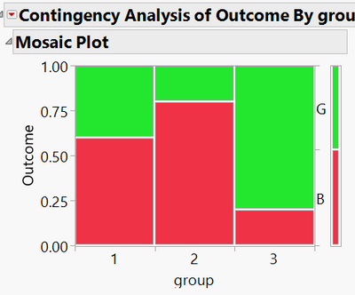
bayesfactor_0-1587491835626.pngbayesfactor_0-1587491835626.png

bayesfactor_1-1587491983679.pngbayesfactor_1-1587491983679.png


2 Comments
bayesfactor1
Level II

+1.  The number of times we make a poor decision because someone glances at these charts without confidence intervals really sets us back. I suggest everyone use python or R because of this deficiency.

Status changed to: Acknowledged

Hi @bayesfactor, thank you for your suggestion! We have captured your request and will take it under consideration.