cancel
Showing results for 
Show  only  | Search instead for 
Did you mean: 
Choose Language Hide Translation Bar

🙏 Column Property: Inclusive Values

☑ cool new feature
☑ could help many users!

☑ removes something that feels like a „bug“

☐ nice to have

☐ nobody needs it


#myTop10_2024


What inspired this wish list request? 

During the Semiconductor Lunch meeting @ Discovery Summit 2024 Europe, we found out that many of us have a similar problem:


GraphBuilder Plots with missing data.


examples:

- date with missing month, day, year ( A way to show a date with no data in graph builder )

- wafer lists with missing wafer (for 25 wafers in a 5x5 grid generated via Wrap, wafer #20 should always be at the same position, independent of how many wafers < 20 are in the data / missing)

- wafermaps with missing dies

- pass / fail

- bins with pre-defined categories (0 occurences for a specific bin)

...


Motivation via date: 

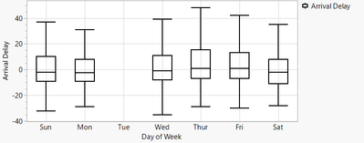
at first glance, nobody will notice that the data for Tuesday is missing - there is not even a label on the axis.

hogi_0-1709901602034.png


To make the missing day appear, one can add a dummy row, Day of Week = Tue, all other entries of the row: missing.

hogi_2-1709902791106.png

hogi_3-1709902875272.png


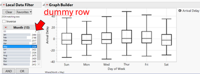
... till somebody uses a data filter:

hogi_4-1709903016702.png


Then we need a dummy row for every item in the data filter.
And if the user has a chance to change the column for the data filter: for every item in any column the user may pick.
Ouch !!!


What is the improvement you would like to see? 

Please add a column property for "inclusive values" *) - values which should always show up on the axis.

For days of week: all days of the week

For 25 "wafers" in a lot: all numbers from 1 to 25.

For pass/fail : pass and fail . Such that one day when there is a lot with 0 fails the plot will say: fails = 0. Instead of: not showing any number of fails.


Besides usage for axes, also X/Y Group & Wrap should react on the new setting. The same for Overlay and Color.


*) "inclusive"? what is the best name for the property? 

- "default value" sounds like 

hogi_0-1711702623483.png

- additional, auxiliary, supplemental suggest that the value is no actual value of the column

- after some discussion, Copilot suggested "inclusive" values - values which should be included, if missing.


Why is this idea important? 

With the new column property INCLUSIVE VALUES,

- missing value information gets visible (!!!)

- the plots can be generated MUCH easier

- the generated plots are "robust" (example with Data Filter!)

5 Comments
shampton82
Level VII

I agree with this request!

Here is an example from my data where when filtering a defect type, parts with no defects disappear:

shampton82_0-1709924123502.png

Thus I have to add in a dummy row or split the data by defect type, make missing values of the defect type columns become zeros, then restack the data.  This in turn makes my file have 10-30X more rows.  If I had the option to turn on a column option that forces the levels of the column to always appear with no data showing as zero that would be a big help!


Steve


hogi
Level XI

Besides Axes, X/Y GRoup, Wrap, Overlay, Color etc.
also Data Filters should use the new column parameter.


At first sight, this sounds weird:

Why does it make sense to show and select a value in the Data Filter that is not in the data table?


The answer:  It can be used to easily fix the current issue with:
 Outlier (👽) screening with Jmp Dashboards - how? / Local Data Filter: option: restrict or do not restrict to current data 

hogi
Level XI

Besides nominal values, there should also be an option to specify the minimum range for continuous values.


At the moment, when I want to restrict a numeric value to eg weight < 100, the numeric data filter automatically creates a lower limit as well.

The disadvantage: the lower limit cannot be set arbitrarily, e.g. >0. it will automatically jump (up) to the lowest value in the data set, e.g. weight > 64.
Next time, when I open the plot again - if there is a student with weight < 64, he/she will not be shown in the plot.


With the new: default settings, one could specify a range, e.g. 0-150 or 0-70 - and prevent the data filter from automatically adjusting to the lowest value of the data table.

hogi
Level XI

@MarijaLind , @jpol 


hogi
Level XI

If you used Map Shapes in Graph Builder - and loved the option Show missing :

This idea is closely related -- but MUCH more general!
it will work
- for continuous values on x & y axis

- for nominal values on x & y axis

- for  Group X & Y

- for page

- for data filters

 -- in Reports

 -- in Tables/summary


It will prevent JMP 

- from showing too few "values"

- from calculating wrong values

- from crashing


.. and maybe more ....


hogi_0-1712252427638.png