What inspired this wish list request?
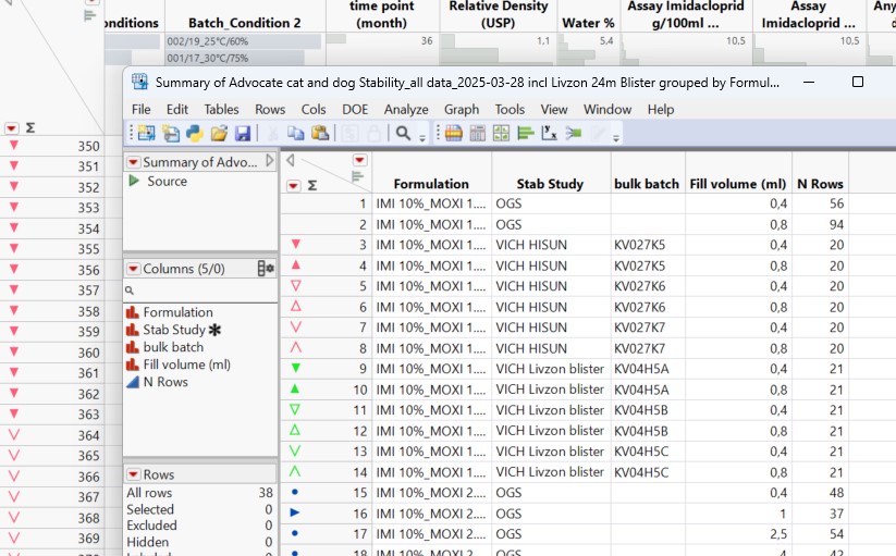
I usually use Summary table to give my rows specific markers and colors to code for e.g. product groups in stability data etc.
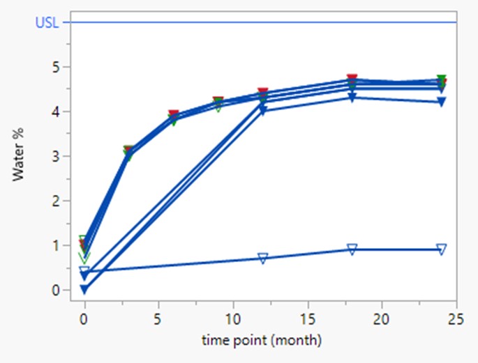
When making graphs using fit Y by X the data points have the right color and marker. When then grouping by batch and adding flexible lines the software typically uses the correct color from the row.
But when then adding and using a local data filter it mixes up the colors so that line and row do not fit any more.
What is the improvement you would like to see?
I would like an option (button etc) to make the software use the row color as line color.
Why is this idea important?
Using same color for data points and lines greatly increases transparency in large data sets.
Change line color manually back to row color costs too high amount of time.