In graph builder, the default min/center/max values for the default three color gradient only work well for normal data. To help this work for other data:
- Change the default values to the 2.5, 50, and 97.5 percentiles to increase the likelihood of a useful graph by default.
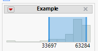
- Introduce a histogram with sliding bars (similar to a local data filter) which would allow the user to move those values around visually.
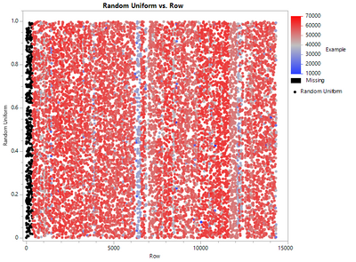
The default settings for this chart:

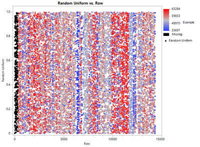
would become:

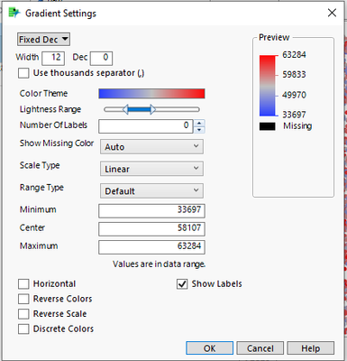
Instead of the user just seeing this:

they would have a chart like this to further adjust the Minimum, Center, and Maximum settings:
