- New to JMP? Let the Data Analysis Director guide you through selecting an analysis task, an analysis goal, and a data type. Available now in the JMP Marketplace!
- See how to install JMP Marketplace extensions to customize and enhance JMP.
- Subscribe to RSS Feed
- Mark as New
- Mark as Read
- Bookmark
- Subscribe
- Printer Friendly Page
- Report Inappropriate Content
Sample Data: 2016 Brexit EU Referendum Results
Scripted to Demonstrate:
- Graph Builder Bar Charts with Error Bars
- Graph Builder Density Distribution Overlays
Source: http://www.bbc.com/news/politics/eu_referendum/results/local
This is just what I have been attempting to do but I have been unable to plot this as a map of the UK in Graph Builder without breaking the data into county levels.
Does anyone have any idea how I can plot this data into a map of the UK but using the Area column?
Thanks for trying out the JMP mapping with the Brexit Results data!
As you have seen JMP includes some maps with the package, but only down to the county level for the UK.
To get down to a lower level (in this case the Area (city/town) level that is in the Brexit Results, you would need to bring in a custom shape map that contains the info to draw each of these Areas. Once you see the underlying tables needed (naming and shape files) you can create your own (a little time consuming) or import in and adapt an already created shape file (probably the best option here). Then put these into the folder your are mapping from in JMP and you should be ready to go. Here is a link to learn a little more: http://www.jmp.com/support/help/Examples_of_Creating_Maps.shtml
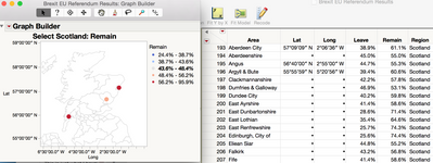
There is another way to view the data that might be helpful as well. If you add both a representative latitude and longitude columns to the datatable for each of the Areas, you can then plot these on a Graph Builder of Bubble Plot over the underlying built-in UK county shapes or any other geographic map. Not the same as having a break out map shape for each Area as you would with a custom mapping view, but might still give you the visual you want.
Shown above is a quick example on just a few rows of the Brexit Results data.
Hope this helps!
Recommended Articles
- © 2026 JMP Statistical Discovery LLC. All Rights Reserved.
- Terms of Use
- Privacy Statement
- Contact Us

