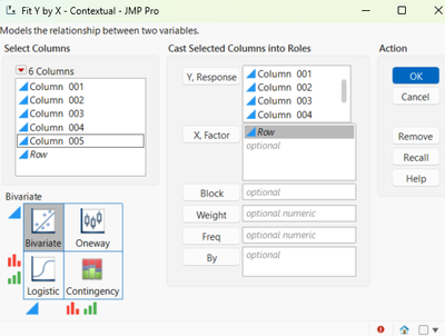
With the deprecation of the Overlay platform, this method provides a quick way to generate multiple trend charts. In this example, the data is structured so that each column contains trend data. For instance, if you have five columns, you can create five separate trend charts.

Steps:
Open Fit Y by X
- Go to Analyze → Fit Y by X.
Create a Row Number Column
- Right-click anywhere in the column list.
- Select Row → Row to add a column containing row numbers. This will serve as your X variable.

Assign Variables
- Select the data columns you want to plot and add them to Y.
- Add the Row column to X.

Connect Data Points
- In the output window, press and hold the CTRL key.
- Click the Red Triangle menu.
- Choose Flexible → Fit Each Value to connect the points.
Bivariate Fit of Column 001 By Row

Bivariate Fit of Column 002 By Row

Bivariate Fit of Column 003 By Row

Bivariate Fit of Column 004 By Row

Bivariate Fit of Column 005 By Row
