Hurricane Maria struck Puerto Rico on Sept. 20, 2017, and left much of the island without electricity for months. The official death toll of 64 has been widely questioned, and a recent paper in the New England Journal of Medicine, Mortality in Puerto Rico after Hurricane Maria, estimated 4500 excess deaths due to the hurricane (95% confidence interval 800-8000).
Official monthly death totals were released a week ago, and the authors of the paper obtained daily death totals since 2015 and shared them in PDF form in a Simply Statistics blog post that further analyzed the data and found about 2000 excess deaths. Raw data is hard to ignore, and I had to explore it myself.
First, let’s look at the data as is (CSV attached). It’s just two fields, date and deaths, so a scatterplot captures everything.
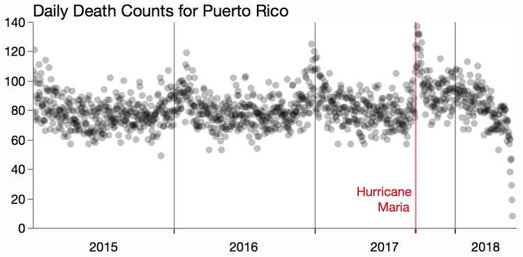
We can see a jump immediately after Hurricane Maria and possibly elevated death totals after that – hard to tell with all the noise. We can also see some winter spikes in previous years. There is a steep drop off near the end of the data, and I’m guessing the totals for the final days are incomplete and will exclude those.
The data is pretty noisy, which is common for rare event data, so I applied a moving average to see the trends. In JMP, you can get a moving average of a column by right-clicking on it and selecting New Formula Column > Row > Moving Average and then select the parameters in the dialog.
I tried a few ranges and picked one that showed the big trends and not much noise: +/-25 days with linear weighting. I also used a BY variable to get different smoothers for before and after the hurricane landfall. Otherwise, the moving average would show a run-up prior to the event.
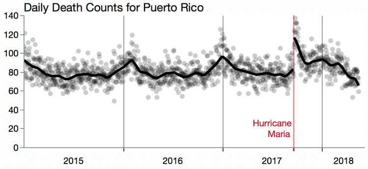
The winter increases are still visible, and it looks like there are some smaller bumps in the summer. Interestingly, the winter increases are not aligned with each other and both peaks fall in 2016, which makes it harder to compare 2015 and 2016. I looked up Puerto Rico flu trends at the CDC and found this graph as part of the report from the Puerto Rico Department of Health.
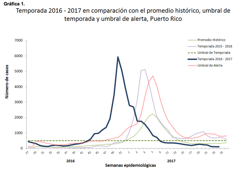
It shows that the 2016-2017 flu season (dark blue) was stronger and earlier in the winter than the 2015-2016 flu season (light purple). That may explain why 2016 had noticeably more deaths that 2015 (in addition to having an extra day). Here are the yearly totals for the calendar years:
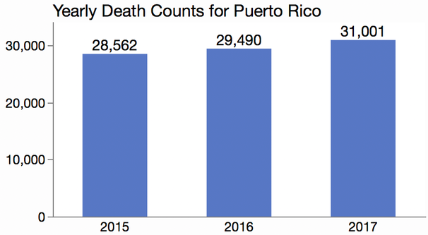
From these totals, we can already suspect that the hurricane led to about 2000 deaths since the total for 2017 is about 2000 more than the average of the previous years. But we can get a better understanding by looking closer.
Wanting to include the early 2018 months, I took a cue from the flu report and shifted the years. I used May – April years instead of January – December years. That nicely gives each interval one flu season which occurs after hurricane season. Here’s a line chart of smoothers for each May – April interval.
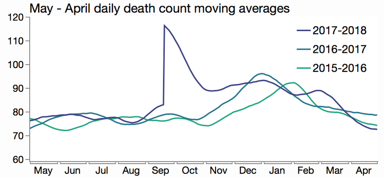
We can see a big gap between the most recent “year” and the others. It would be interesting if we could calculate the area of that gap. And we certainly can sum up those differences in the smoothers, but there is more direct way that doesn’t involve taking differences of smoothers.
Another technique for smoothing noisy data is to look at the cumulative sums. In a way, a moving average is not that different from a cumulative sum since an average is just a sum divided by the count. However, a cumulative sum chart can be harder to read since the scale of the accumulated values can overwhelm the individual values. Here are cumulative sums of the three years.
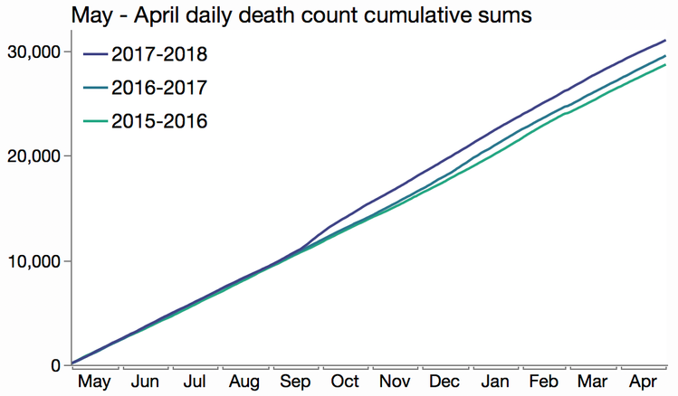
While we can see a gap, it’s hard to see details or even estimate the size of the gap. Cumulative sum charts work best when the expected sum is zero; then the cumulative values stay around zero and are similar in scale to the individual values. We can get such a cumulative sum by looking at the cumulative difference between the last year and a typical non-hurricane year to get a sense of the impact of the hurricane. We only have two other years of data, so about all we can do to estimate a non-hurricane year is to average those two together (the above paper does go further if you’re interested, taking into account changes in population and ages). Here is the cumulative difference:
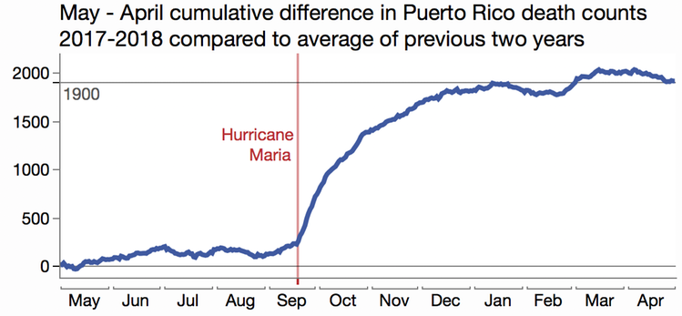
The plateau is around 1900, and the total was already running about 250 above “normal” before the storm hit. In the few months following Maria, there appear to be about 1650 more deaths than in the previous two years. That’s in line with the more analytical approaches, which you’ll need to try to consider things like unreported deaths and other biases.
Cumulative sums have a long history in process control as CUSUM control charts for helping to visualize shifts in a process. In that context, our chart suggests a shift lasted until January 2018, when about 60% of electricity customers had power restored (weekly reports).
Thanks to Rafael Irizarry and his co-authors for sharing this daily data. I’ve attached a CSV file with the raw daily totals from the PDF for anyone else who wants to explore.
PuertoRicoDeaths_2015_2018.csv
You must be a registered user to add a comment. If you've already registered, sign in. Otherwise, register and sign in.