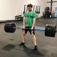
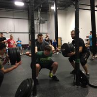
In March of this year (the dumpster fire that is 2020), my world (like pretty much everyone else's) went bananas. Full-blown, off-the-rails bananas. I live in upstate NY and, because of the pandemic, my state collectively decided to have a state-mandated three-month staycation. I’ve never seen anything like it. And for an extrovert like me, it was tricky to navigate. Since I live in a house full of introverts, I had to find some ways to deal with my situation while giving them their space. I turned to exercise.
I’m normally a pretty active person (even if my pre-lockdown waistline disagreed). I love working out and strength training.


My gym went virtual during the lockdown so that we could keep in shape…or at least not get out of shape. At the same time, since my customers are all in NY and NJ (thus also subjected to staycations), I wasn’t traveling ̶ at all. Which really annoyed me, since it torpedoed my plan to go on a pastrami bender at Katz Deli for my 40th birthday. However, the lockdown also meant that I could get in a workout every day. I needed something to fill the hours and it was either cleaning the basement or burpees. My daughter also came down and joined me in our classes, which gave my wife a bit of a breather. (Alas, since the workout space I was "assigned" is in the basement, I did end up cleaning that anyway.)
The staff at the gym also took the shutdown as an opportunity to help us improve our overall health. They helped us examine our health and wellness habits, tracking how much we slept, daily activity, and food intake. Now, me being me, I looked at the spreadsheet they provided us for this data and said, "I bet I could put this into JMP and get some interesting insights." And, me being me, I also have access to JMP and JMP Public, so I decided to tinker with some control charting and data visualizations. Let’s have a look!
Weight and Body Composition
My top line metrics (KPIs, if you like) were my weight and body fat composition. The weight bit was really easy. I have a good scale that measures weight to +/-0.2 lb. It also measured other body composition values like Percent Body Fat. I was, however, really skeptical of the absolute measurement for body fat composition. There’s a lot of data about impedance-based measurements being a little wonky, so I was more interested in the trend than the absolute numbers it provided. Here’s my top-line dashboard (created using Graph Builder, Dashboard Builder and JMP Public:(:(
I have different phases in my charts because of the different goals in each phase, Phase 1 was for establishing baseline values in my diet and learning how to get my diet dialed in for Phase 2. Phase 2 was about getting down to roughly 205 lbs. by the end of the 12 weeks. I averaged around 1.5 lbs. per week pretty consistently, despite some day-to-day variations. As I write this, Phase 3 has just begun; it has a slightly more aggressive goal of reaching ~180 lbs. by the end of November. Right now, I’m averaging about 2 lbs. per week. I don’t have a huge amount of data yet, so that rate might change as things settle in.
As you can see, the body fat numbers do trend down. But they are really noisy. This is consistent with my research. Lots of factors can impact body composition based on impedance measurements, basically anything that changes how electricity would pass through my body would impact this measurement. So again, a statistically significant downward trend is what I was looking for; the rest is pretty much meaningless.
Nutritional Control Charts
After grad school, I went into manufacturing and learned about control charts, which is probably the reason I looked at this data in JMP. The spreadsheet my coach provided me had color coding for when my nutrition values were outside the range he wanted me in. When he explained his spreadsheet to me, I said to myself, "That’s a set of spec limits! I can do that in JMP!" And, yes, I really did say that to myself. And, yes, I immediately reverse-engineered the spreadsheet and ran it through Process Screening. Here are the results, again with the phases:
The phases that I mentioned earlier are more apparent here. You can see things are all over the place in Week 1 of Phase 1, when I’m just getting in the habit of logging things and getting the process together. You might call this Early Stage Process Development, which is always noisy. Week 2 of Phase 1 is where I’m dialing things in (Process Targeting). And then we transfer into Phase 2 where everything is stable, and we just run the process. Phase 3 was a retargeting of the process, which included changing the spec limits for my nutrient categories. The dashboards you see above have the Phase 3 targets and acceptable ranges on them. (Side note: Strictly speaking, I shouldn't have Spec Limits and Control Limits on the same chart. It's a bad habit I picked up somewhere - don't get into it. If you want to know why have a look at our STIPS statistics course.)
Forecasting and Goals
Because I’m pretty consistent with everything in this program, I can do a pretty good job of forecasting the weight-loss trend overall. (See below.) I did this by modeling the weight loss by day as a function of phase, which I can plot in Graph Builder. More importantly, I built a nested regression in Fit Model that allowed me to build a model on the entire data set taking into account each phase of the journey.
Why Does All This Matter?
That’s probably the question that you’re asking. Why would I want to model and control chart my weight-loss journey? Well, for one, the graphs are pretty cool. We are visual creatures, and a graph of the journey is much more engaging than a table of numbers or a spreadsheet.
The other reason is more pragmatic. Weight fluctuates. I don’t eat the exact same thing every day. I don’t exercise exactly the same way every day. All kinds of things impact a person’s health data on a given day or even time of day.
The point with modeling the data is that I get a better sense of a normal range for me. Since modeling the data gives me prediction intervals and confidence intervals for fits, I can also check to see what might be normal noise and what might be something I need to address with my coach. So, all together, I did this for two reasons: 1) data visualization is more impactful and 2) modeling gives me a better way to know if something is outside of expected behavior.
Wrapping Up
And that’s about it. I’ve still got a way to go before I hit my target weight. But the numbers look good, as do my trends. JMP made this analysis really easy (even pulling in the data from the Google Sheet my gym used). I showed the numbers to my coach, and he found it to be an interesting way of approaching wellness.