At the risk of belaboring an already belabored point in this COVID-19 age, numerical data about human beings sometimes mask the context of actual events. Graphics on the other hand can reveal context and illuminate data in ways that numbers alone cannot and can shine a light on the story in your data.
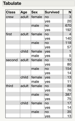
To illustrate the point, let’s go back in time to another historical event. The RMS Titanic sunk tragically in the North Atlantic on its maiden voyage on April 15, 1912. It was thought to be unsinkable at that time when its 2,224 passengers departed Southampton, England, for New York. More than 1,500 of its passengers perished in its sinking, making it one of deadliest peacetime marine disasters. Below is a summary table of some key variables associated with survival on board the RMS Titanic. With some work, you might make out the worst and best mortality outcome groups and their demographics, but it’s not simple using the table alone.

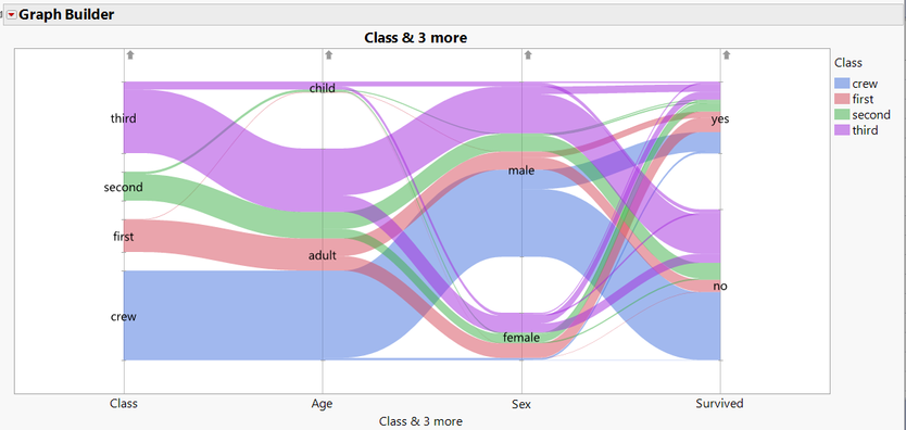
Consider the graphic below in addition to the table above. This is a parallel plot.
This parallel plot consists of curved bands and vivid colors. The plot illustrates, in one picture, some of the key predictors of survival that unfolded more than 100 years ago on board the RMS Titanic in the North Atlantic on April 14, 1912. It turns out that who you were is related to your probability of survival. Let me explain.
Note: I suggest you open the parallel plot above in another browser window. The rest of this article will reference this graphic. This will save you scrolling as you interpret the graph.
How to read the parallel plot
You can read this graph from right to left or left to right. Let’s read from right to left since the question of survival is key here, so let's start there. First, look at the label on the lower right that reads ‘Survived’ and then move your eyes up vertically. You should see that the vertical width of the band is greater centered around ‘no’. These represent all the people aboard who did not survive.
As you continue moving your eyes up vertically, you start to see the width of the bands centered around ‘yes’. These are the people who survived. Which band is wider (vertically-speaking)? You should see that the vertical width of the bands is smaller centered around ‘yes’. You immediately see that many more people did not survive because the width of the bands is greater around ‘no’ than around ‘yes’.
Within each set of bands, you can see color delineations. Each color represents the class group of each passenger including crew members. You can see from the legend labeled “Class” that blue is crew, red is first, green is second and purple is third. What may jump off the page is the large number of crew (blue) who died relative to the number who survived in that group. Most of the crew perished.
Now consider the relative proportions of ‘Class’ in each survival group. To do this, move your eyes to the ‘Class’ label in the lower left of the graph. Then move your eyes up vertically. The width of each group is different, representing the number of individuals in each class. The smallest band widths are the first (red band) and second (green band) that correspond to these two classes. The largest band widths are the crew (blue band) and third (purple band).
Now, reading from left to right and following the crew (blue) band, you can construct a natural language narrative for this group. This is a powerful feature of parallel plots. The narrative might sound like this:
“The crew was the largest single ‘Class’ group on board the Titanic, and they were all adults. Most of the crew were male. Most of the crew perished while a very small proportion of both males and females did survive.”
Let’s read one more for the Class group 'third'. Again, reading left to right, following the third class (purple) bands:
“Third class was the second largest single ‘Class’ group on board Titanic, and they were mostly adults, but there were a significant number of children. Most of third class was male. Most of third class perished, but a small proportion of both male and female adults and some children did survive. Given the large number of third-class passengers, a smaller proportion of them survived relative to first- or second-class passengers.”
If you are interested in producing this parallel plot, the directions for producing it and the Titanic data example are excerpted from JMP Essentials, Third Edition. You can find this simple example and many others in Chapter 3, Index of Graphs. You can also find the source data and examples of parallel plots in the JMP documentation, or you can get the data and a script from my post on JMP Public.
In the parallel plot above, you will see small arrows on top of the plot for each X variable. They look like this:

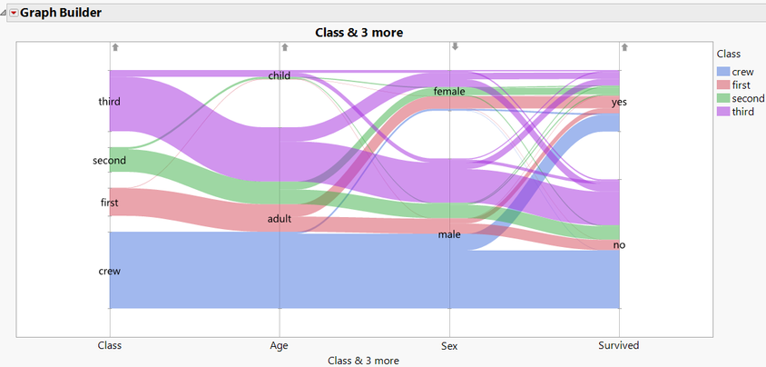
These arrows represent the sorting order of the column. If you click this arrow for ‘Sex’, the vertical order of the colored bands is reversed vertically below it. This yields a parallel plot that emphasizes the message that most of the crew did not survive. Here is the result of changing the direction of the arrow for 'Sex' from up to down:

Now with this new visual, you can better see the dire situation for the crew. Reading from left to right, the wide blue band representing the crew extends with almost the same vertical width from left to right until it intersects the 'Sex' variable, where a small proportion of the males branch upward toward 'Survived'. But as you see, most crew perished. If you look carefully, you can see a very thin blue band that represents female crew members who also survived and branched upward toward the female node.
Quiz: How did the second class fare with respect to survival? Hint: Follow the green bands from left to right.
Conclusion
Graphics can illuminate data in ways that the numbers alone cannot and provide a richer context to the stories in your data. The interactive parallel plot presented here is particularly useful in telling stories about your data. In fact, JMP typically provides both graphs and numerical summaries for most of the outputs for this reason. In this case the parallel plot along with numerical summaries tell a more complete story of survival on board the RMS Titanic.
I wish to thank my co-authors @susan_walsh1 and @curt_hinrichs for their help in drafting this article.
You must be a registered user to add a comment. If you've already registered, sign in. Otherwise, register and sign in.