 The second thing I wish someone had told me when I first started using it is that JMP has a workflow.
We last left our author looking back with nostalgia on his early days as a
JMP user and reminiscing about what he wished someone had told him on that fateful day when he first opened JMP. He had just...
OK, I can't even finish writing that melodramatic nonsense with a straight face... sorry – let's try this again.
– I've thought of five* things I wish someone had told me on Day 1 with JMP software.
– Thing 1: Always start with a graph.
And now, on to...
The JMP Workflow
This is second on my list because it was the one that I desperately wished someone could have told me. It's that important. JMP is designed with a specific workflow in mind. Mastering this four-step workflow will help you to understand where to look in any JMP report for answers.
1. Generate a graph or run a report (Which will generally generate a graph – see the
first episode in this series).
2. Study the results in the report.
3. Ask questions about what you are seeing.
4. Push "The Answer Button." If that Answer Button doesn't work, push the one on the mouse (right-click).
Wait, you didn't know there was an Answer Button in the software? There is. Let's do an example, and I can show you where it is.
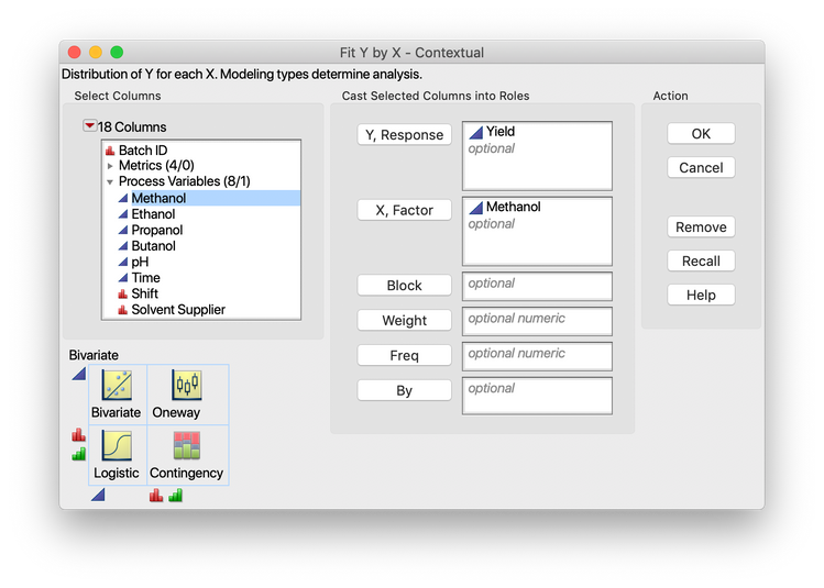
Step 1. Generate Report: Let's start with a data set, and let's further say that we want to compare a response called Yield to a factor called Methanol. The details of the data set aren't crucial at this point, just that we want to compare a factor and a response. Going into JMP, we can go to Fit Y by X (more on why we would know that in a bit) and put Yield into the "Y, Response" field and Methanol into the "X, Factor" field.

We can then click "OK," and we've completed Step 1. A
JMP Public version of the report is provided below. Note, we could have done this in Graph Builder, too.
Step 2. Study the results: When looking at this graph, what do you see? In this case, I see fairly easily that there may be a trend in Yield as Methanol goes to higher percentages. Pro Tip: This step has a five-second rule. If you stare at a graph long enough, your brain will start seeing all kinds of things, whether they are really there or not!
Step 3. Ask Questions: Is the trend significant? Is there a correlation between Yield and Methanol? What is the line of fit for the relationship that we're seeing? These are all examples of questions that we could ask.
Step 4. Push the Answer Button: If you're experienced with JMP, you've probably figured out that the Red Triangle is what I call "The Answer Button." There's a good reason for this. It is the Answer Button! All the answers to the questions I listed in Step 3 are found under the menu that pops up from the Red Triangle.
Is the trend significant? Select Density Ellipse from the Red Triangle and look at the statistics. That also answers the question about correlation. The line of fit is found by selecting Linear Fit. Below is a JMP Public version of the Fit Y by X report if you turned on the 99% Density Ellipse and a Linear Fit from the drop-down menu.
The point is that the contextual menus under the Red Triangle are designed around this four-step workflow. If you get that bit down, everything else becomes variations on the theme.
Which brings us to the end of another episode. Tune in next time to find out why the Analyze menu is set up the way it is!
You must be a registered user to add a comment. If you've already registered, sign in. Otherwise, register and sign in.