Have you ever wondered where the US stands in terms of representation of women in government and labor force participation? I and three other JMP interns – Preethi Surapaneni (@prsura), Liz Zarzar (@ezarzar) and Caroline Huang (@cahuang) – did. We decided to dig deeper into the data to see how the US fares during the Data for Good Intern Hackathon at SAS.
For the Hackathon, we created an info graphic that presents statistics and trends on the global representation of women in government and the female labor force. We specifically focused on evaluating how the United States compares to other nations. In the US, women make up 51% of the population, but only 19.6% of government seats. So, our first question was to explore where exactly the women leaders are and whether or not the US has made any progress in women’s representation in politics.
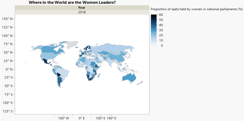
To do this, we used JMP to map every country to see which ones had the highest women representation in government. The visualization below indicates that the top five countries with the most women in government were Rwanda, Cuba, Bolivia, Mexico and Grenada. Surprisingly, the results revealed that the US ranked 104th out of the 213 countries, despite being one of the most developed nations in the world.
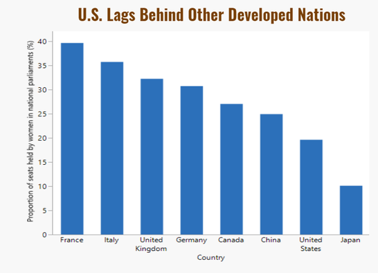
The United States lags considerably behind six other similarly developed countries, with only 20% of seats in government held by women.
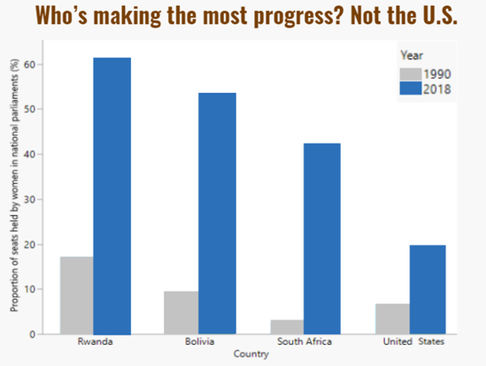
But is this likely to change? To answer this question, we created the following bar chart; it shows that, although the US has made some progress from 1990 to 2018. the United States still substantially trails other nations that are less developed in terms of GDP.
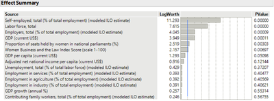
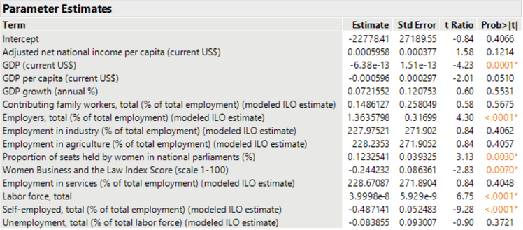
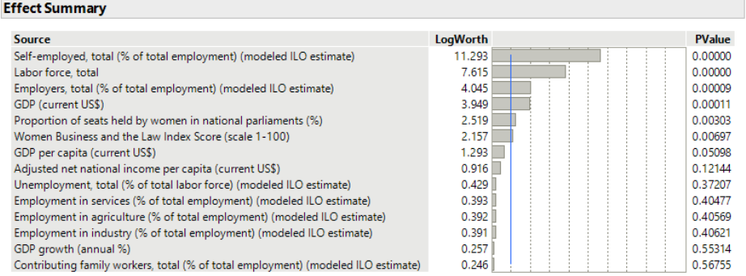
To understand the relationship between female workforce participation and various variables describing a country’s economy, we fit a model using percent female labor participation as a response variable. From these results, we determined that the biggest correlations occurred in job opportunities. Across the board, if more roles were available in agriculture, service or industry fields, female labor participation would increase. On the other hand, countries with larger GDP or higher Women Business and Law Index scores actually had lower female labor participation. This observation was surprising, and we think more research is needed before offering a definitive explanation.
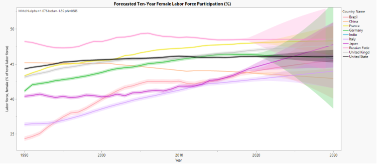
Looking into the future, we used a time series plot to predict how female labor force participation will change in the coming years. In the United States, which is represented by the black line, we see that female participation improved up until 2000. Since then, the line has been stagnant, even showing a slight decrease over the years. Using the time series plot, we predict that female participation for the next 10 years will continue to be stagnant. Comparing this against other highly developed countries, our lack of change becomes more apparent against their continual growth in female equality.
Overall, these trends show that we need representation in government and the overall workforce to better reflect the actual US population. The year 2020 brought some hope with a record number of women running for Congress and president. However, we still have a lot of work to do in terms of female representation. Our stats show that progress will not necessarily be made on its own. There are not many policies in place in the United States to create equal representation in government or the workforce, so it seems that it still takes powerful women "breaking the glass ceiling” to set precedent and encourage others to follow in their path.
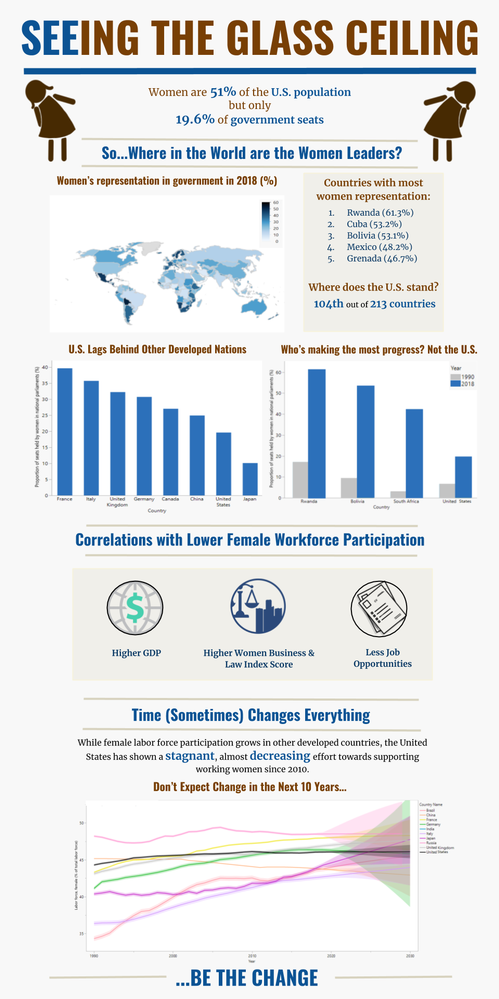 Here's the whole infographic that we entered in the Hackathon. Our team placed 1st for best infographic and 2nd in best data story.