We're just wrapping up the JMP Discovery Summit Europe in Copenhagen today, and I'm pleased to see that Pi Day is also celebrated in Europe even though the date is written "14/3" here instead of "3/14" as in the US. We served pie for everyone after Tim Harford's closing plenary talk.
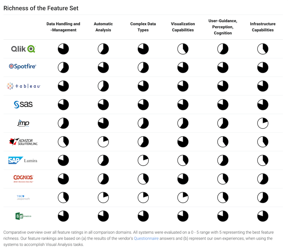
Since 2014, I've used Pi Day as a chance to discuss pie chart makeovers under the banner of #onelesspie. One day a year seems like a small investment for thinking about pie charts we make or discover, and where an alternative chart type might be more effective. Ideally, I (and you) will remake and replace a pie chart -- I often choose a Wikipedia pie chart. This year, I'm highlighting a matrix of 60 pie charts I ran across in a paper a few months ago, at a visualization conference of all places.
The paper sought to compare Commercial Visual Analytics Tools, which is quite an ambitious task considering the number of possible products and the depth of each. It was nice that JMP (and SAS Visual Analytics) made it to the final set of 10 products. The matrix is showing the results from their questionaire and is necessarily coarse given the scope of the work.
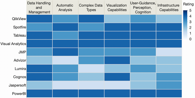
Regarding the chart matrix as a visual, I found it difficult to make quick comparisons across rows or within columns using the pie charts, which seem like reasonable tasks for interpreting the results. I transcribed the data and made this heatmap of the same information.
Now it's easier to see, for instance, that SAS Visual Analytics and Microsoft PowerBI scored well across the board and Tableau was not far behind. JMP did well -- but, of course, I think it should have scored better! I'll attribute it to the spirit behind John Sall's keynote yesterday, "Secret Features of JMP," where he explains why some features are hidden below the surface in contextual menus so that the display is dominated by data, graphs and analytics results.
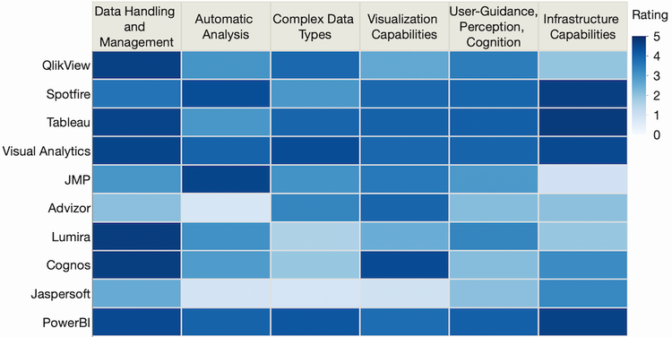
Besides the pie chart form, the other design choice is whether to discretize the data or not. All the pies and all the colors above represent integers 1 to 4 on a 0 to 5 scale. Later in the paper, a different view reveals the actual non-integer values (in a radar chart -- don't get me started). Here's that data in a heatmap.
It's often difficult to decide whether to bin the data or not in a color scale. Discrete colors are easier to compare across distances but have less resolution. For instance, in the new heatmap we can now discern some variation in the previously uniform Visual Analytics scores. And I'm glad to see that JMP's visualization score was better than it initially appeared -- it must have been just on the wrong side of the discretization cut-off.
After I tweeted my remade charts, tagging one of the authors I found on Twitter, he replied that his original chart was a heatmap (!) but that it got changed to the pie matrix after suggestions during the editorial process. Oh, well...happy Pi Day to all!
You must be a registered user to add a comment. If you've already registered, sign in. Otherwise, register and sign in.