For Black History Month 2019, Montgomery College sponsored the Black Data Project, a contest to draw attention to the data analysis and visualization work of W.E.B. Du Bois. They selected 12 of his works from the 1900 World’s Fair in Paris and invited participants to create derivative works. Many people still don't know that Du Bois created data visualizations. A great place to learn more is an article in Smithsonian magazine about the important work he and other Black sociologists did to raise awareness of systemic racism.
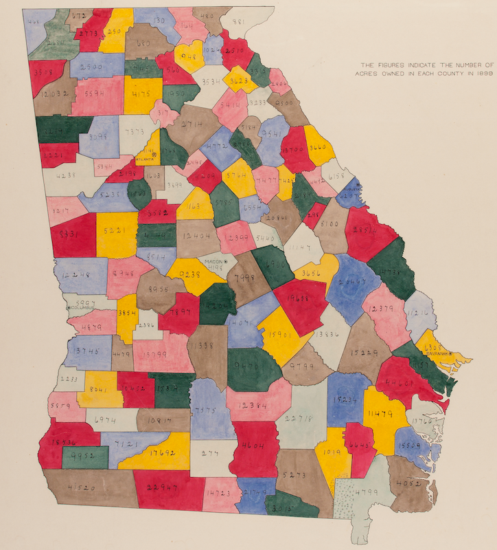
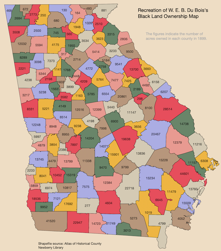
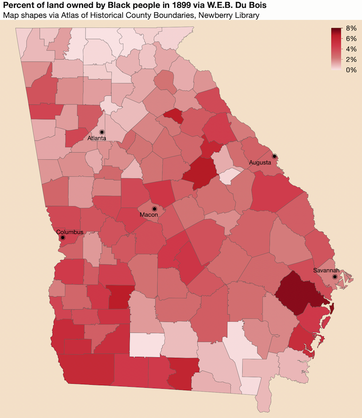
As a weekend project first shared on Twitter, I decided to have a go at this map of land ownership by Black people, first to recreate it and second to augment it with a color gradient that reflected the data values. In its original form, the colors only serve to distinguish the counties.

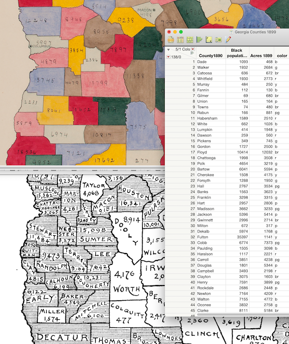
Not finding any corresponding data set, I started keying in the values from a high-resolution version of the map from the Library of Congress. I soon realized that the counties in the map were different from today’s Georgia counties. As part of my research, I found another map by Du Bois from around the same time that had the names of the counties. Using those together, I was able to create a data table of the information in the maps.

That was more work than I expected – Georgia has a lot of counties! And I still had one problem remaining: translating the old counties into the modern counties that JMP knows about. I spent a little while puzzling over ways to apply the old acreage numbers to the new counties. Some of the old counties were joined together, and others were split in two, and in trickier cases new counties had been carved out of multiple old counties. Not looking forward to diluting the data integrity by estimating values for the new counties based on the old counties, I started looking around for old map shapefiles and found the Atlas of Historical County Boundaries. Amazing -- just what I needed!
I downloaded the shapefiles for Georgia and imported the .DBF and .SHP files as JMP data tables. There were a few extra fields for each shape in the DBF file, including the dates of the county’s existence and its area. I filtered both tables down to only the counties existing in 1899 and saved the data tables to be used as custom map files. Then I linked my keyed-in data file directly to the map files with a Map Role column property.

I had recorded each county’s color (one of seven) in my original data entry work and added a Value Color column property to mimic Du Bois’s original colors. Then it was just a matter of dragging that variable into Graph Builder’s color drop zone to color the counties. The map projection is a little different and I couldn’t capture the beauty of his hand-filled colors, but otherwise I was happy with the reproduction.
Finally, I was ready to augment the graph by showing the acreage with color. As a way of taking the varying county sizes into account, I colored the counties by the percentage of land owned by Black people instead of the raw acreage value, which also provided a little context for the amounts.

Adding markers for the cities to the map required a little advanced work. I added rows to the table for the five cities in the original map along with their longitudes and latitudes, and then I layered a Points element over the Shapes element in Graph Builder and labeled the rows for the points. The final touch was to use the Unicode “fisheye” character, ◉, as the marker shape.
As part of my data search, I came across Du Bois’s write-up of his Georgia land ownership study that appeared in a 1901 Congressional Bulletin [PDF]. Here is an excerpt from his introduction:
This study, therefore, is an attempt to make clear the steps by which 470,000 black freedmen and their children have in one of the former slave States gained possession of over a million acres of land in a generation, the value of this land and its situation, the conditions of ownership, and the proper interpretation of these statistics as social phenomena.
His report is more than 100 pages long and includes maps, many tables of economic and real estate data, backgrounds on each county, and even comments on the quality of the data collected. It’s a very interesting read if you want to add some context to your data science and to your American history.
You might also like to look at other re-creations of Du Bois' works, such as those by Anthony Starks or by a team of researchers at UMass Amherst.
GA_Historical_Counties1899-Name.jmp
GA_Historical_Counties1899-XY.jmp
Georgia Counties 1899 Data.jmp