- New to JMP? Let the Data Analysis Director guide you through selecting an analysis task, an analysis goal, and a data type. Available now in the JMP Marketplace!
- See how to install JMP Marketplace extensions to customize and enhance JMP.
JMP Blog
A blog for anyone curious about data visualization, design of experiments, statistics, predictive modeling, and more- JMP User Community
- :
- Blogs
- :
- JMP Blog
- :
- ROC curves for evaluation of prediction models with categorical responses
- Subscribe to RSS Feed
- Mark as New
- Mark as Read
- Bookmark
- Subscribe
- Printer Friendly Page
- Report Inappropriate Content
In a recent Technically Speaking webinar, I discussed predicting risk of peripheral arterial disease (PAD) where the response is categorical with two possible results: Yes (patient at risk of having PAD) and No (patient not at risk of having PAD).
During that presentation, I pointed out that the prediction model contains two parts 1) the probability function created by a model and 2) the cutoff used to classify the data as most likely Yes or No. I briefly mentioned that the ROC curve is a good way to evaluate and compare the probability function created by the model.
This blog post will further explain ROC curves and how to interpret them. I will also provide some thoughts about ROC curves when predicting rare events (unbalanced data) and choosing a classification cutoff.
The ROC curve
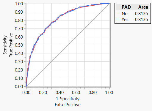
The ROC curve for a prediction model for risk of peripheral arterial disease (PAD) is shown in Figure 1.

Standard elements of the ROC curve:
- The x-axis is 1-Specficity, which is the false positive rate; it ranges from 0 to 1. It can also be thought of as the Type I error of the model.
- The y-axis is Sensitivity, which is the proportion of true positives; it ranges from 0 to 1. It can also be thought of as the power of the model, or 1-Type II error.
- Occasionally, a diagonal line passes through 0,0 and 1,1 which is where the true positive rate equals the false positive rate. This line represents a truly random model or a model that has no predictive value.
So what is plotted on the ROC curve?
To understand what is plotted on the ROC curve, recall that the prediction model for a categorical response has two parts 1) the probability function and 2) a cutoff to classify the probability into most likely categories. For each observation in the data set, the predicted probability is used as the classification cutoff. The resulting Sensitivity and 1-Specificity of a model with that cutoff is plotted for each observation in the data set. I will go into more detail about these calculations below.
Note that the ROC curve never falls below the diagonal line that passes through 0,0 and 1,1.
And how does one interpret the ROC curve?
A perfect model passes through the top left corner of the grid (0,1). An x value of 0 indicates the model results in no false positives. A y value of 1 indicates the model results in all true positives.
Area under the ROC curve (AUC) gives an indication of how close the model is to the top left corner of the ROC curve. An AUC of 1 is a perfect model, and an AUC of 0.5 is a random model or a model with no predictive value. Since the ROC curve never falls below the diagonal line, AUC will always be between 0.5 and 1.
Higher AUC indicates that the model is farther from the diagonal line that represents a model with no predictive value and approaches a perfect model that passes through top left corner of the grid (0,1).
A closer look at the ROC curve for the PAD model
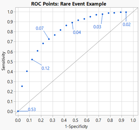
Let’s take a closer look at the ROC curve for the prediction model for risk of PAD and how the x and y values are calculated. Figure 2 is a graphical plot of a subset of observations in the data set and plotted on a ROC curve. Some of these points are labelled with their corresponding prediction probability for PAD = Yes.

First, notice that the data points are in order of predicted probabilities, ranging from 0.02 to 0.53. If I had built a model from a data set with an equal number for Yes and No, I would expect the range to be between 0 and 1 with 0.5 near the center of the curve. However, this data set is for a rare or unbalanced data set which means there is a much lower frequency of Yes compared to No. As a result, all predicted probabilities fall on the lower end of the range – they are all 0.53 and below.
The data point in the top right corner of the graph corresponds to the lowest predicted probability in the data subset (0.02). Before we talk about the calculations used to plot this point, take a minute to think about the scenario. If we use one of the lowest predicted probabilities as a cutoff to classify all the predicted probabilities, what is going to happen with our classifications? Nearly all the data will be classified as Yes when many of them are really a No. This corresponds to a high false positive rate (1-Specificity). Likewise, any data that are a Yes will be classified as a Yes which is a high true positive rate (Sensitivity).
Also think about the data point in the bottom left corner of the graph. This point corresponds to the highest predicted probability in the data (0.53). If the highest predicted probability is used as a cutoff, all data will be classified as No, meaning the false positive rate (1-Specificity) is low, in fact it is zero. Any data that are a Yes will be classified as a No which results in a low true positive rate (Sensitivity), and again, is zero.
Calculating 1-Specificity and Sensitivity
To plot data on the ROC curve we must calculate 1-Specificity and Sensitivity. Let’s start with the data point in the top right corner of Figure 2 which corresponds to the lowest predicted probability in the data subset (0.02). First, the predicted probability of 0.02 is used as the cutoff to classify the entire data set as Yes or No. This predicted condition is compared to the actual or true condition and the data can be separated into four outcomes – true positive, true negative, false negative, false positive (Figure 3). Figure 3 is referred to as the Confusion Matrix and the numbers populated in the Confusion Matrix are used to calculate 1-Specificity and Sensitivity.
|
|
True Condition |
||
|
Actual Positive |
Actual Negative |
||
|
Predicted Condition |
Predicted Positive |
True Positive (TP) |
False Positive (FP) |
|
Predicted Negative |
False Negative (FN) |
True Negative (TN) |
|
Figure 3. Outcomes of binary classification models (Confusion Matrix).
1-Specificity
1-Specifity is the false positive rate and is calculated by subtracting the true negative rate from one. The true negative rate is the number of true negatives (TN) predicted by the model divided by the total number of actual negatives which includes both true negatives (TN) and false positives (FP).
Sensitivity
Sensitivity is the true positive rate which is the number of true positives (TP) predicted by the model divided by the total number of actual positives, including both true positives (TP) and false negatives (FN).
With a classification cutoff of 0.02 applied to the entire data set, we get the outcomes reported in Figure 4 below.
|
|
True Condition |
||
|
Actual Positive |
Actual Negative |
||
|
Predicted Condition |
Predicted Positive |
TP = 277 |
FP = 3394 |
|
Predicted Negative |
FN = 0 |
TN = 312 |
|
Figure 4. Outcomes of PAD prediction model with classification cutoff of 0.02.
From these outcomes, we can calculate 1-Specificity and Sensitivity which corresponds to the x and y values, respectively that are plotted on the ROC curve.
In summary, the ROC curve is a plot of each data point in the data set that was used to create the probability function. 1-Specificity and Sensitivity are calculated for each data point by using the outcomes in the Confusion Matrix when the predicted probability is used as the classification cutoff.
By going through these calculations for the ROC curve, we can also conclude that a prediction model using the probability function and a classification of 0.02 would not be a great model. First, since this point falls close to the diagonal line that represents a truly random model, we are not much better than simply randomly assigning risk of PAD to patients. We can also see from the calculations that there is large discrepancy in our true negative rate (specificity) of 0.08 and true positive rate (sensitivity) of 1. In other words, while 100% of the true PAD cases are classified, the false positive rate is 92%. We will want to choose a classification cutoff that balances out specificity and sensitivity and is farther from the diagonal line and closer to the top left corner of the graph.
Choosing a classification cutoff
By default, a cutoff of 0.5 is used to classify data based on the probability function, JMP creates a prediction formula using this cutoff. A cutoff of 0.5 may be appropriate for data with equal numbers of actual positives and negatives. However, when the actual positive rate is low (e.g., rare events or unbalanced data) a cutoff of 0.5 is likely not optimal.
The question then becomes, what approach can be used to choose a classification cutoff for rare events? The ROC curve does give us some clues. The top left corner of the graph is where the true negative rate (specificity) and true positive rate (sensitivity) of both are maximized. Looking at the Figure 2, where the prediction probabilities are labelled, we can see that a cutoff around 0.07 would be optimal for this prediction model if our goal is to balance out specificity and sensitivity. However, ROC curves typically are not labelled with their prediction probabilities.
Youden’s J Statistic can be used to find the prediction probability that corresponds to the point on the ROC curve where specificity and sensitivity are maximized.
Youden’s J Statistic ranges between 0 and 1 where 0 corresponds to an equal rate of true positives and false positives and 1 corresponds to a model with all true positives and no false positives. It can also be thought of as the point along the ROC curve that is farthest away from the diagonal line that represents a random model.
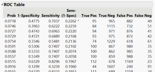
If you are using Nominal Logistic in the Fit Model Platform, when you select the ROC curve you will also get a corresponding ROC Table. One of the columns in the table is Youden’s J Statistic and is labelled as Sens-(1-Spec). The ROC Table can be sorted descending by Sens-(1-Spec) to identify the prediction probability (Prob) that has the maximum Sen-(1-spec) which is where the true negative rate (specificity) and true positive rate (sensitivity) of both are maximized. You can see that JMP puts an asterisk next to the maximum value for Sens-(1-Spec).
In the PAD example, there were only 277 patients with PAD from a data set with 3,983 patients; a classification cutoff of 0.07 balanced out the true positive and true negative rate. Once a classification cutoff has been determined, it can be changed in the prediction formula saved to the data table. I will note that choosing a cutoff depends on the goal of the prediction model and the risks associated with the outcomes. A researcher may choose a different cutoff if they wish, for example, to guard against false positives or false negative.
- © 2026 JMP Statistical Discovery LLC. All Rights Reserved.
- Terms of Use
- Privacy Statement
- Contact Us


You must be a registered user to add a comment. If you've already registered, sign in. Otherwise, register and sign in.