In my first Control Chart Builder blog post “Control Charts are easy in JMP 10,” I used a column named “Date” on the X-axis. When I downloaded the data, it didn’t arrive as a date; I had to create the date column from the original month and year columns. Traditionally, when you had more than one variable or column of interest on an axis, you needed to create a new variable with a formula similar to Char(:Month ||“ “||:Year) – which concatenated the levels of the original columns. Additionally, to have the axis sort correctly, you often needed to add Value Ordering as a column property and arrange the levels into the order desired.
Open Cars Sold.jmp, which you can download from the JMP File Exchange
From the Analyze menu, choose Quality and Process->Control Chart Builder
Drag Volume ($M) sold to the Y-axis area of the chart
Drag Year to the X-axis area of the chart
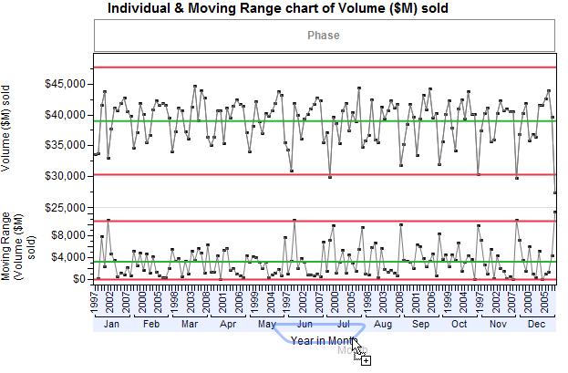
Drag, but don’t drop yet, Month to the X-axis area of the chartWhen you move the new variable to the drop zone below the X-axis, the new variable is inserted at the outer-most nesting level, outside of the current variable. You can see the blue drop zone below the axis and the hint displaying what the new graph will look like. (See Figure 1.)

Plotting Year within Month doesn’t make sense, so while still dragging Month with the mouse, we need to move Month up to a different drop location.
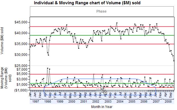
When you move the new variable in the drop zone above the X-axis, the levels of the new variable are nested within the current variable, at the inner-most nesting level. Again you see the drop zone, but this time it’s above the axis inside the lower part of the graph.

The results look good in the hint display, so let’s drop Month inside the graph.
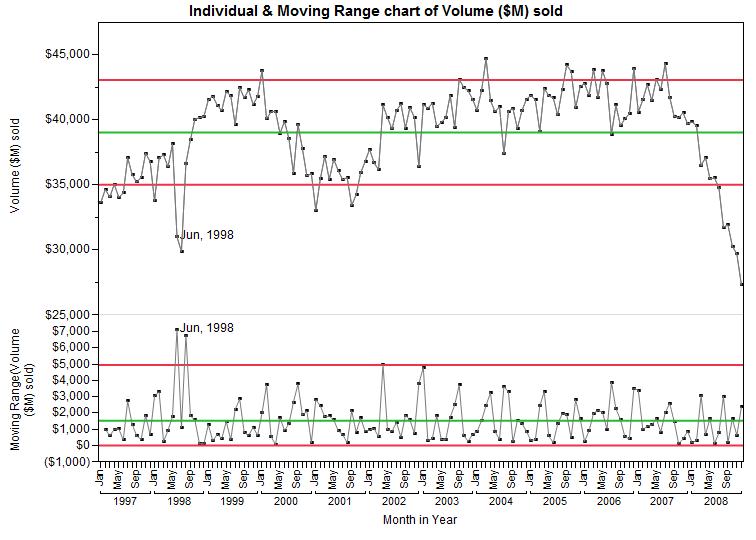
 Although it’s the same graph as my first blog post, seeing the axis grouped by years is much cleaner for me to read. Plus, it’s faster than creating a new formula column and adding value ordering.
You must be a registered user to add a comment. If you've already registered, sign in. Otherwise, register and sign in.